The very picture of the world
Visual Style
Copy link to this element
Link Copied
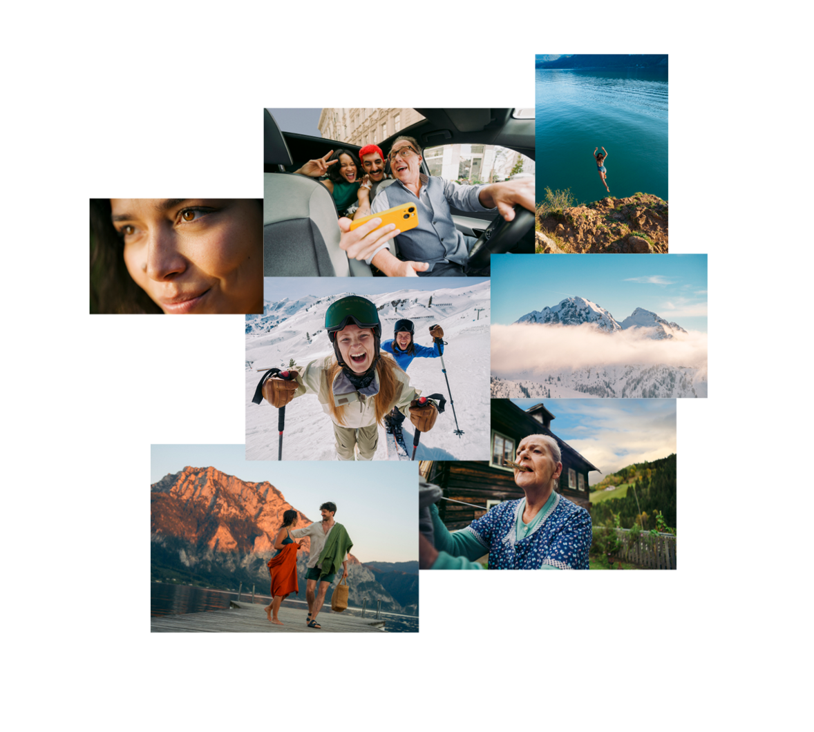
The image style of the Austria Tourism brand differs from commercial, sometimes exaggerated images and always generates closeness. Closeness to the moment, to people, to the country. Situations are staged by life itself, rather than constructed by hand.
Pure moments
Unique perspective
Framing
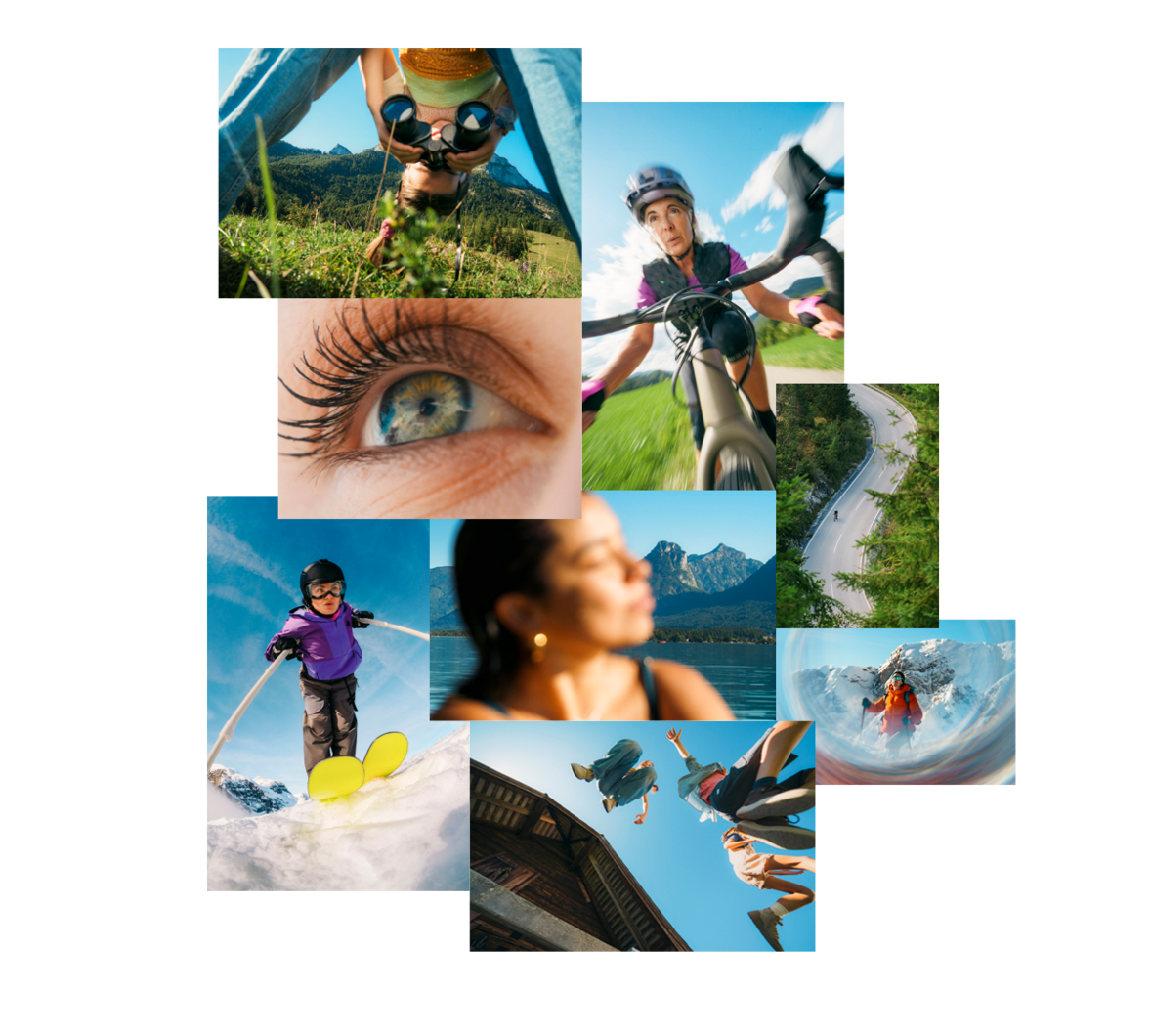
We evoke emotion through closeness and a sense of place. Detailed close-ups meet atmospheric wide shots, making the experience immediately tangible and opening up a fascinating world. Unusual perspectives and lenses are used deliberately as an artistic device, giving naturalness new angles that release the full energy of the images.
We evoke emotion through closeness and a sense of place. Detailed close-ups meet atmospheric wide shots, making the experience immediately tangible and opening up a fascinating world. Unusual perspectives and lenses are used deliberately as an artistic device, giving naturalness new angles that release the full energy of the images.
Natural with an edge
Colouring
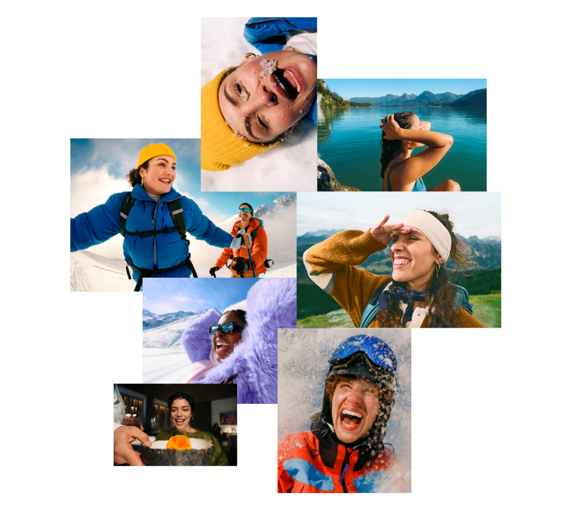
We use the contrasts and colours that reality offers and show natural, powerful vibrancy, but never overdo it. Colours may emphasise character and bring out its accents. Lighting stays true to life, but its intensity can heighten the mood. We aim to capture a wide range of moments, working with sunshine as well as rain clouds, different times of day and different emotional states. The result is a composition that is both modern and timeless.
We use the contrasts and colours that reality offers and show natural, powerful vibrancy, but never overdo it. Colours may emphasise character and bring out its accents. Lighting stays true to life, but its intensity can heighten the mood. We aim to capture a wide range of moments, working with sunshine as well as rain clouds, different times of day and different emotional states. The result is a composition that is both modern and timeless.
Austria has character
Cast & styling
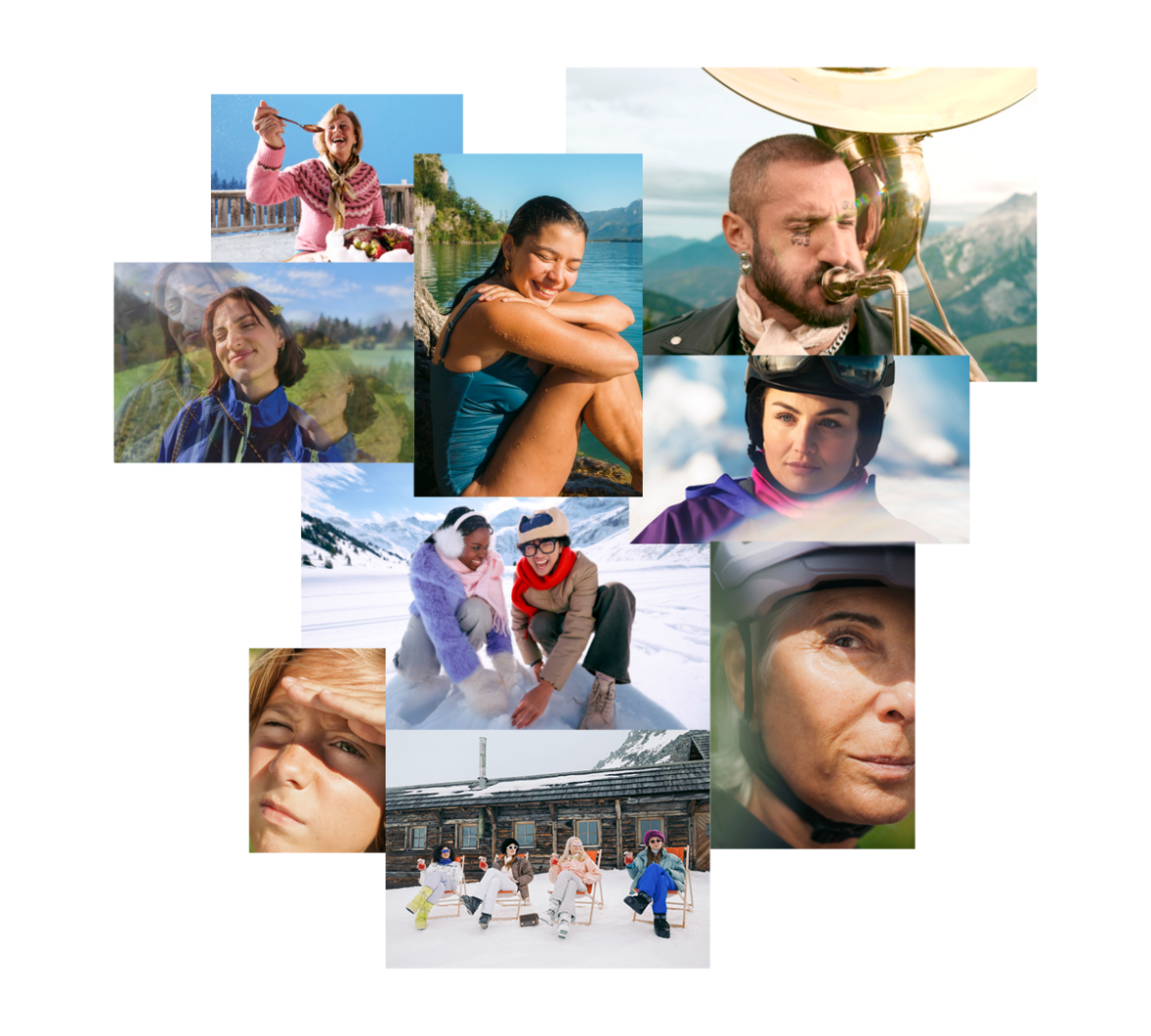
We show a diverse, expressive cast, regardless of age, background or body type. What counts is being REAL. Whether hiking, shopping or at the bar, it is all about authentic, likeable personalities. Perfection and convention play no part. We choose modern styling that strengthens each character and deliberately avoids anything over-staged. Colour can be used to emphasise characters or to add targeted accents (e.g. clothing, accessories).
We show a diverse, expressive cast, regardless of age, background or body type. What counts is being REAL. Whether hiking, shopping or at the bar, it is all about authentic, likeable personalities. Perfection and convention play no part. We choose modern styling that strengthens each character and deliberately avoids anything over-staged. Colour can be used to emphasise characters or to add targeted accents (e.g. clothing, accessories).
The aim is a natural, high-quality and timeless visual language that feels modern without appearing artificial or over-staged. Editing should always stay true to reality and simply enhance it, never distort it.
It is important to work with the natural colours and contrasts already present in the scene. Images should feel vibrant and powerful but never oversaturated. Authenticity always comes first.
Lighting should remain realistic and reflect the actual shooting conditions. Light intensity may be adjusted to enhance the desired mood. Images should never appear too dark or gloomy. For high-contrast or dark subjects, please brighten them gently and give them a friendlier feel without losing the original mood.
A key aspect is the visual consistency of the entire visual world. All images should complement one another and harmonise in their colouring. Skin tones, vegetation (e.g. grasses) and sky colours in particular must be carefully balanced with one another. Naturally, we take into account the natural conditions of each subject, such as time of day, weather and available light. Colours are vibrant and strong without appearing too dominant or intrusive. Avoid both an overly cool look and an overly warm, yellowish or sepia-like colour temperature, as these quickly look dated. Bright blue skies are deliberately given a more modern interpretation by shifting them slightly towards a warmer tone. This creates a contemporary look without losing naturalness.
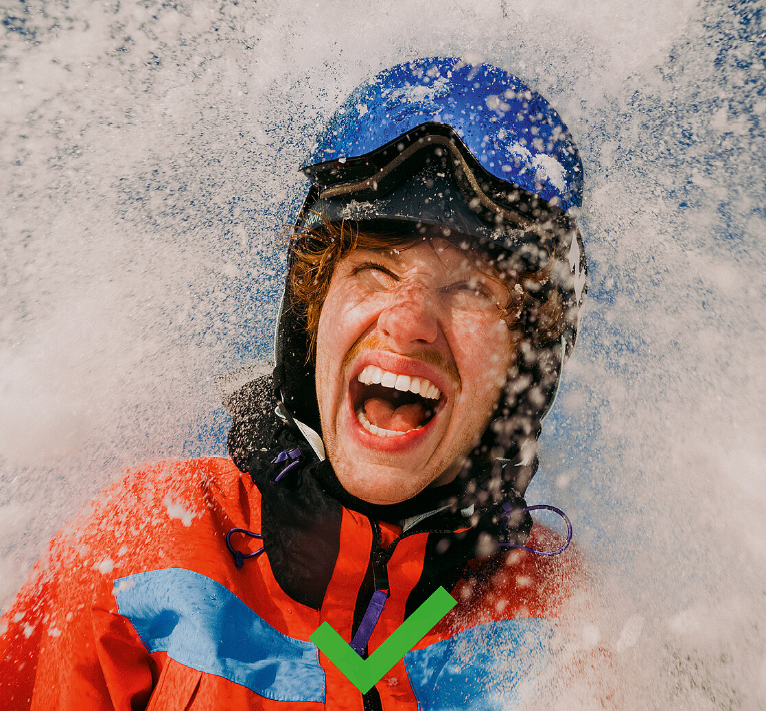
Images should feel natural, vibrant and unposed.
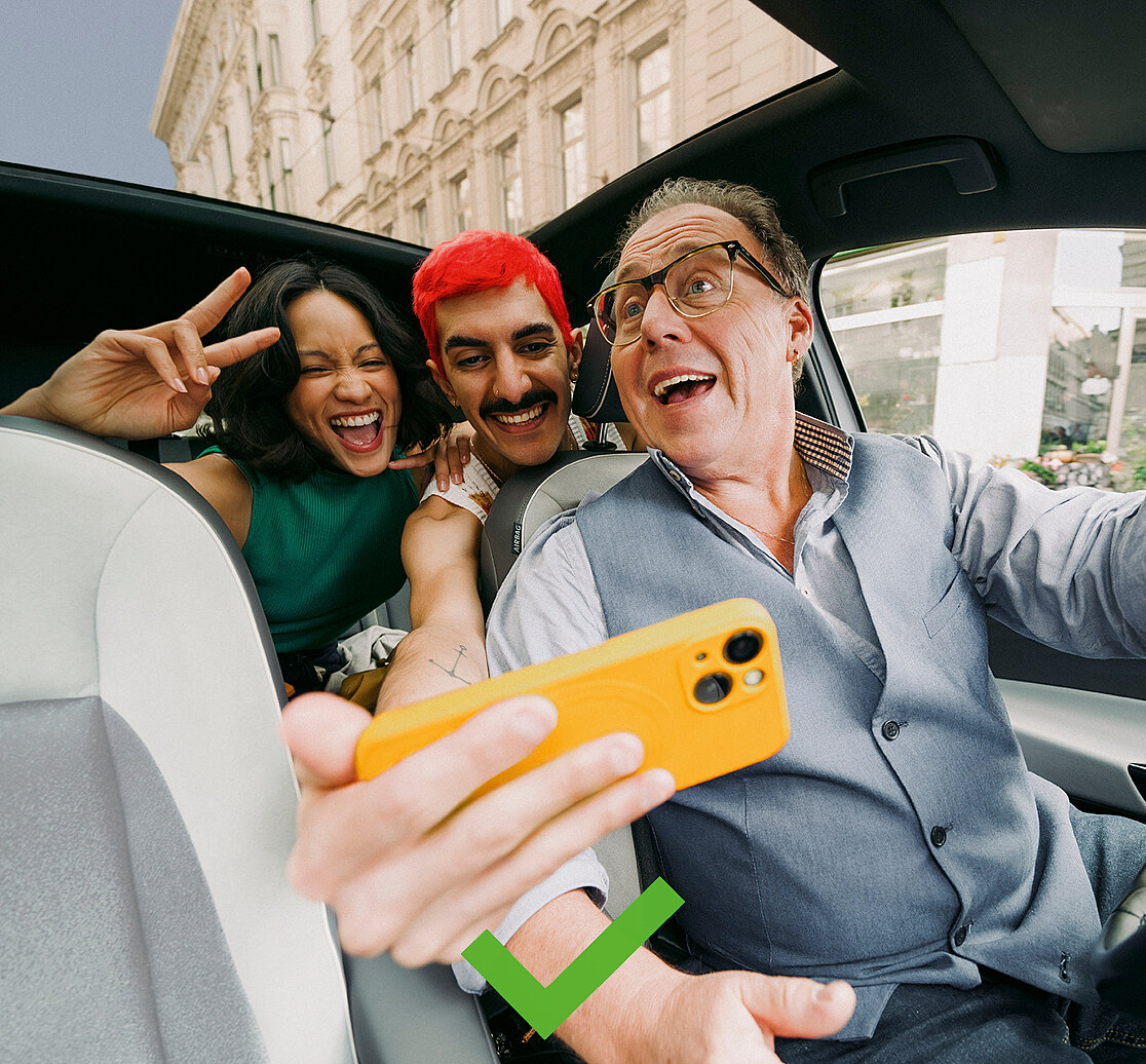
Colours may emphasise characters and bring out their accents (e.g. clothing, accessories). Vibrant, strong colours are welcome but should never appear too dominant or intrusive.
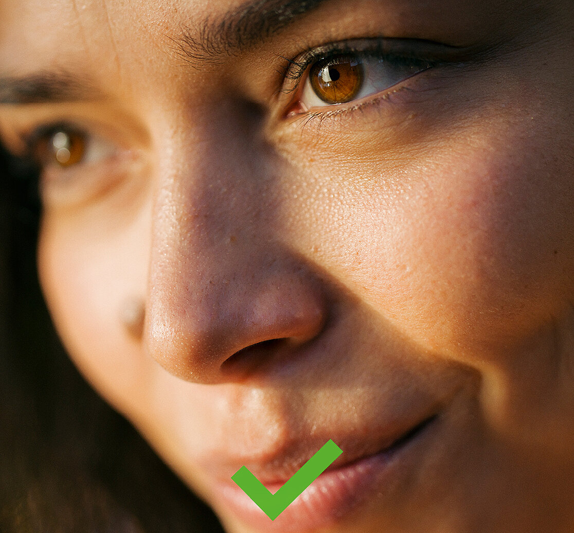
Lighting stays true to life, but its intensity can heighten the mood
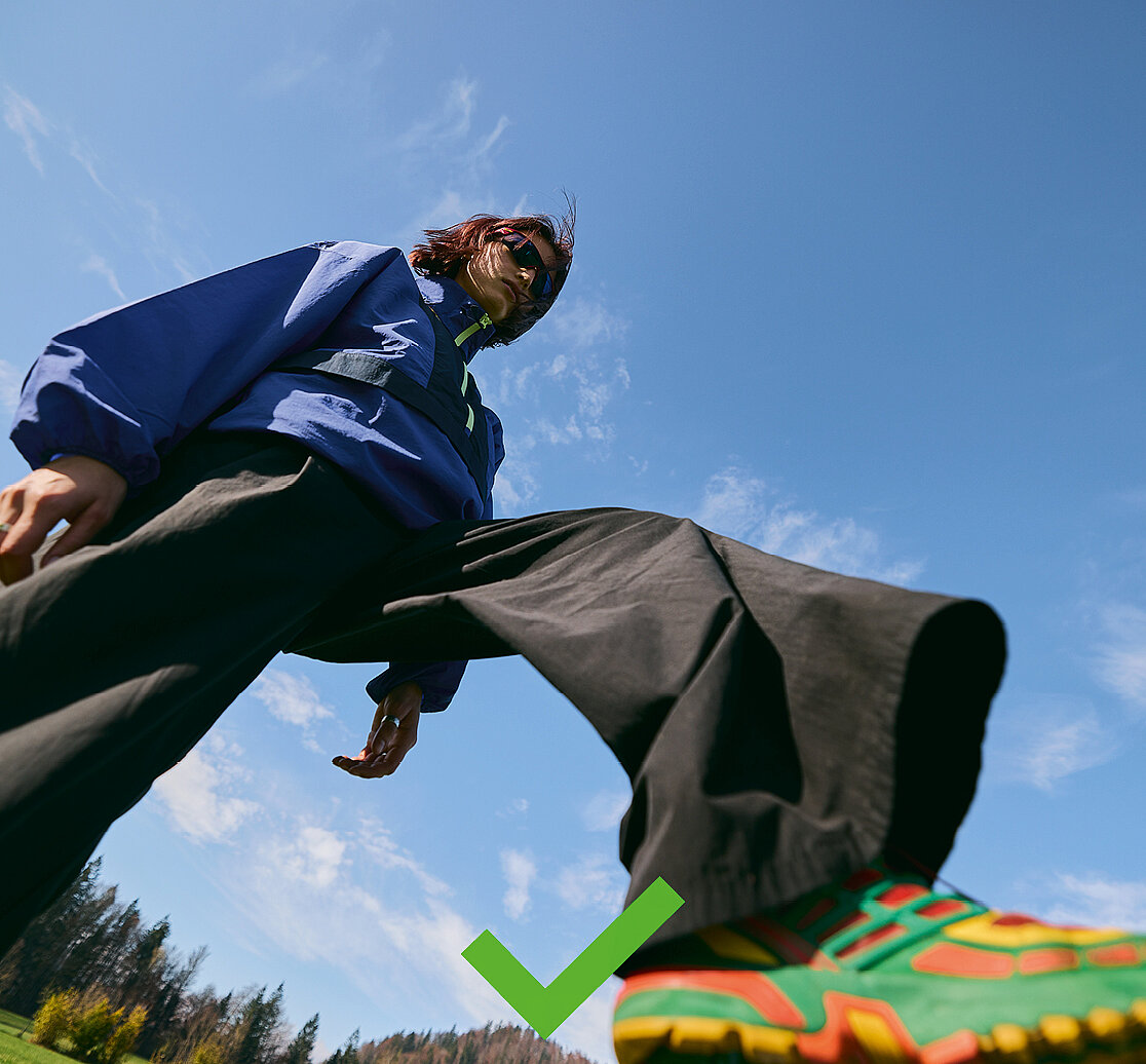
Unusual perspectives and unexpected angles are used deliberately to bring freshness and dynamism to the visual language and to open up new, surprising ways of seeing.
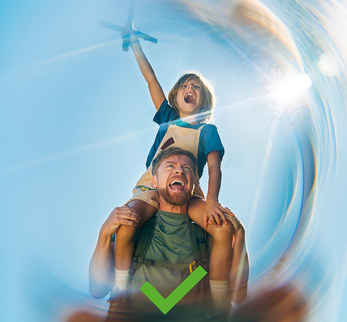
Special lenses are used sparingly as an artistic device, for highlights rather than as a signature style.
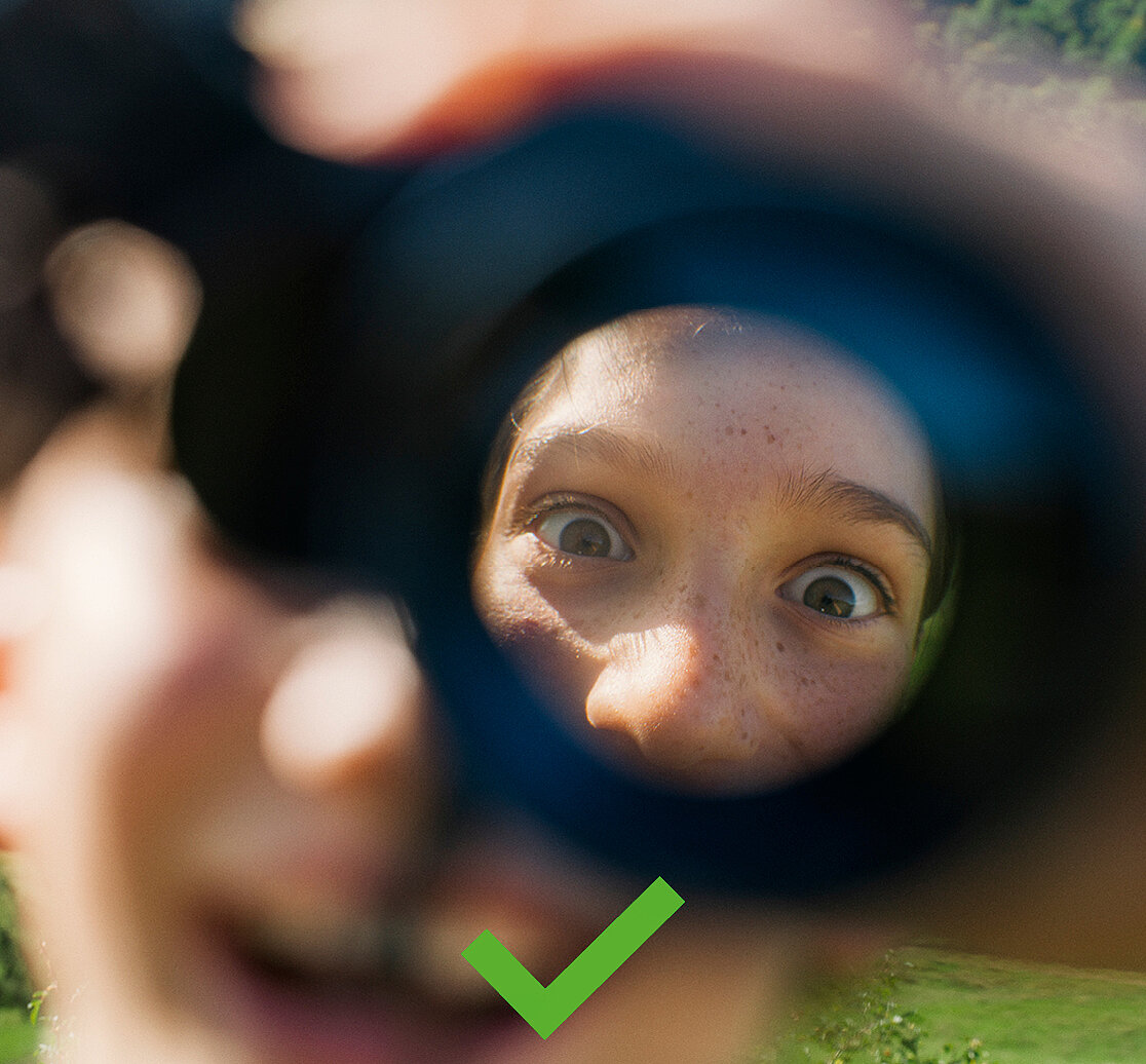
Schärfe & Unschärfe setzten wir gezielt als Stilmittel ein, um den Fokus auf bestimmte Bildbereiche zu lenken.
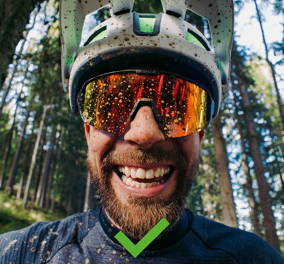
In images of sporting activities, safety should also be taken into account, for example by showing people wearing helmets.
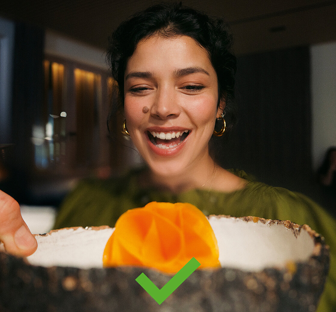
In terms of content, sensitivity towards international markets must be taken into account, for example regarding dress norms in Muslim-majority or Asian countries.
Dont's
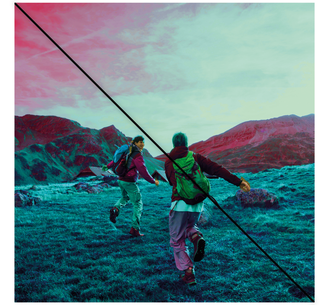
Colour effects, artificial lighting and artificial filters must be avoided.
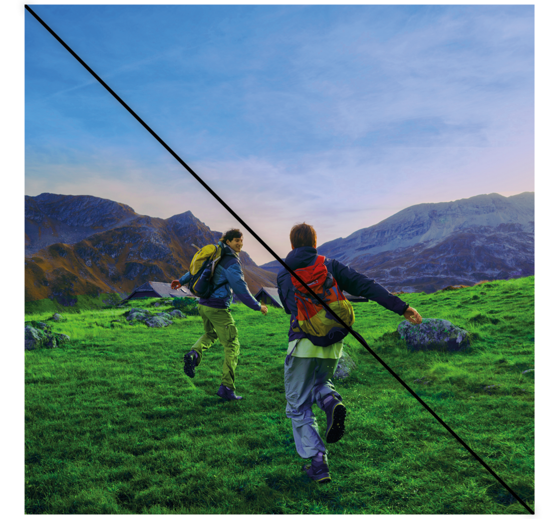
Greens and blues should never be oversaturated. Authenticity comes first!
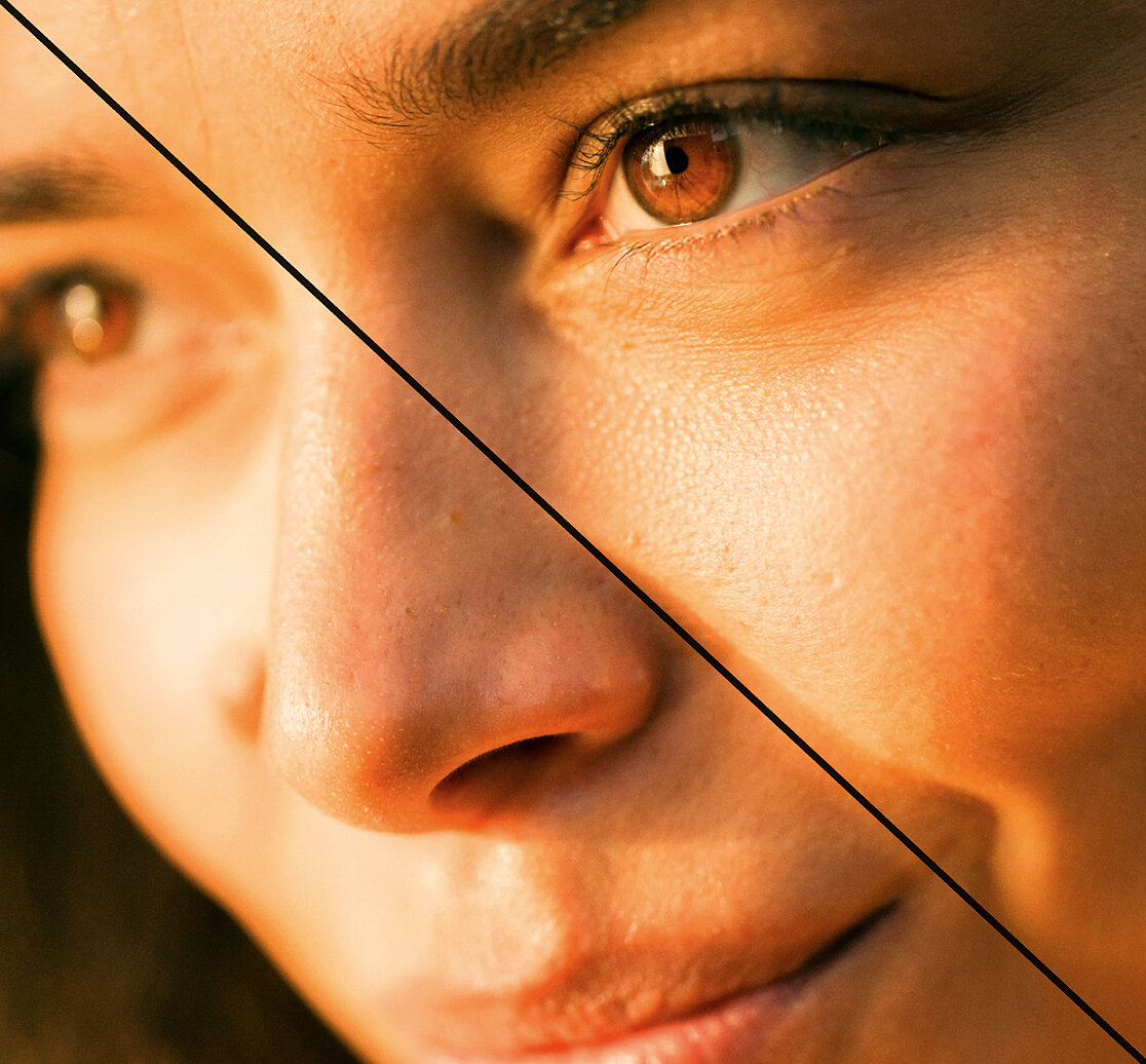
The image should not have too strong a yellow cast (sepia effect), as this looks dated.
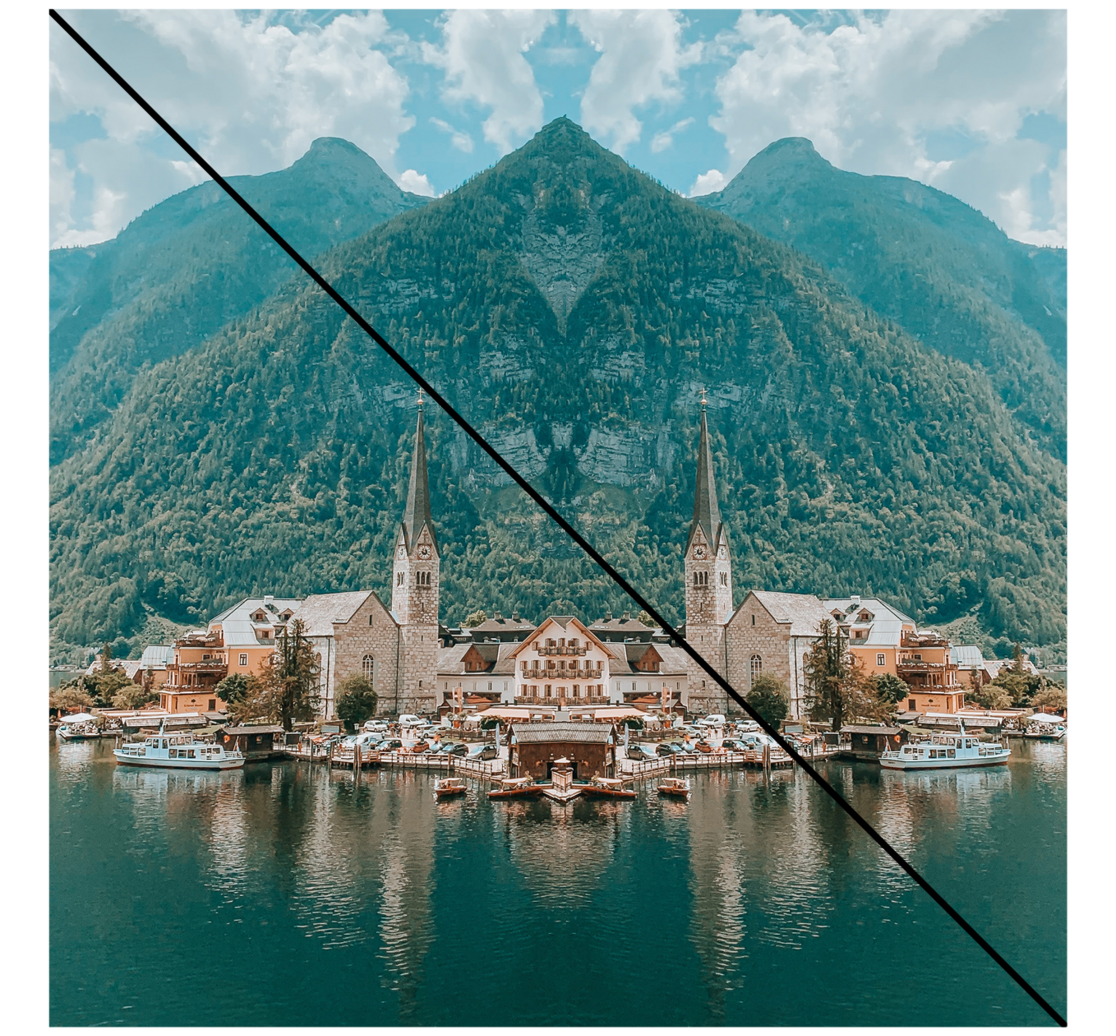
Images must not be mirrored, and photo composites should be avoided.
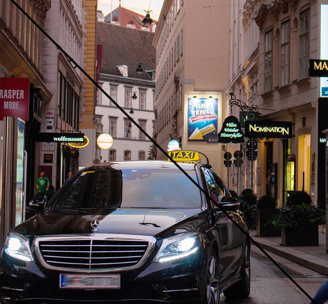
Images with clearly visible brand names should not be used. Images of busy roads should also be avoided.
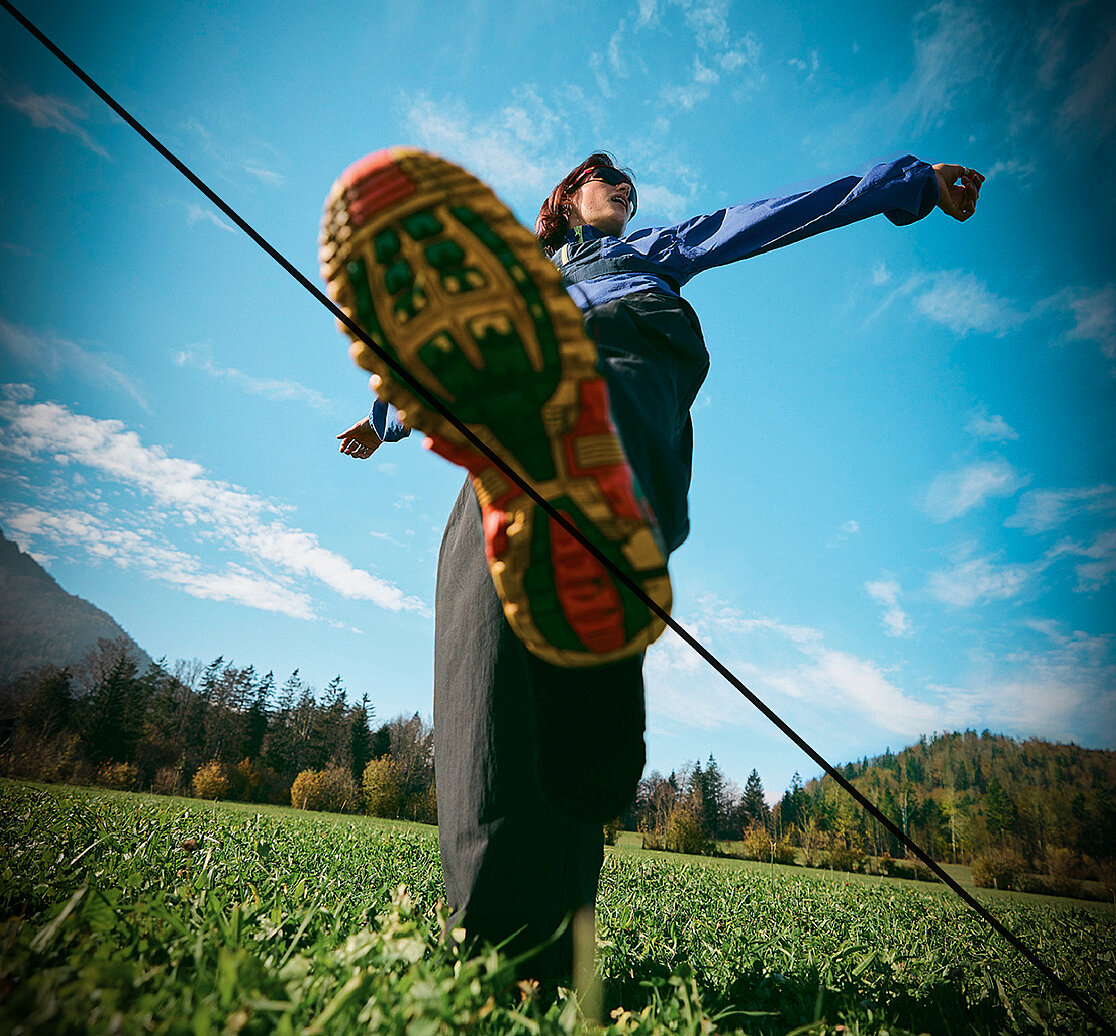
No artificial vignetting
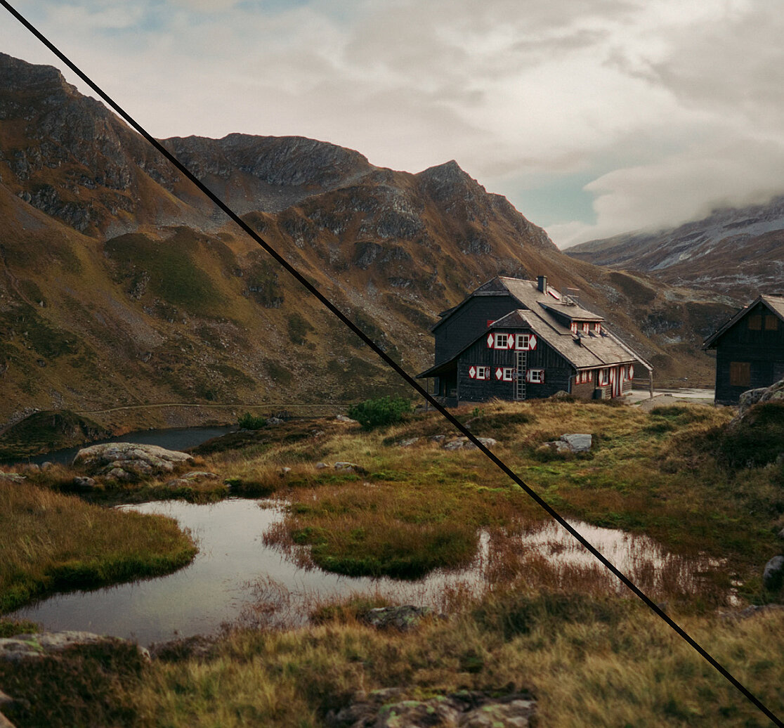
Images should never appear too dark or gloomy. For high-contrast or dark subjects, please brighten them gently and give them a friendlier feel without losing the original mood.
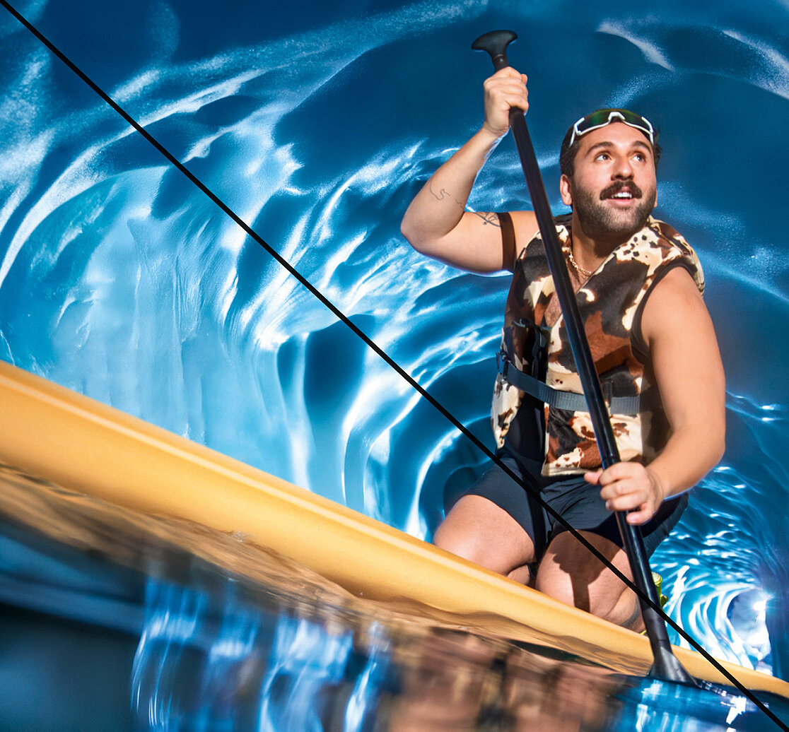
Modern styling underlines the personality of the cast. Over-staged looks or accessories are avoided to put authenticity first.
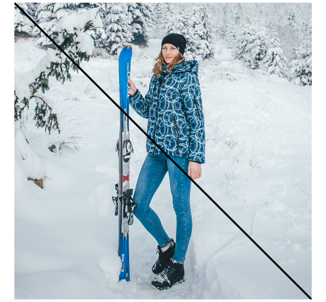
Staged, unnatural poses and emotionless subjects should be avoided.
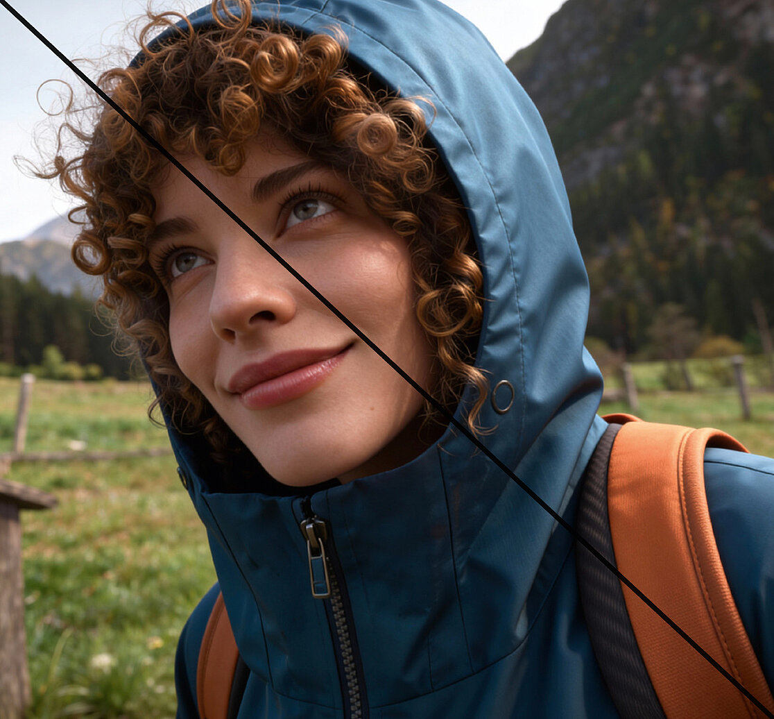
We want to show images that come as close to reality as possible. That is why we deliberately avoid AI-generated images and any aesthetic that looks artificial.