How nice.
Profile picture/Logo
Copy link to this element
Link Copied
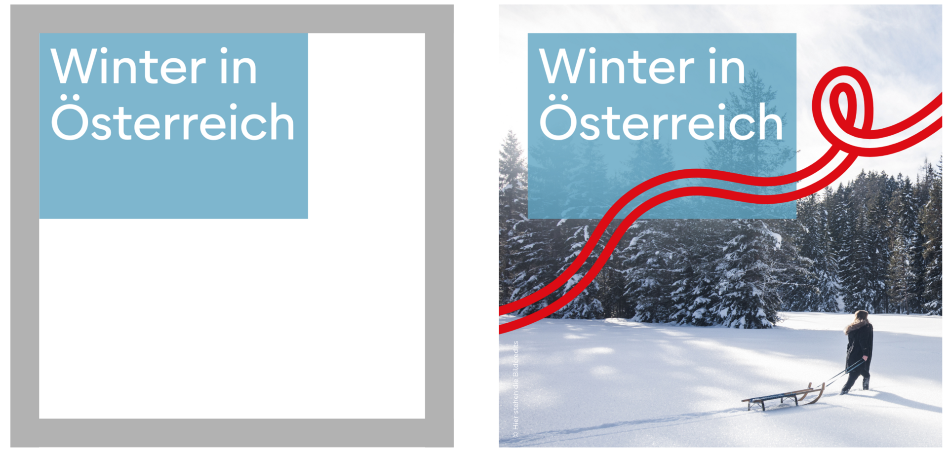
This is one of the few cases in which the flag is isolated from the logo and used independently. The safe space also deviates from the rules – due to the exceptionally small format – and is defined separately for this special case.

Safe Space = 1/9 Flags
Branded Hashtag
In addition to the branded hashtag #feelaustria, the hashtag #lebensgefühl should also be used. Lebensgefühl should stand as a synonym for Austria and should therefore also be continuously transported and established via social media postings and content in general.
It is possible to use the hashtag with an umlaut on Instagram, Facebook, YouTube and Pinterest: #lebensgefühl
On TikTok it is currently only possible to use the hashtag like this: #lebensgefuehl


Cornerbug
Copy link to this element
Link Copied
- No cornerbug is required for pure 16:9 YouTube content videos.
- For 9:16 social media video formats, there will also be no cornerbug because it is either cropped or disturbed by the interface. For these cases we recommend the vibe animation.
- In the social media area there is always a cornerbug anyway: namely the profile picture Thus, the profile picture is the cornerbug for played ads.
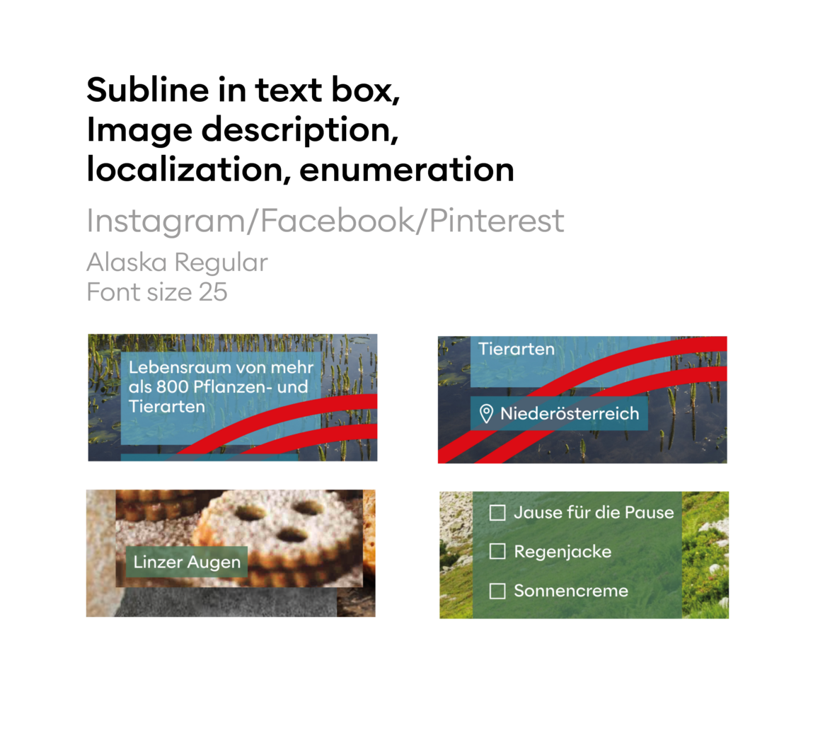
Textinserts
Copy link to this element
Link Copied
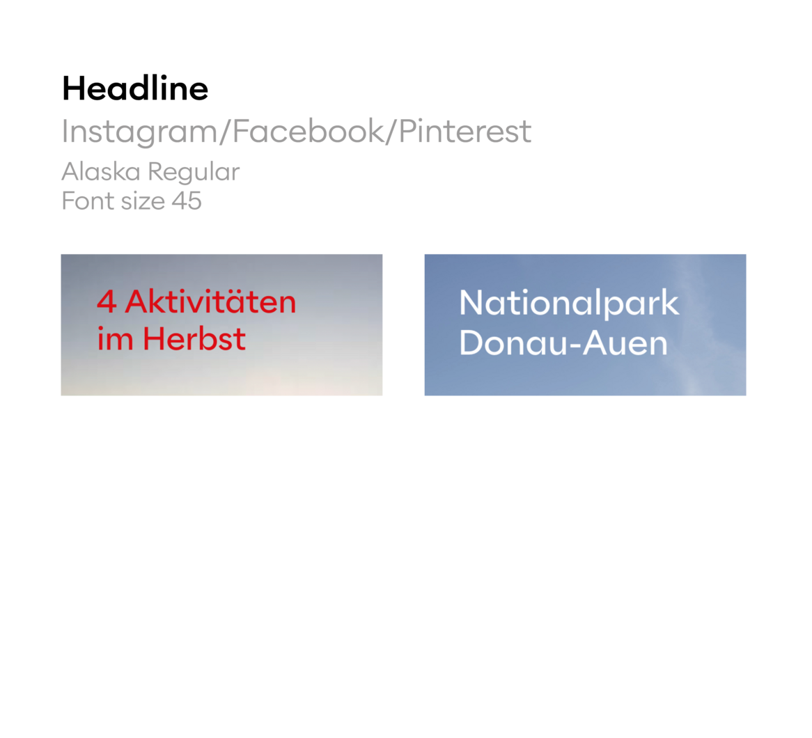
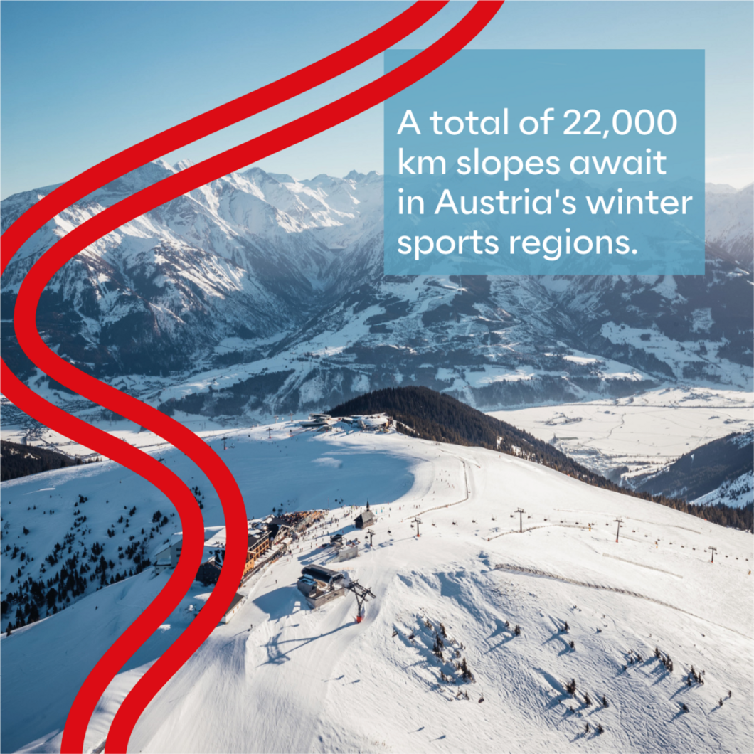
Depending on the background, inserts can be set to white or red. You can be inspired by the various options of the 16:9 version for placement. The text size is freely selectable and should be adapted to the respective advertising medium and be easy to read.
The grid columns do not have to be taken into account in social media videos. The safe space must of course still be
taken into account - 250 px to the top and bottom of the image.
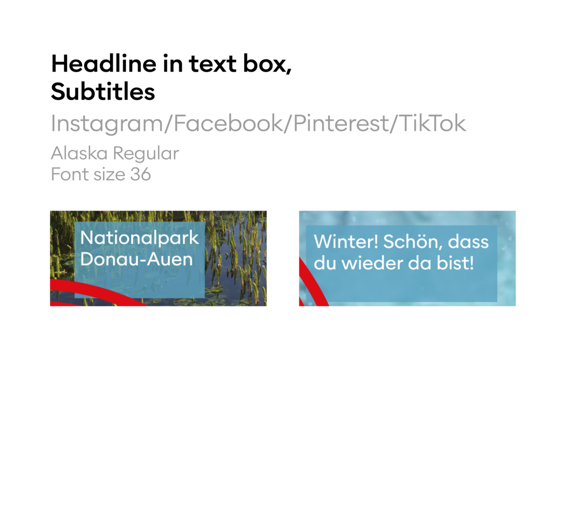
Subtitles
Copy link to this element
Link Copied
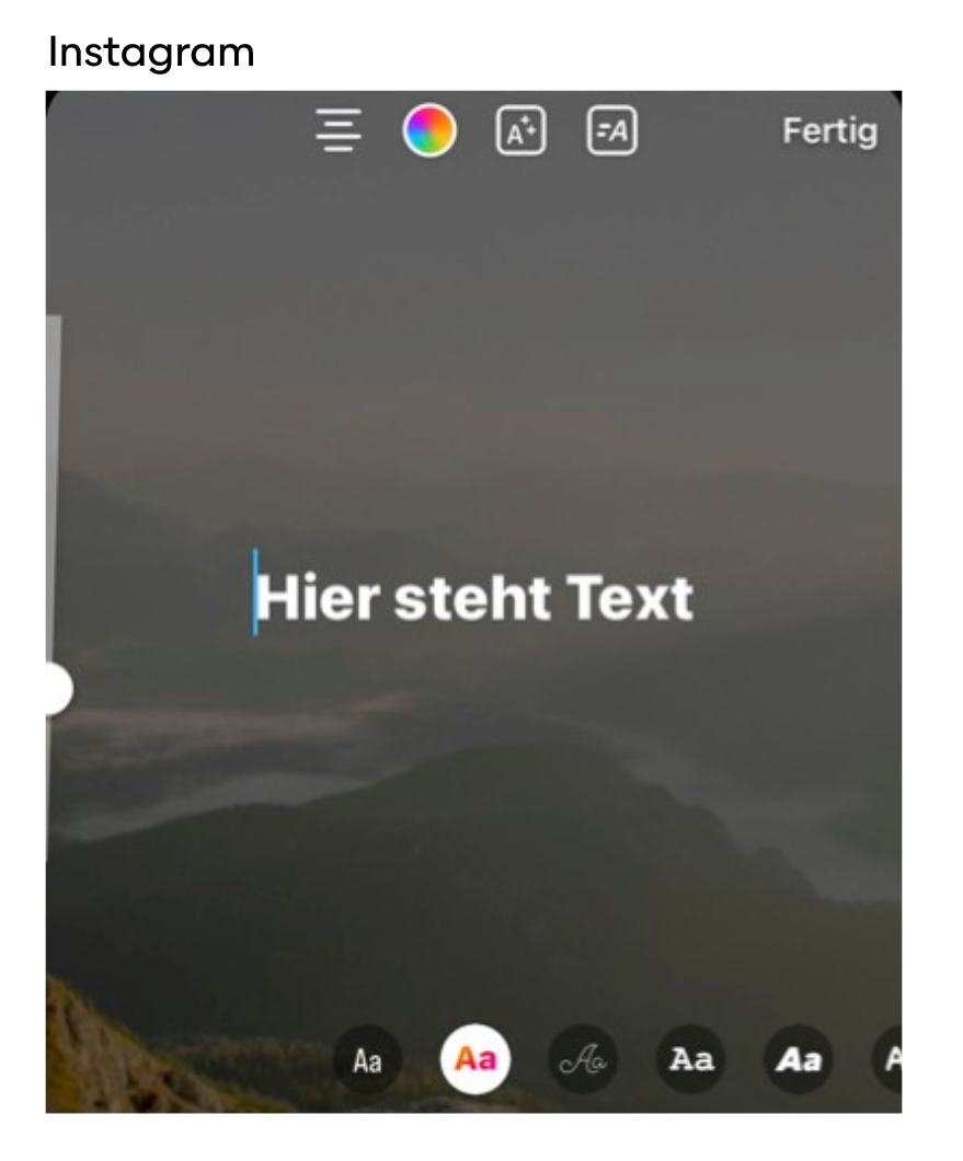
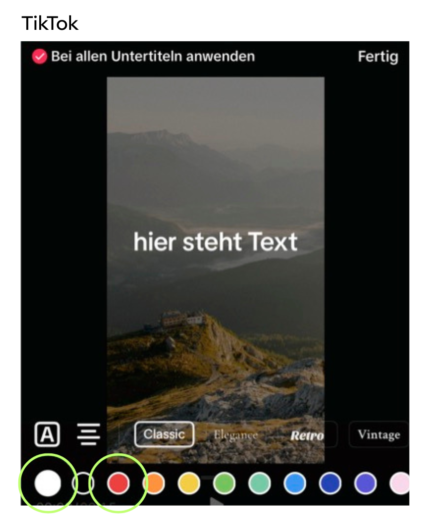
Subtitles can be added via Canva or Adobe programs, as well as directly in the respective app, e.g. YouTube, Instagram or TikTok. Instagram or Tiktok have different layouts available for their subtitles. We always use the same settings to ensure consistency.
Automatic subtitles - whether YouTube or Tiktok - can always be edited manually. Please always check so that no errors creep in. YouTube offers several ways to add subtitles: write them yourself, SRT file, transcribe, or automatically.
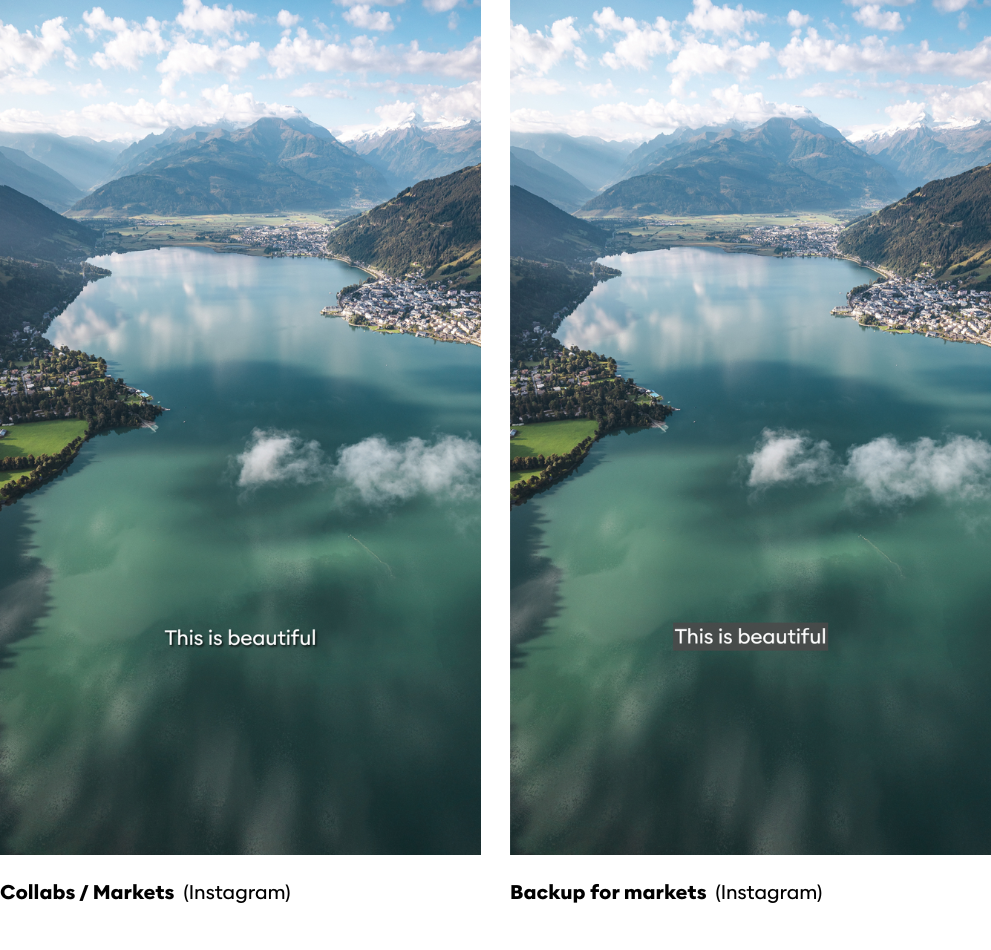
The subtitles are displayed in white with a shadow, the intensity of which can vary to ensure optimal readability. The font size used is 33 pt or 44 px. As a backup for the markets, the old version with a gray color box can also be used. In this case, the gray background (shade 5) is semi-transparent.
Subtitles in the apps
For digital formats, such as header images or banners, layouts may also be used without white space. The layout structure remains the same.
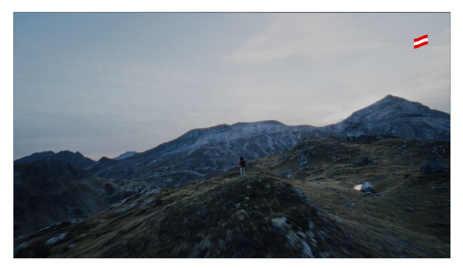
Image credits can be placed in all 4 corners - preferably not in the corner where the headline is placed.
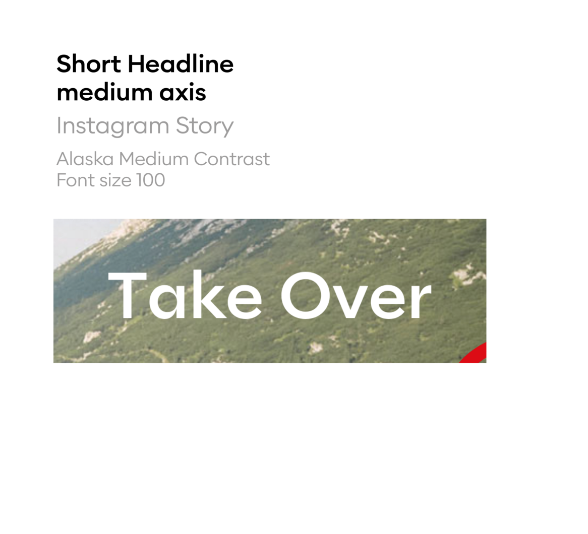
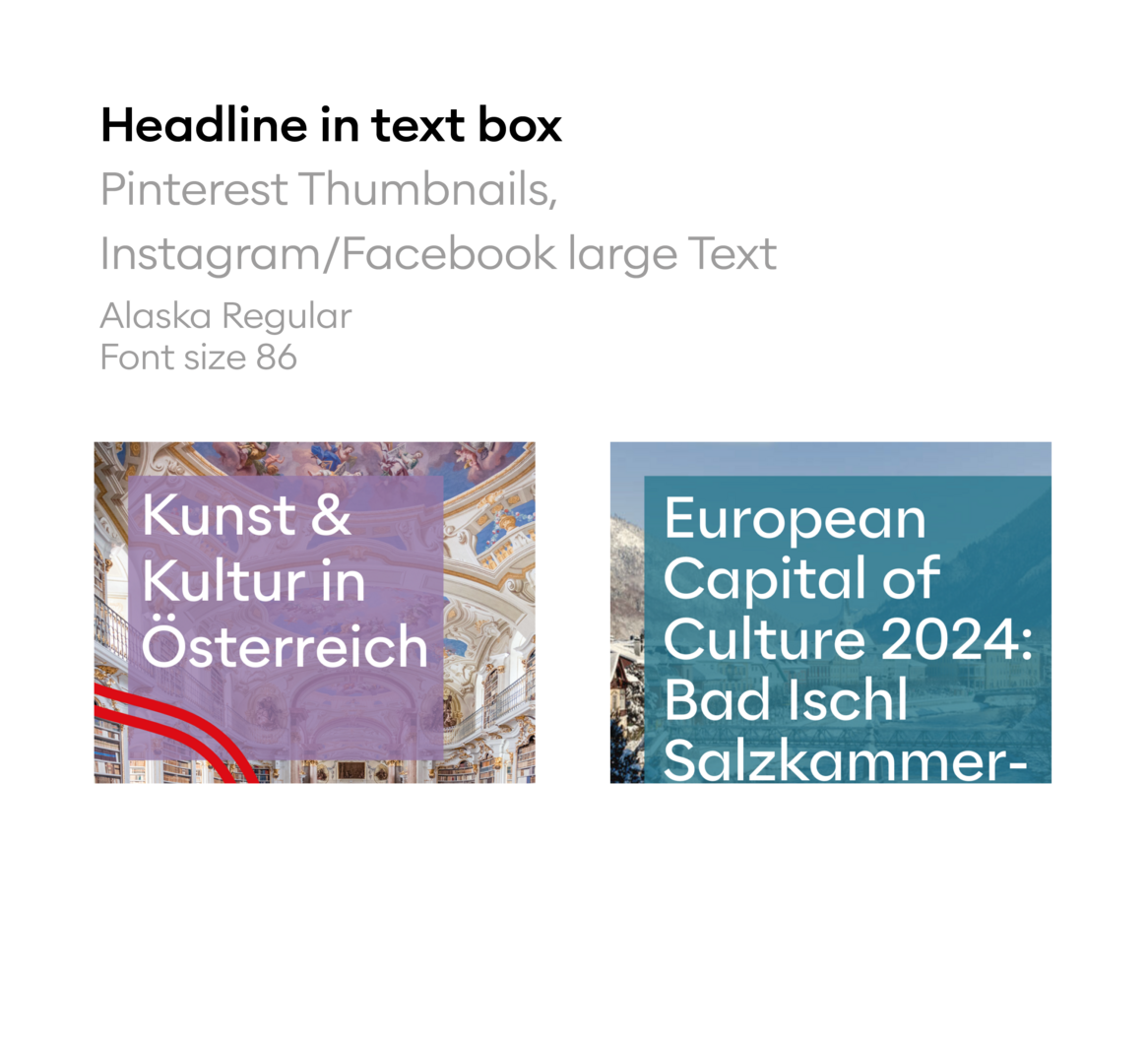
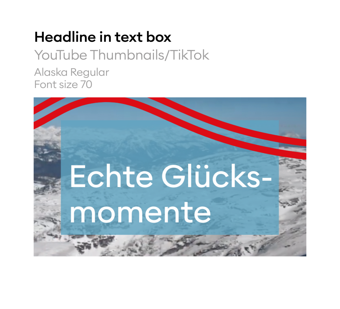
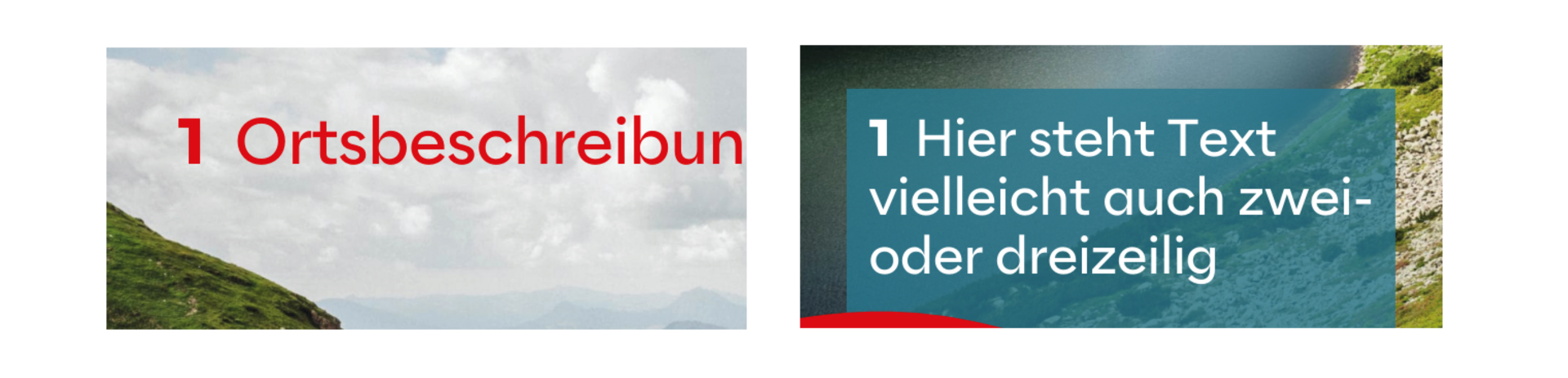
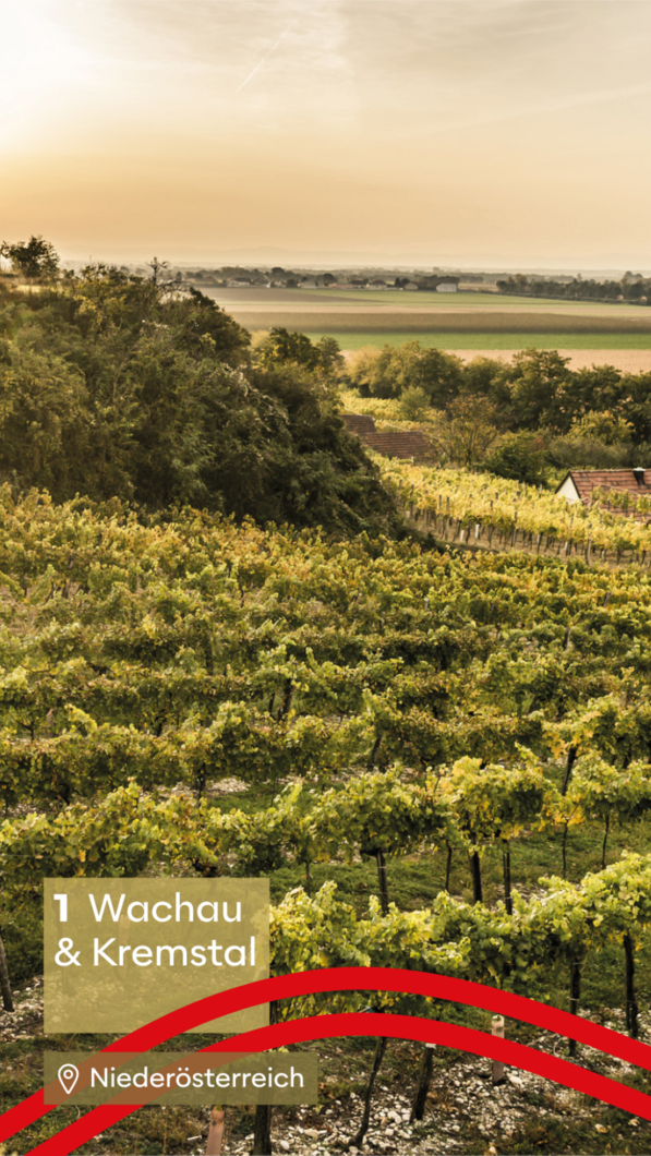
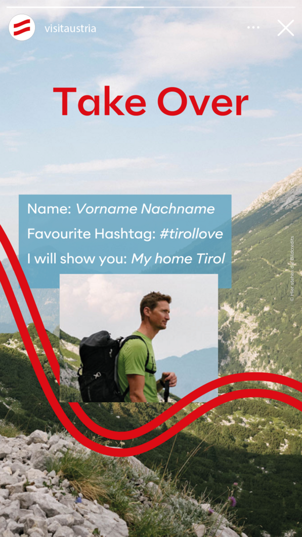
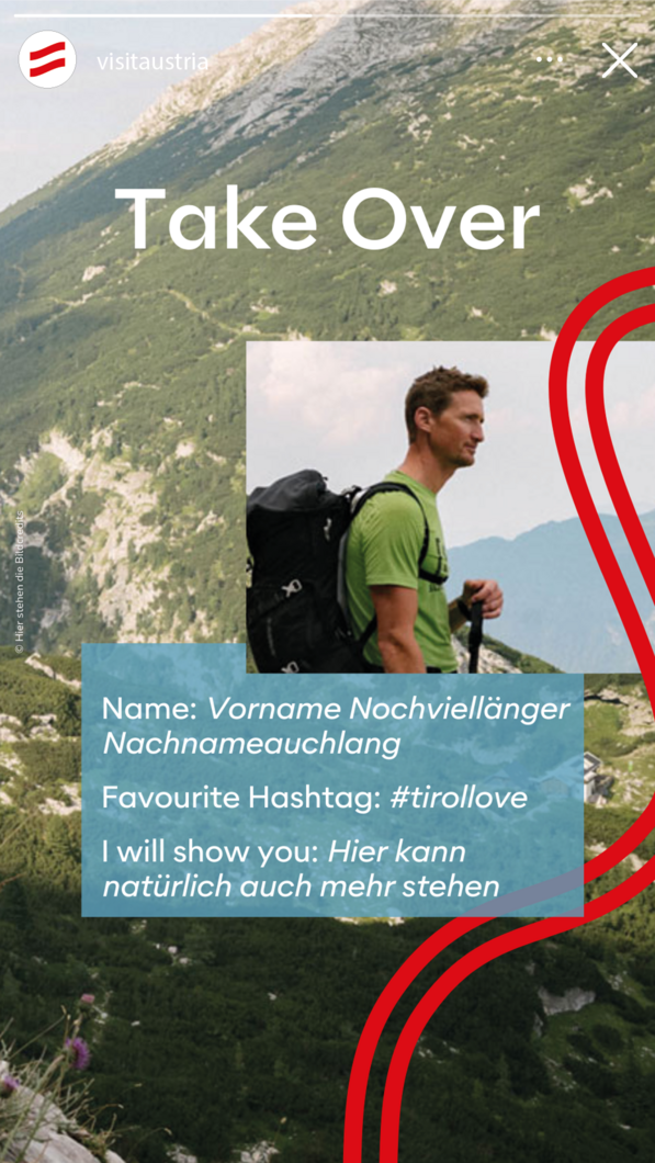
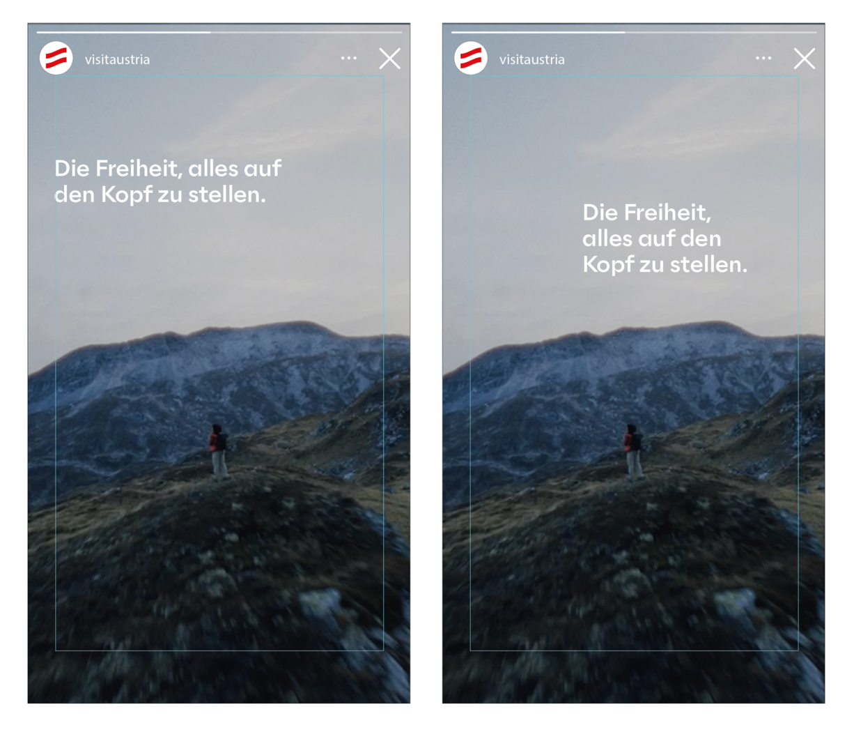
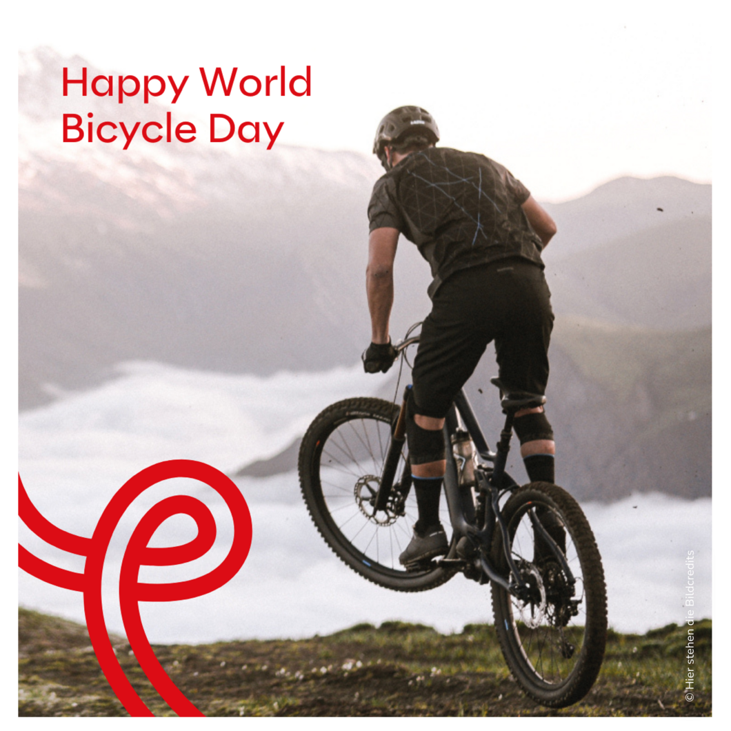
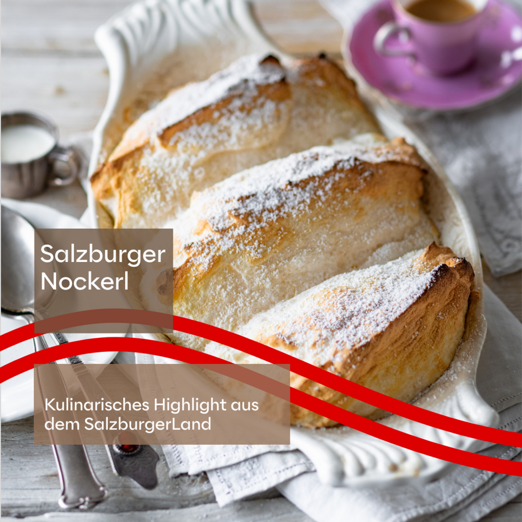
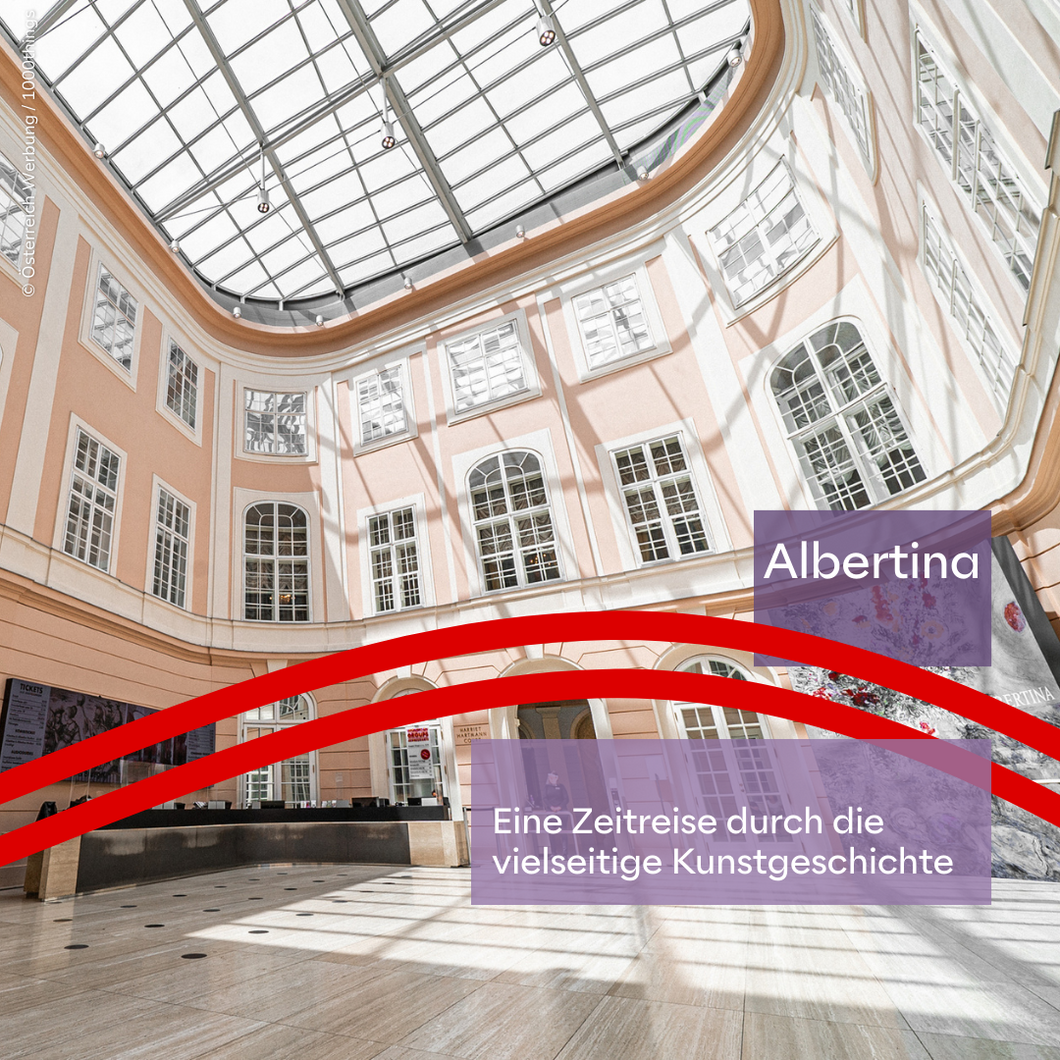
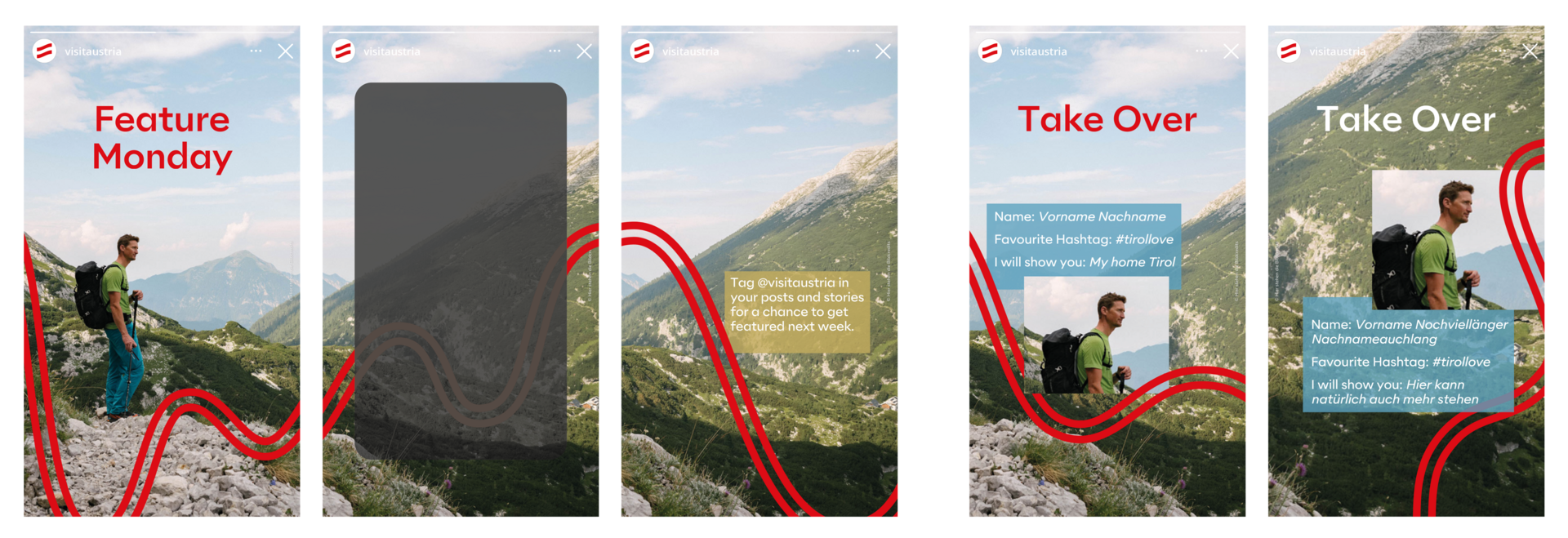
Text boxes can be positioned flexibly anywhere along the safe spaces. It can be decided individually whether they appear in combination with the vibe. Either the first or last line is empty. There is space there so that the box can overlap with the vibe. The width of the box depends on the The width of the box depends on the length of the text or the pagination options.
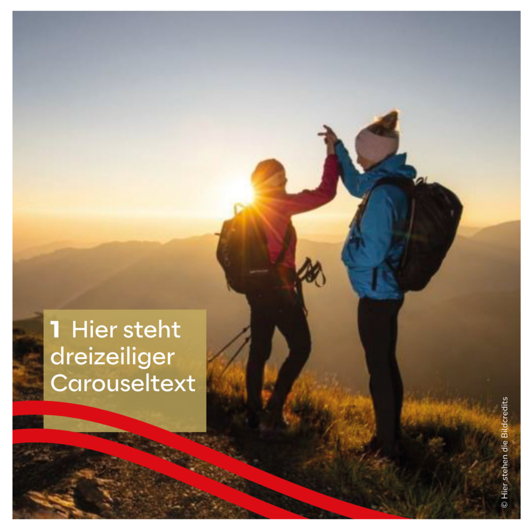
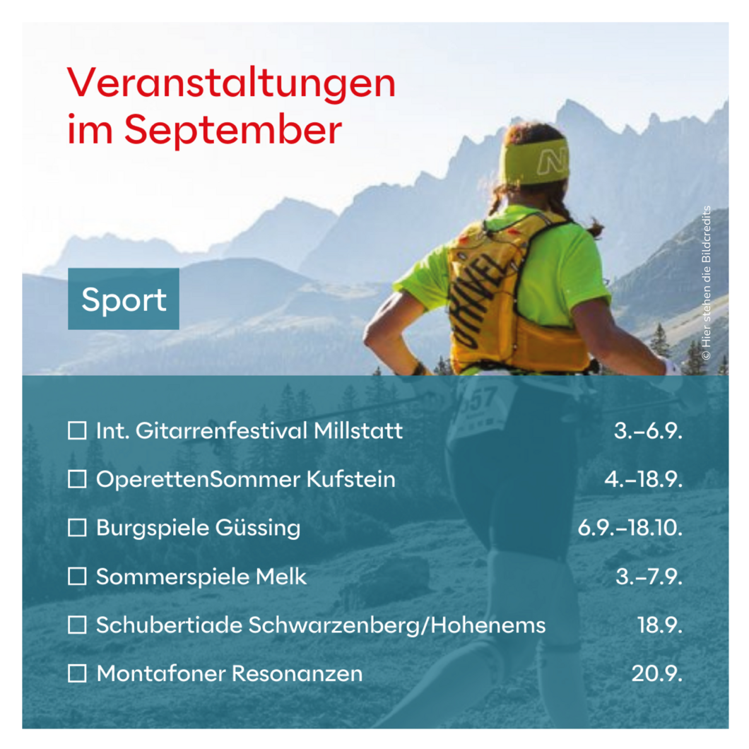
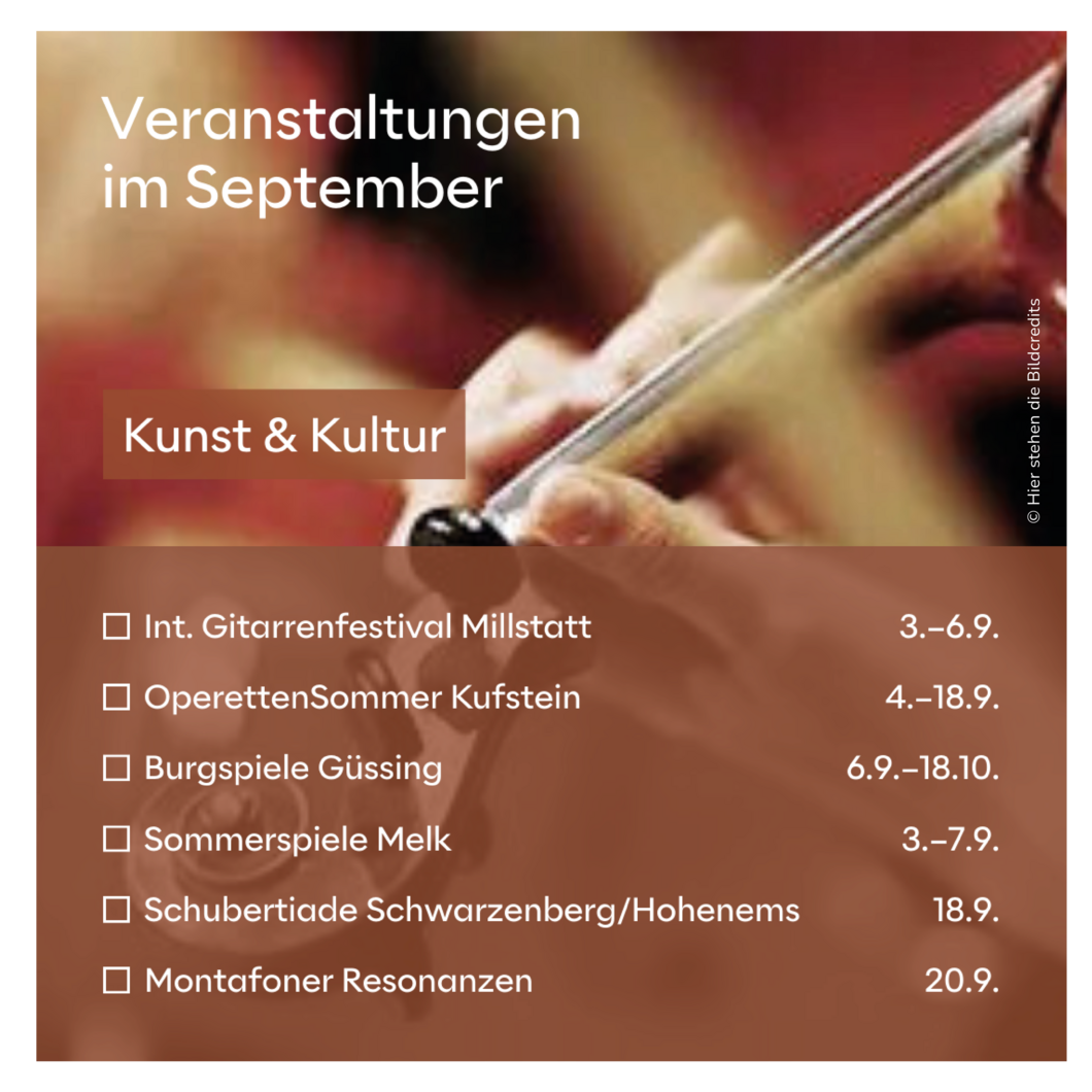
- If the carousel text is very short (e.g. place names) and the upper part of the image is quiet enough for all images, the subsequent images can also be set without a text box.
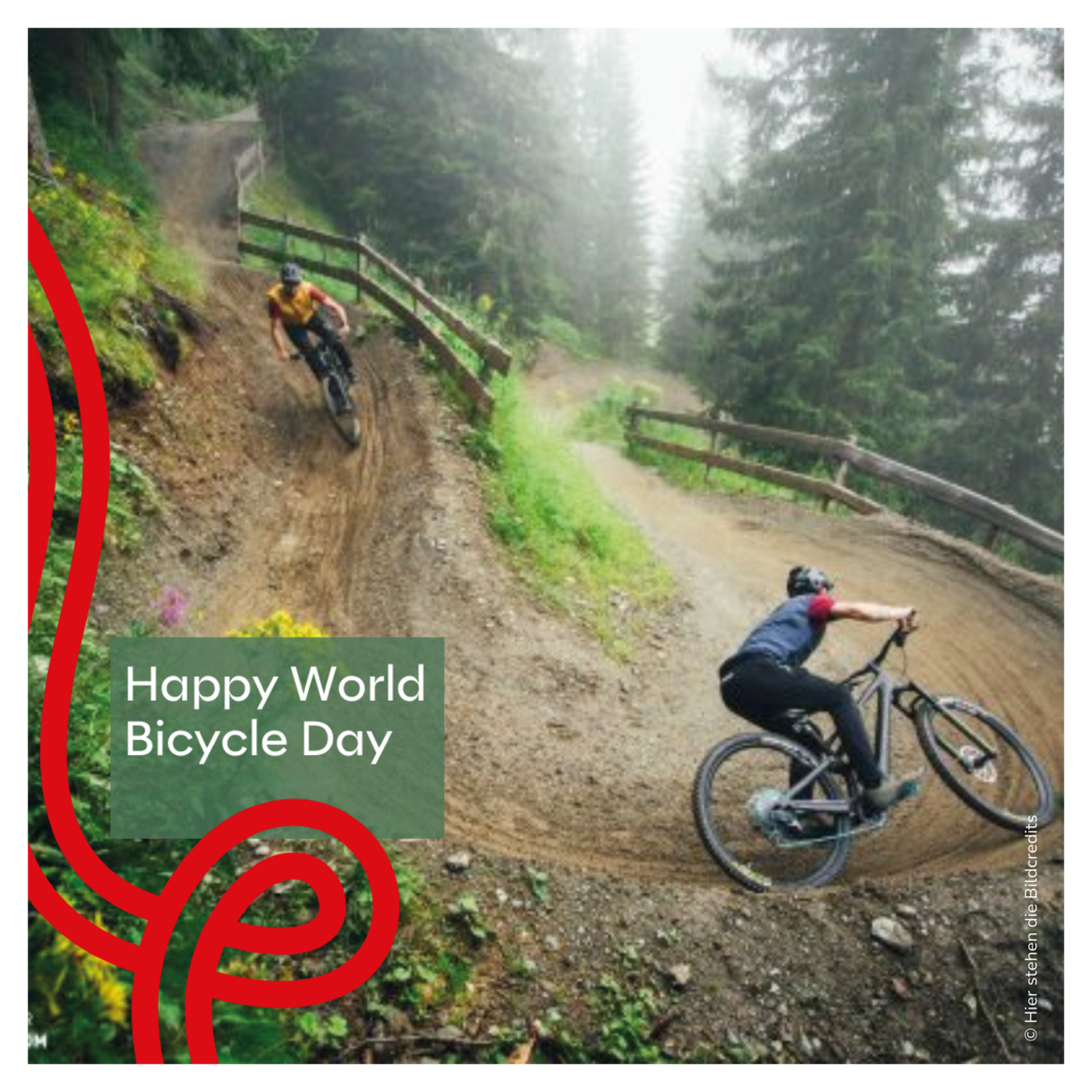
- Here you can see two different implementation types for the same posting. Both are possible and can be selected depending on the image selection.
Multipost
Copy link to this element
Link Copied
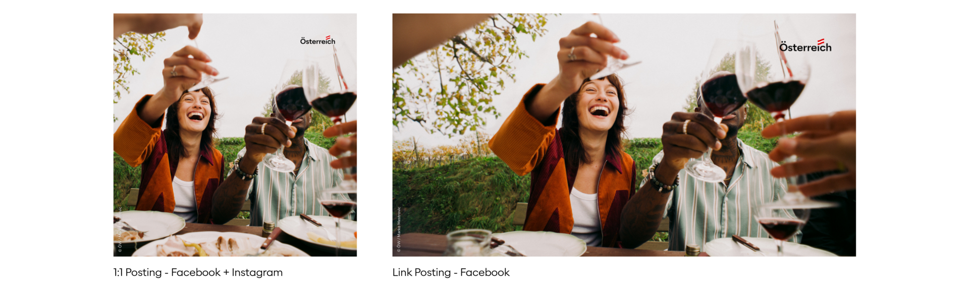
We loosen up the feed on Instagram by occasionally having posts where a color area (text) dominates. In this case, the text box is always as large as shown here.
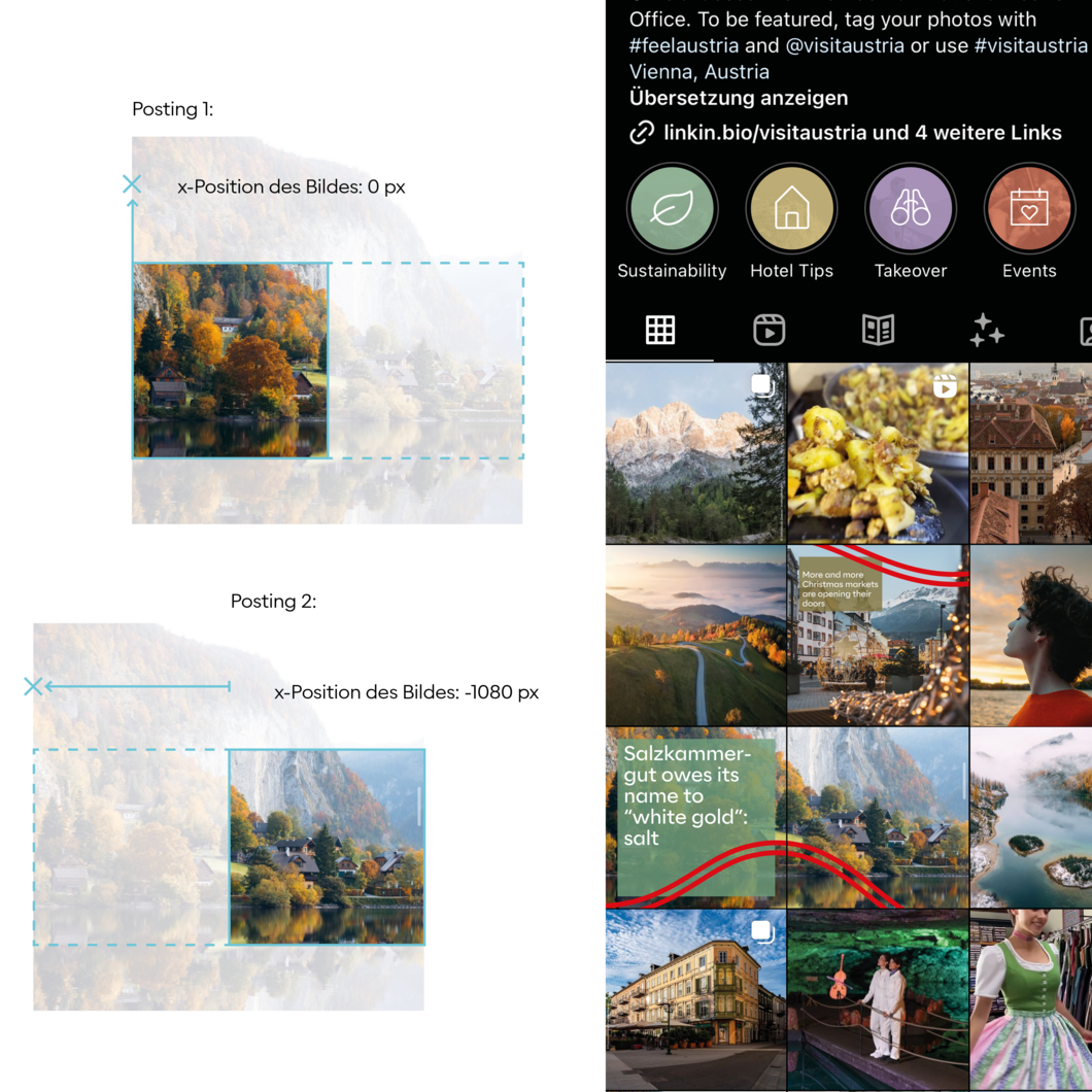
It is possible to split the image in order to make a section of it visible in a second, related post. The vibe continues.
If the image does not allow this, you can also take two different matching images on the same topic, and only the vibe subtly marks the connection.
We loosen up the feed on Instagram by occasionally having posts where a color area (text) dominates. In this case, the text box is always as large as shown here.
It is possible to split the image in order to make a section of it visible in a second, related post. The vibe continues.
If the image does not allow this, you can also take two different matching images on the same topic, and only the vibe subtly marks the connection.
Text
The font is red or white, depending on the image and legibility
The Lift-Effect can be used as required
Sublines and continuous text are always left-aligned
The headline can be leftaligned or center-aligned
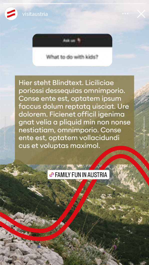
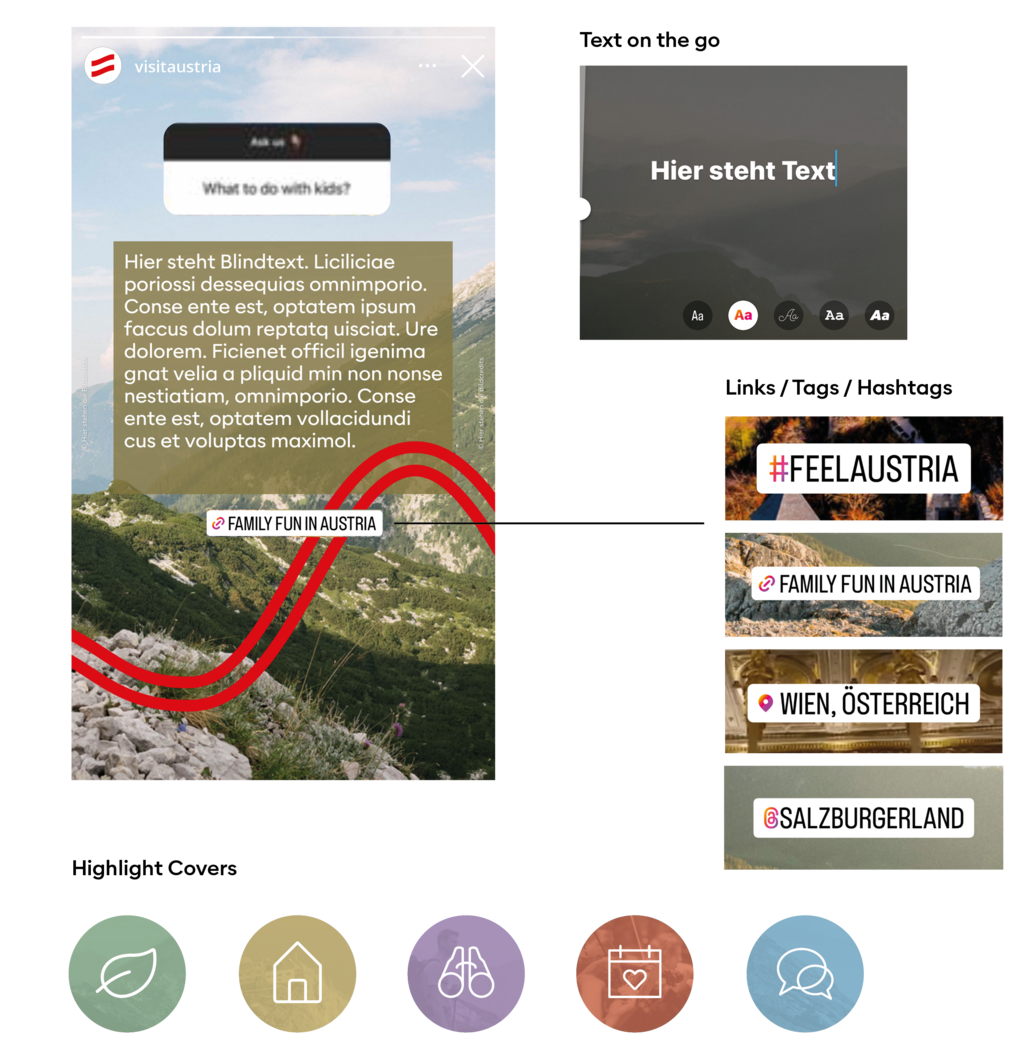
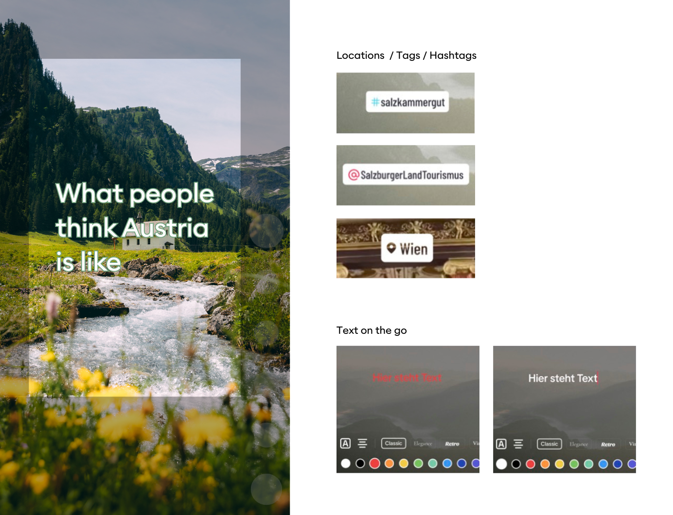
Links / Tags / Hashtags
Design from Instagram in black and pink display
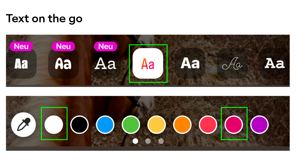
Text on the go
If you need to design spontaneously on the go in the Instagram app, please only use this font. Colors: red or white
Highlight Covers
80 % transparency of the secondary colors Behind it is an image in black and white
Instagram Reels
Copy link to this element
Link Copied
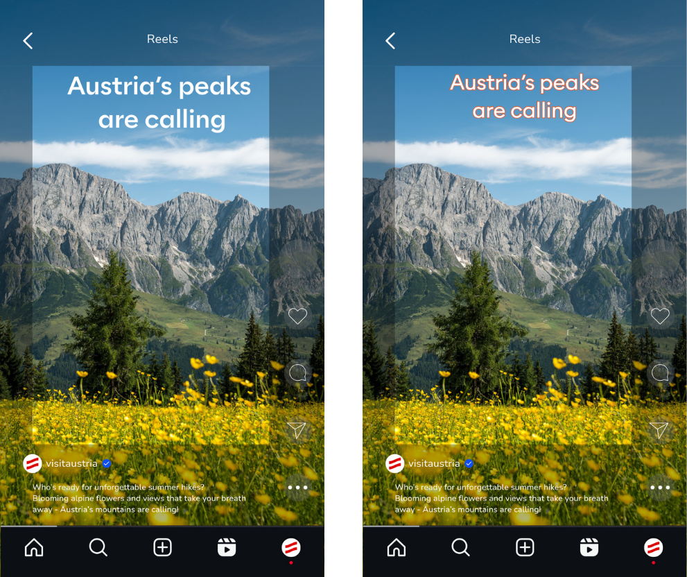
It is better to wrap more often, The font can vary freely in size and position (within the safe space). In videos, no color boxes are used. Instead, the text is displayed in white or red – alternatively in white with an outline in the respective social media colors.
It is better to wrap more often, The font can vary freely in size and position (within the safe space). In videos, no color boxes are used. Instead, the text is displayed in white or red – alternatively in white with an outline in the respective social media colors.
- No transparent color backgrounds are used on TikTok.
- The Alaska font can be used directly in images on TikTok, not only in white and red but also with colored outlines in our secondary colors.
- The font size for headlines and subheadlines is flexible and can be adjusted depending on the situation, up to a maximum size of 70.
-
If the design is created directly in the TikTok app, only the “Classic” font should be used. Preferred colors: red or white, without any background. Remember to consider safe spaces here as well.