Demonstrate character.
Logo
The logo is the linking element that represents the brand at every point of contact: modern, self-confident and with a touch of sophistication, it conveys directly what the brand stands for. The word mark "Austria" is creatively modified by directly integrating the flag. The Austrian flag is hoisted in every language adaptation, which ensures a visually unique selling point.
The logo is the linking element that represents the brand at every point of contact: modern, self-confident and with a touch of sophistication, it conveys directly what the brand stands for. The word mark "Austria" is creatively modified by directly integrating the flag. The Austrian flag is hoisted in every language adaptation, which ensures a visually unique selling point.
The Austria logo with the red flag must always be used. If circumstances do not allow it, for example due to printing specifications, the alternative logo in grey scale should be used. The black and white alternative logo is used only when printing in one colour. Logo mutations are to be avoided in any case to ensure originality and stringency in the design.

Flag
Copy link to this element
Link Copied
In its representative role, the flag combines essential values: the straightforward design symbolises clarity, while the suggested motion conveys liveliness. It should be disconnected from the word mark and used separately only if circumstances require it, e.g. as a profile picture on social media.

The logo must not be rotated.
The flag may not be displayed in colours other than red, black/grey and white.
The correlation between flag and typography must not be changed.
The flag must not be distorted.
The flag must not be mirrored.
The typography must not be modified.
In order to guarantee readability, be careful not to place the logo on unquiet details.
The logo must not be placed in the document without safe space. The logo safe-space of 1.5 flags must neither be exceeded nor less.
Generally, the logo must not be placed in the upper left or in any of the lower corners, unless there are valid reasons like i.g. disturbing factors (handles of carrier bags, punch holes etc.)
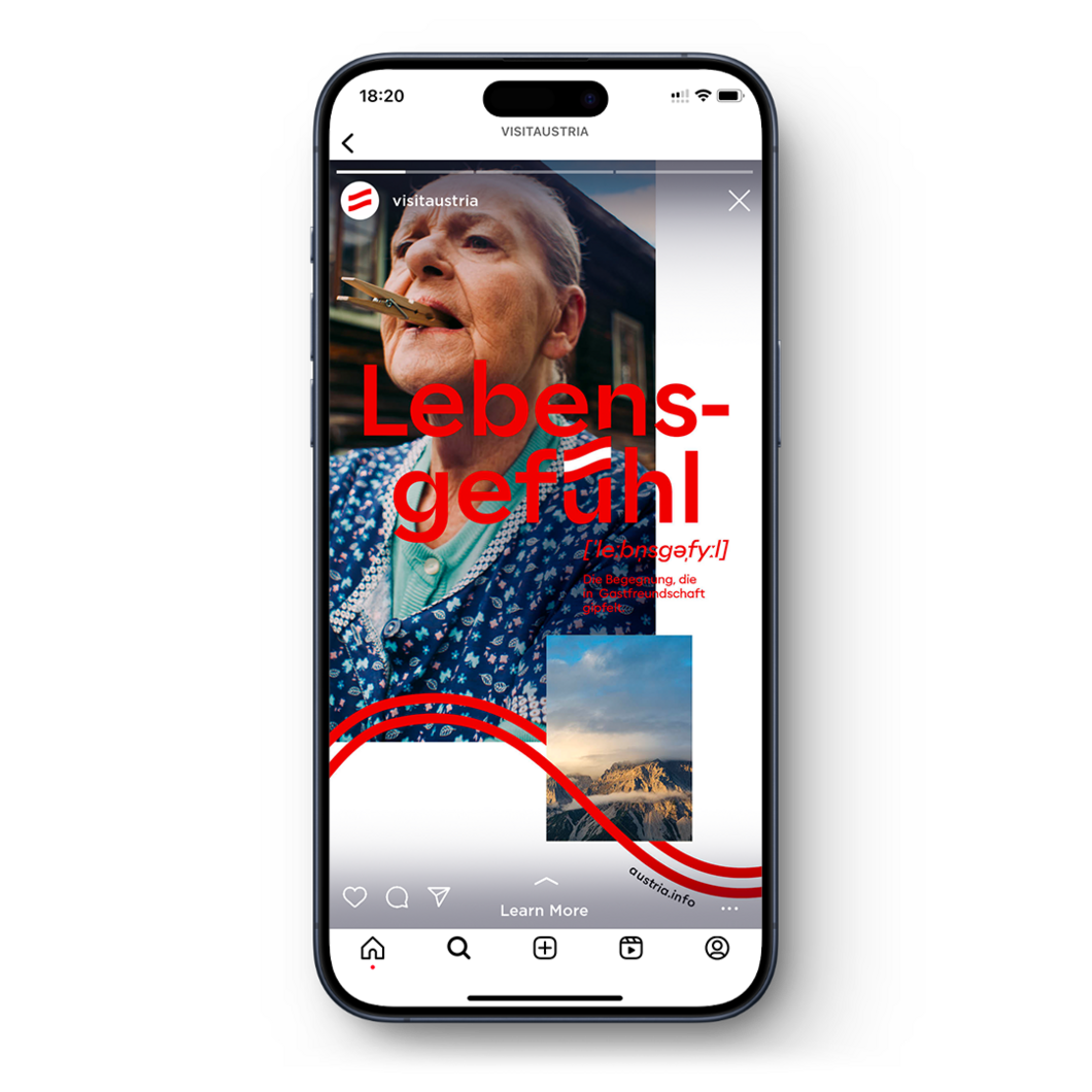
Lebensgefühl Austria
Copy link to this element
Link Copied
For certain applications, such as partner integration, a logo variation with Lebensgefühl as headline can be used.
The application areas are explained in more detail in the "Partner integration" chapter.
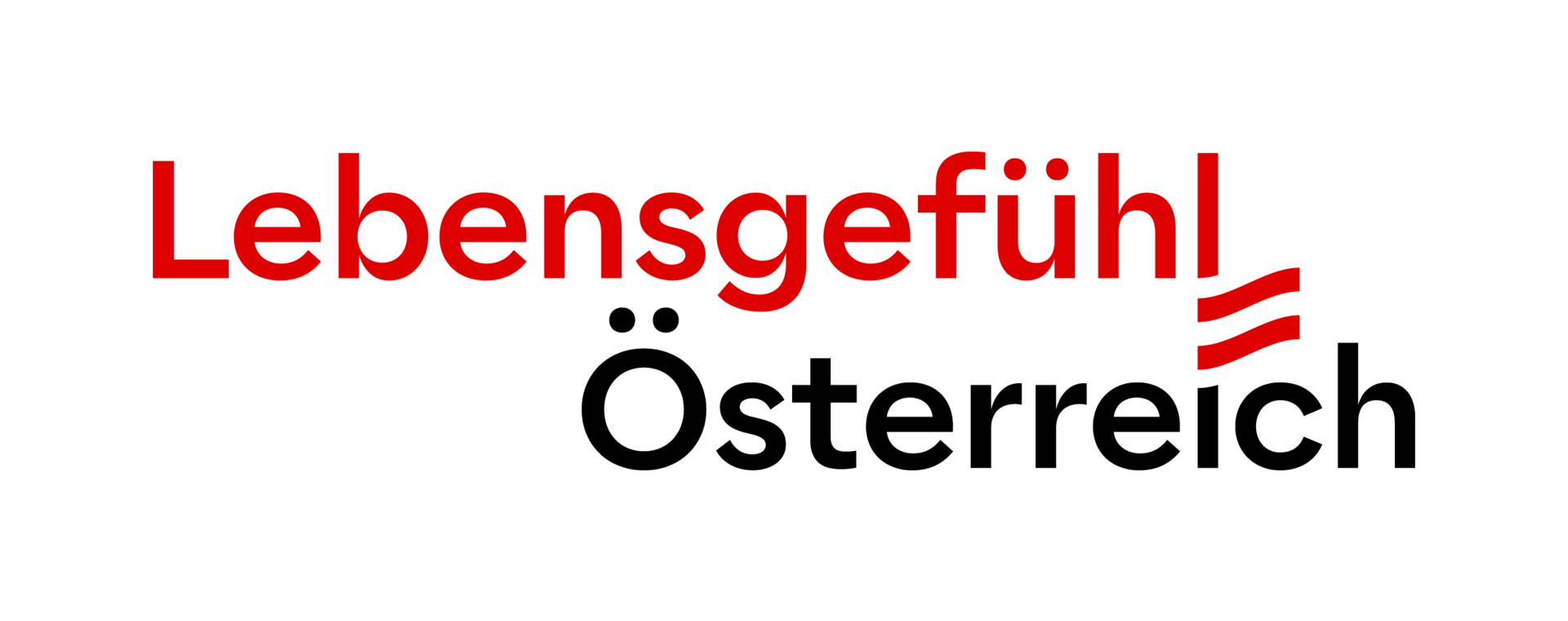
The Lebensgefühl logo with the red flag should always be prioritised. If circumstances do not allow it, for example due to printing specifications, the alternative logo in grey scale should be used. The black and white logo alternative is only used for single-colour printing. We generally recommend favouring the variation with the red „Lebensgefühl“ lettering. If legibility is limited (e.g. on natural cardboard or an image in the background), the white version is also possible.
Logo overview and application areas
Copy link to this element
Link Copied
Logo B2C Austria, the holiday destination | Logo Lebensgefühl Austria | Logo for partner- integration | Logo b2B Corporate brand Austria | Logo mit URL special case: business cooperations |
|
|
|
|
|