Aesthetics with a system.
Basic principle
Copy link to this element
Link Copied
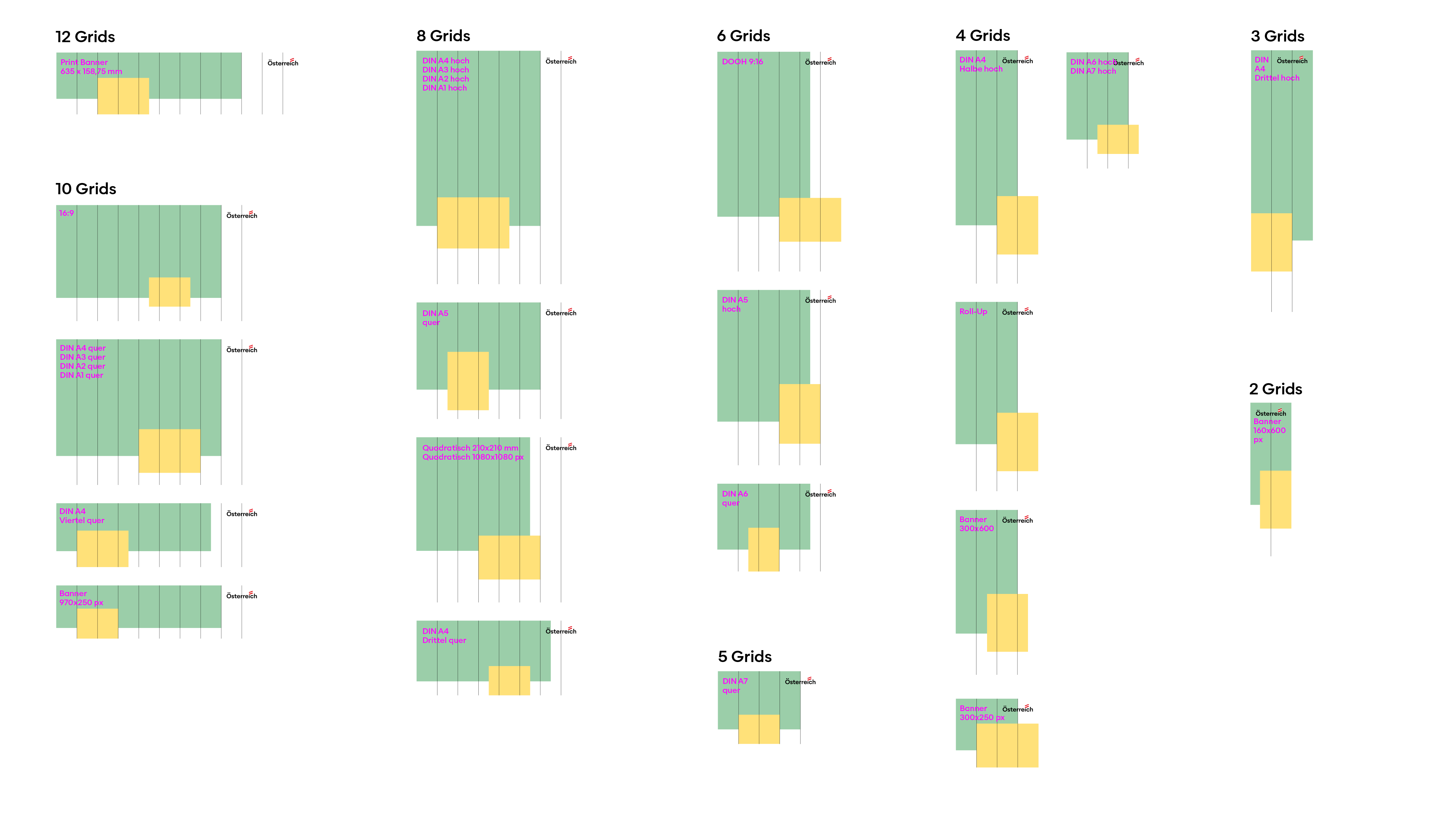
In general, the design of advertising media across all channels is made up of essential standard elements: Visually, an emotional image is paired with an image that localises this specific feeling. In the text, the headline combination reflects the visual impressions. The vibe acts as a connecting element; the logo and URL round off the perfect brand presence.
Lebensgefühl
Copy link to this element
Link Copied
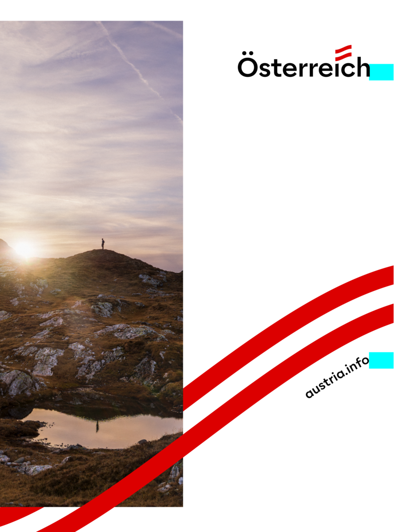
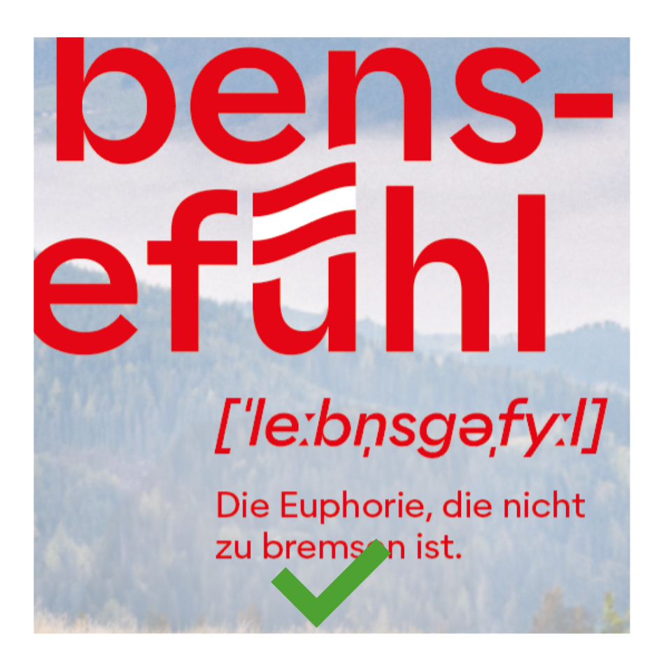
The Lebensgefühl is inextricably connected with Austria - this idea is realised in the design by linking the word "Lebensgefühl" directly to "Austria". In order to associate the "Lebensgefühl" with Austria, the flag is integrated directly into the word.

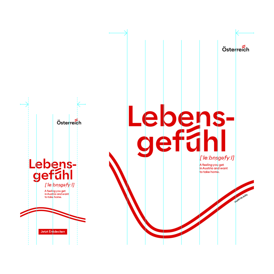
The Lebensgefühl claim is available in two applications. The wrapped version is intended for portrait formats in order to utilise the space optimally.
We generally recommend favouring the version with red lettering. If legibility is otherwise limited (e.g. on natural cardboard), the white version can also be used.


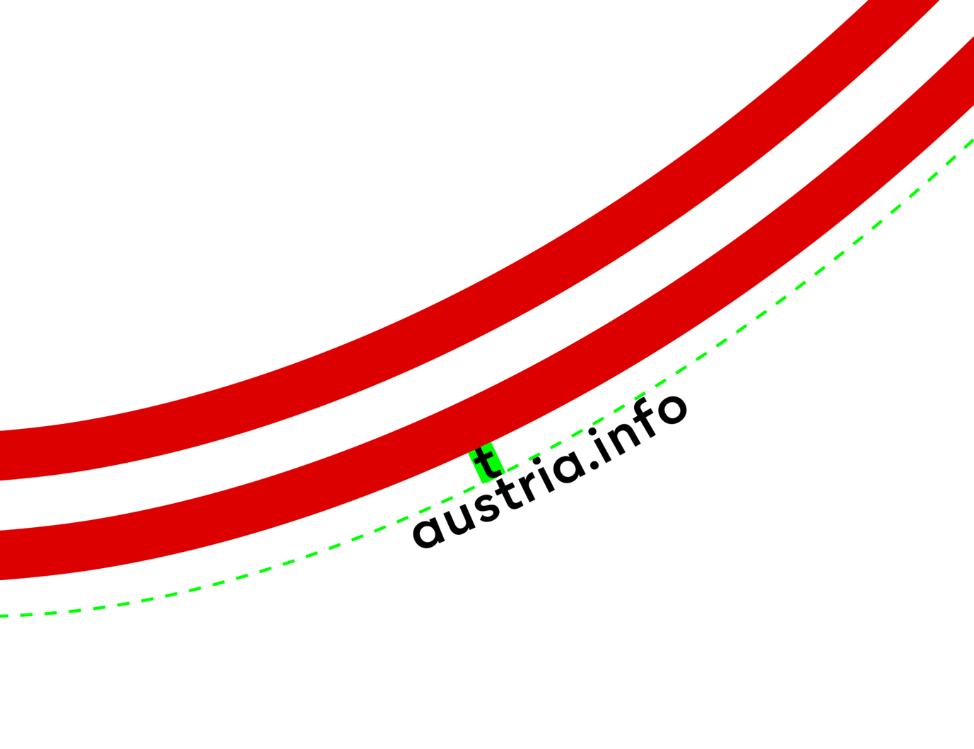
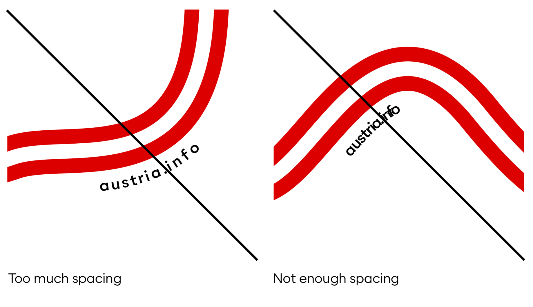
The URL is a path text with a baseline offset downwards.
The distance from the vibe to the URL corresponds to the height of the "t" from the URL lettering.
To ensure that the URL is not displayed too small in print products, we recommend the following font sizes:
- DIN A7: 7 pt
- DIN A6: 8 pt
- DIN A5: 9 pt
- DIN A4: 10 pt
t = Distance


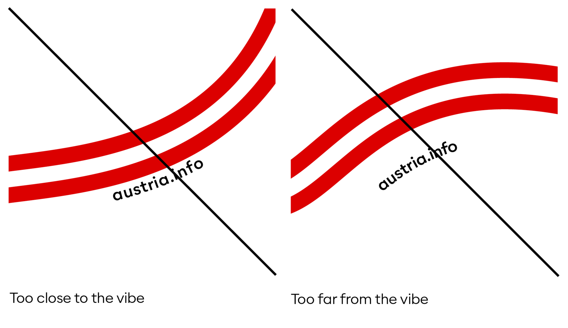
Dont's URL placement
Headline Combination
Copy link to this element
Link Copied
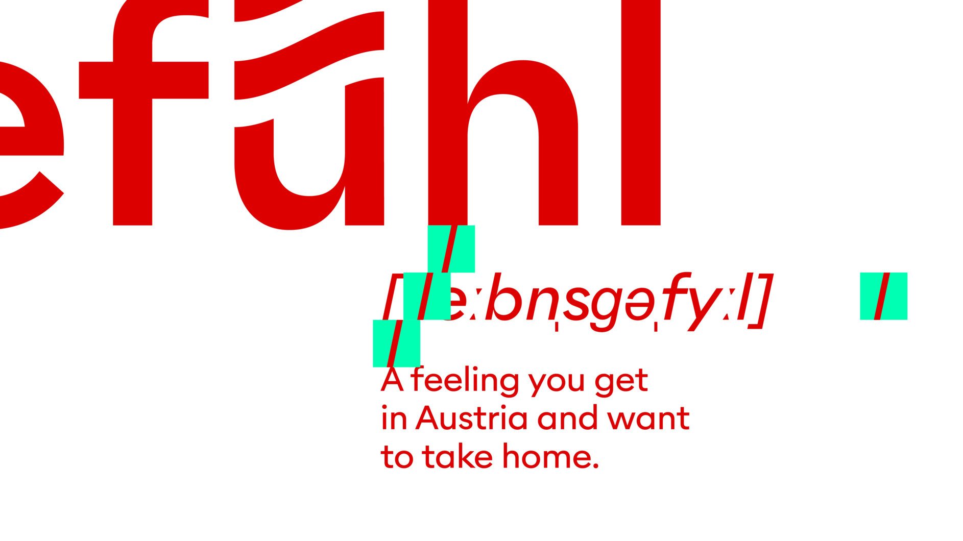
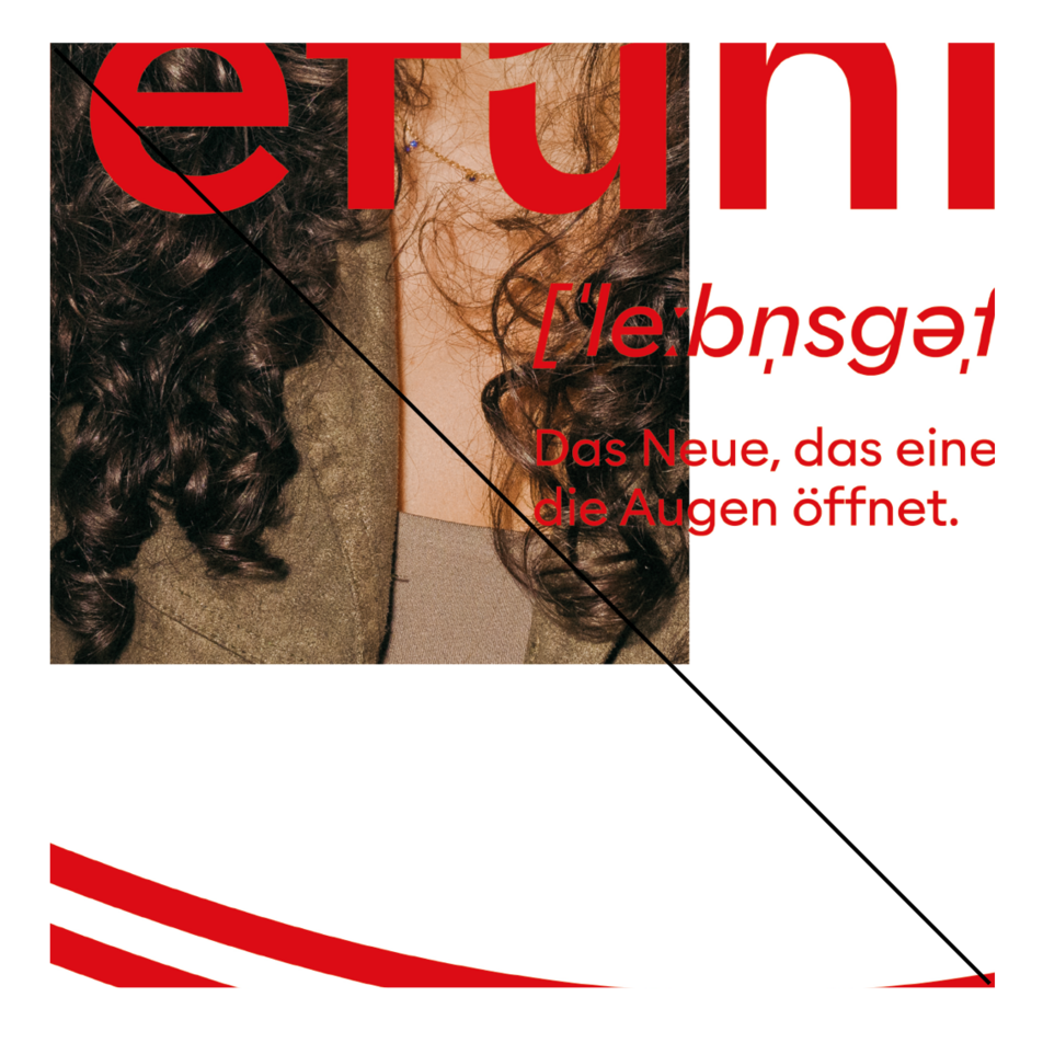
The "conventional" headline is replaced by a headline combination. Consisting of the "Lebensgefühl", its phonetic translation and a subline, this combination is modelled after a dictionary entry in terms of structure and design. There are clear hierarchies between the text elements and related rules in order to remain consistent throughout.
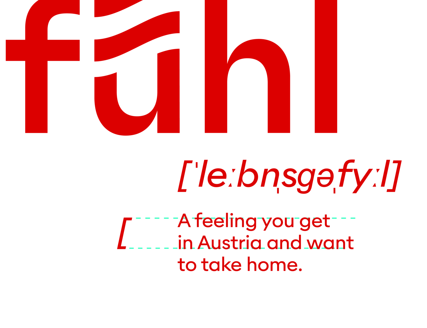
The size of the subline is chosen according to the format size to ensure good legibility. This in turn determines the size of the phonetic transcription.
Please note: The phonetic transcription is not a typeable font, but an extra file converted into paths, which must be linked. The size of the brackets can be defined with two lines of the subline (X-height of the 1st line to the baseline of the 2nd line).
To ensure that the subline is not too small in print products, the following font sizes are recommended for standard format sizes:
- DIN A7: 8 pt
- DIN A6: 9 pt
- DIN A5: 10 pt
- DIN A4: 12 pt
The minuscule of the letter "L" in the phonetic transcription serves as a distance measure between the text elements: On the one hand, it is the distance from the baseline of Lebensgefühl to the height of the capitals of the phonetic transcription and on the other hand from the base line of the phonetic transcription to the subline.
The headline “Lebensgefühl“ is always set in the centre. The phonetic transcription and subline are always flush left and aligned with the columns or half columns of the grid.


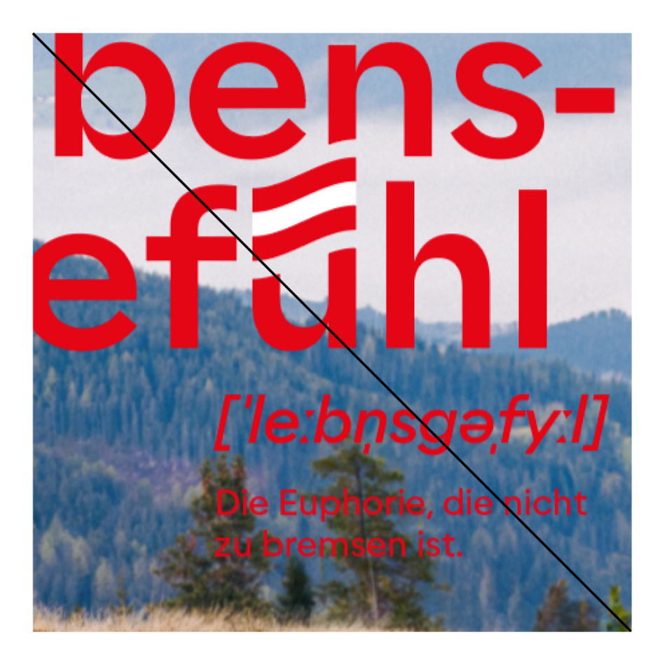
No red backgrounds in the images
For shootings, instruct styling and equipment to minimise red and orange tones in the choice of clothing and accessories.
No medium tones
Red lettering is easy to read on light and dark colours. With green tones, for example, it can be difficult. If this is not possible:
Good image editing
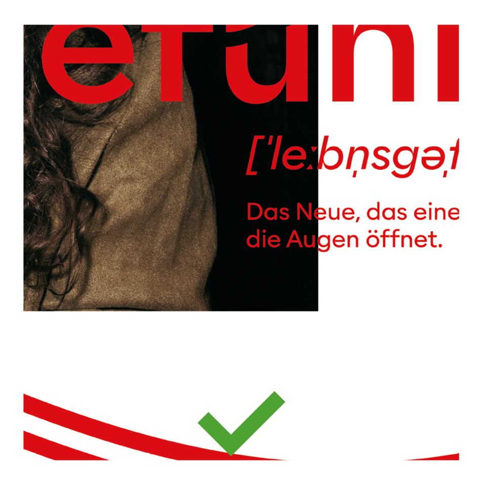
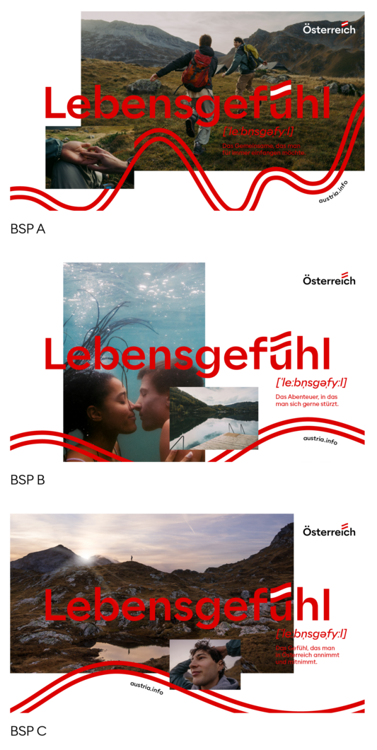
Image editing can definitely ensure readability for large headlines. What does good image editing mean in this case? You darken or lighten the area behind the text. However, it should be large, soft and careful so that the viewer does not have the feeling that the font has a cast shadow or an outward appearance. (BSP A) This must be done individually for each picture with sensitivity.
Sometimes it is enough to recolour or darken/ lighten individual parts, such as an item of clothing.
Change the position of the large image.
It makes a big difference to readability if the large image is sloping downwards instad of upwards or has a vertical instead of a horizontal format. Always try out which is the best layout option. (BSP B)
Place as little small text as possible on the image.
If image processing reaches its limits with small texts, the flexible layout gives you the option of placing the small texts on a white background next to the image. (BSP B)
Position the small font in a legible/quiet place.
An image has quiet and unquiet areas. For example, you can try to place the small image and the vibe over an unquiet area and reserve the quiet areas for text. (BSP C)


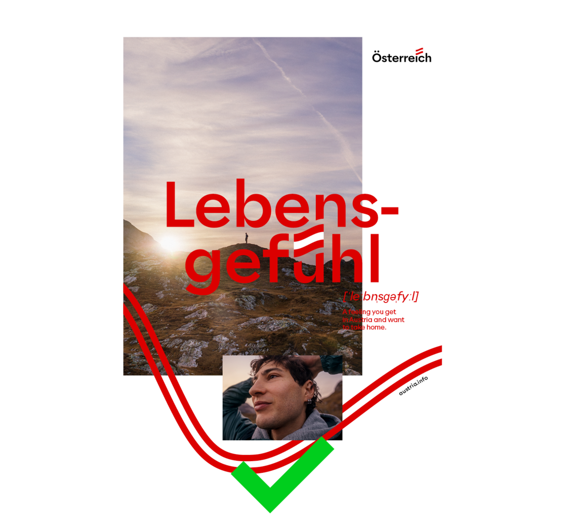

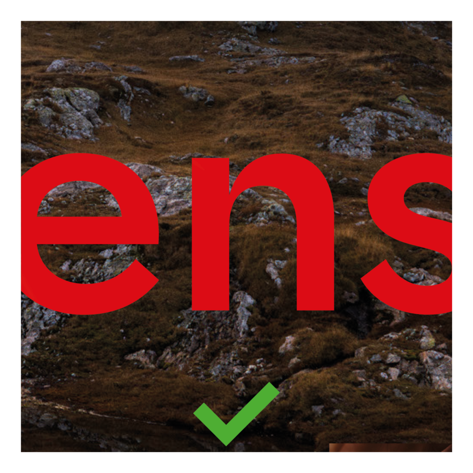
Lebensgefühl must be placed in the visual centre.

Lebensgefühl must be showcased in a big image, never in a small one.

Lebensgefühl must be placed as a vector file.

Full-surface images must not be used.

The subline is never set in capitals.

The spacing between Lebensgefühl, phonetic transcription and subline must be observed.

The phonetic transcription and subline must not be set in the centre axis.