Better together.
During the awareness stage, our partners have the opportunity to be involved with their moving images on the digital out of home (DOOH) and online video (OLV) channels.
Textual connection: Textual consistency is created when partners also mention Lebensgefühl in their adverts in the headline/insert or describe Lebensgefühl or a facet of it in their own province/region.
Textual combination of foreign-language sujets: Lebensgefühl in the headline is always left in German.
Visual connection: To ensure recognisability with our spot, our vibe is used as a connecting element to the partner spot. Additionally, the Austria logo is included.
When integrating partners in moving images, our core elements are the Austria logo, the vibe and a headline. “Lebensgefühl“ and URL are not used.
Example of application
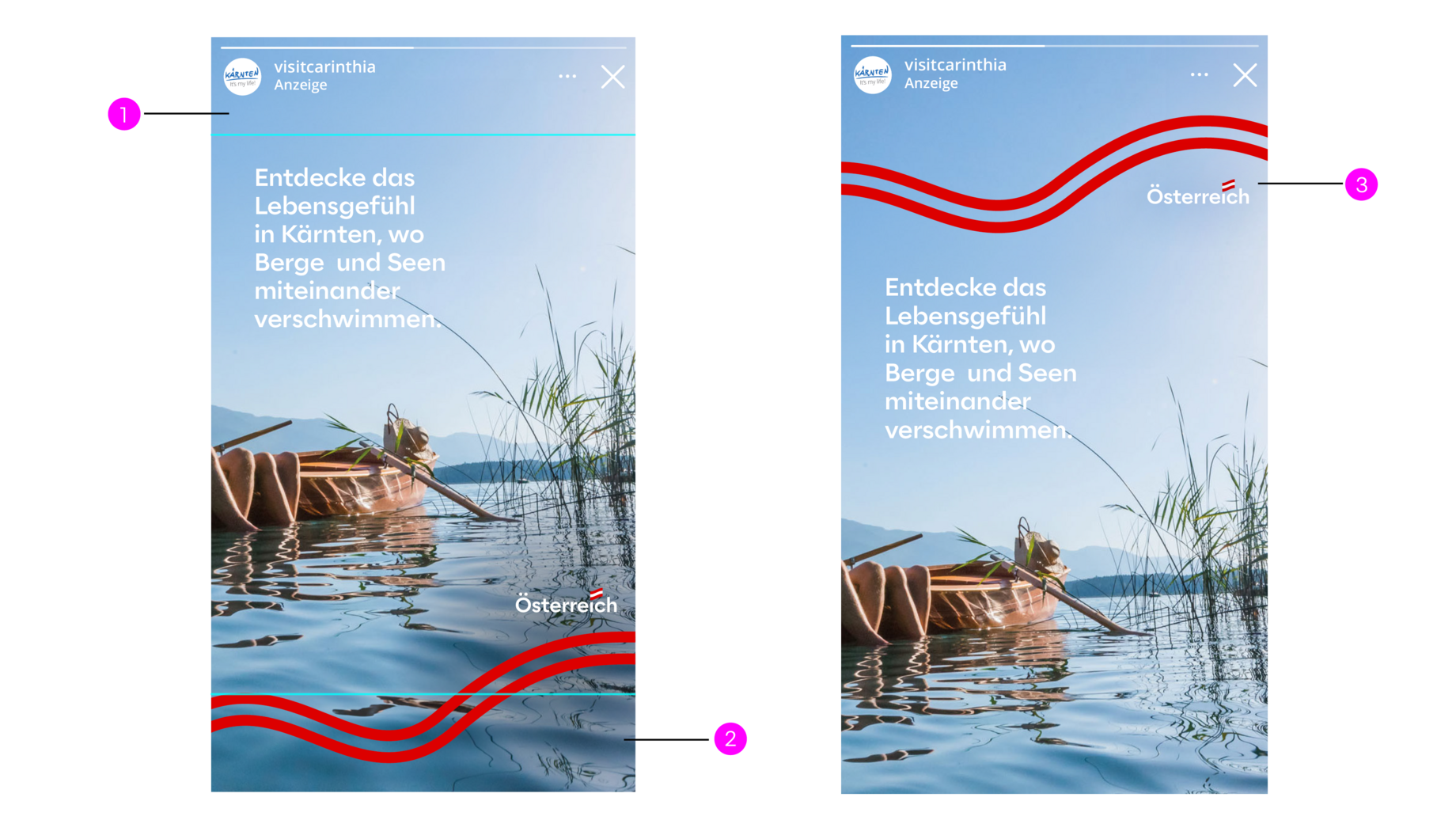
1 + 2: 250 px safespace
3: The logo must not be higher than shown here. It should be rather on the right than on the left so as not to compete with the profile picture.
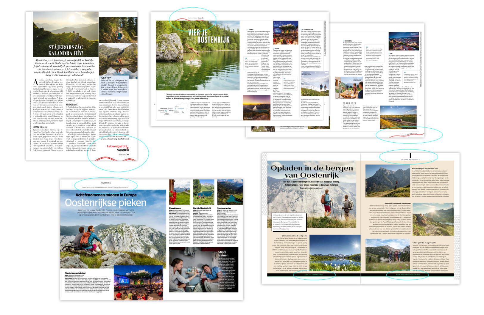
In the involvement stage, we have the possibility to work with partners in print & content co-operations (online & offline).
Cooperative sujets usually consist of two basic elements:
Austria Tourism sujet with Lebensgefühl as the core message in the advert section of the cooperation partner.
The two sujets must be perceived as a unit and therefore be combined to prevent that the advert falls into two separate parts.
This requires that “Lebensgefühl“ is always included - both in print media and in content co-operations.
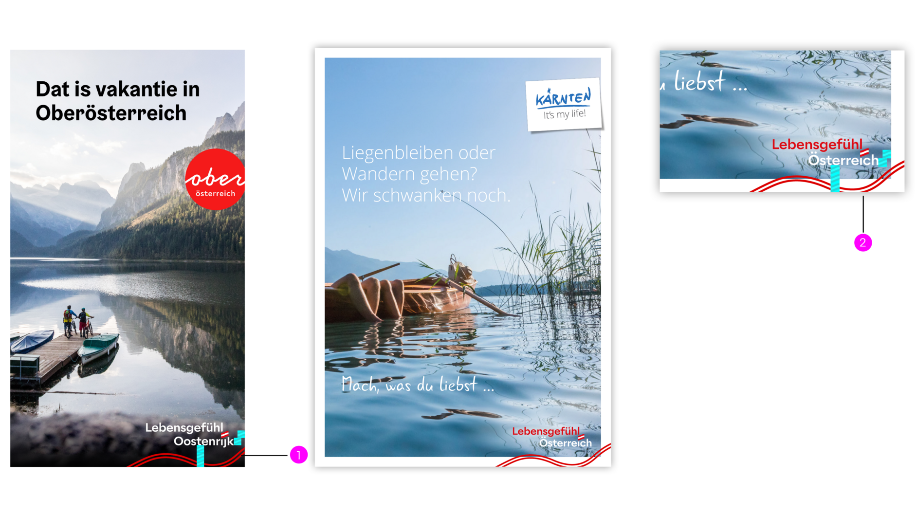
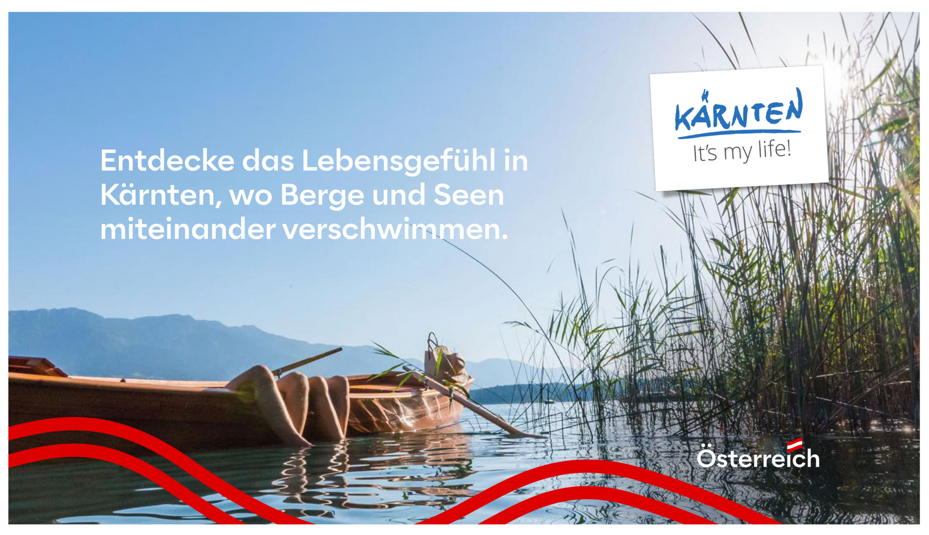
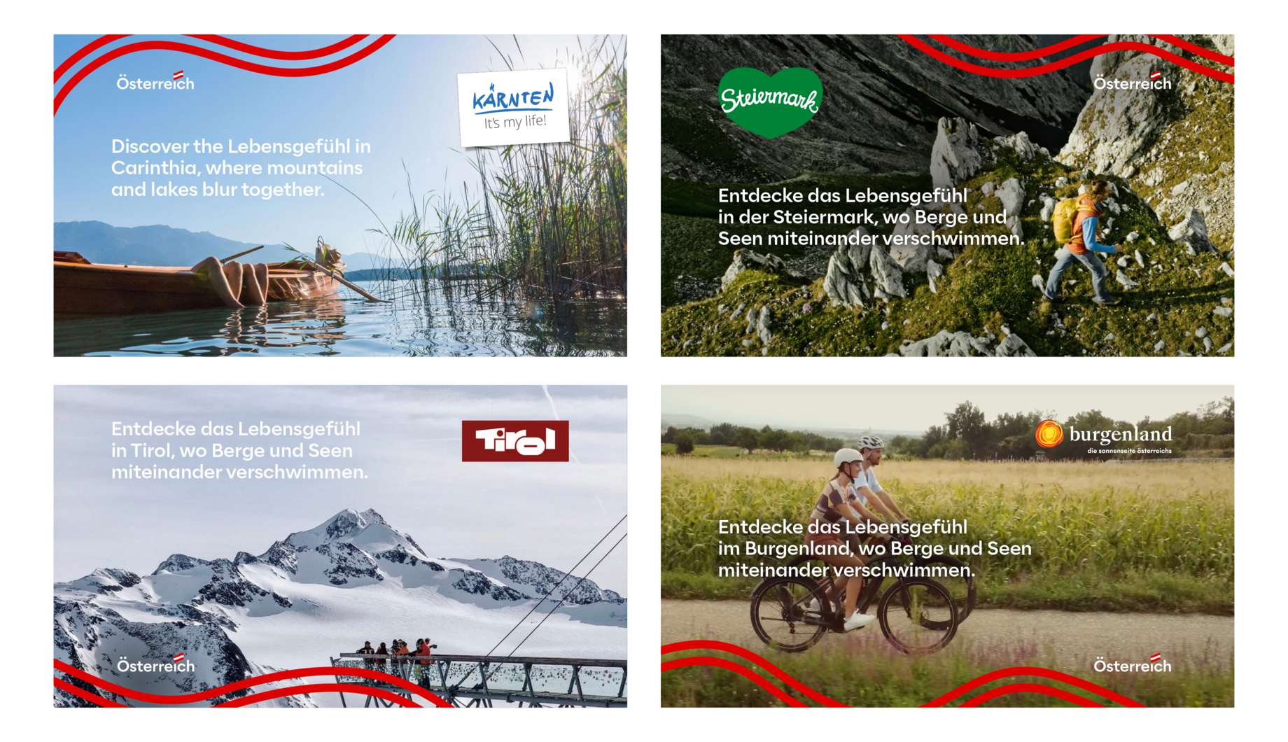
1: Distance to the right and bottom edge of the format = 1.5 flags
2: Attention, exception! Since the Carinthia sujets have their own white frame in their layouts, the logo moves further inwards at the side - the flag spacing starts from the edge of the image, not from the white space. The distance at the bottom remains the same.
Examples
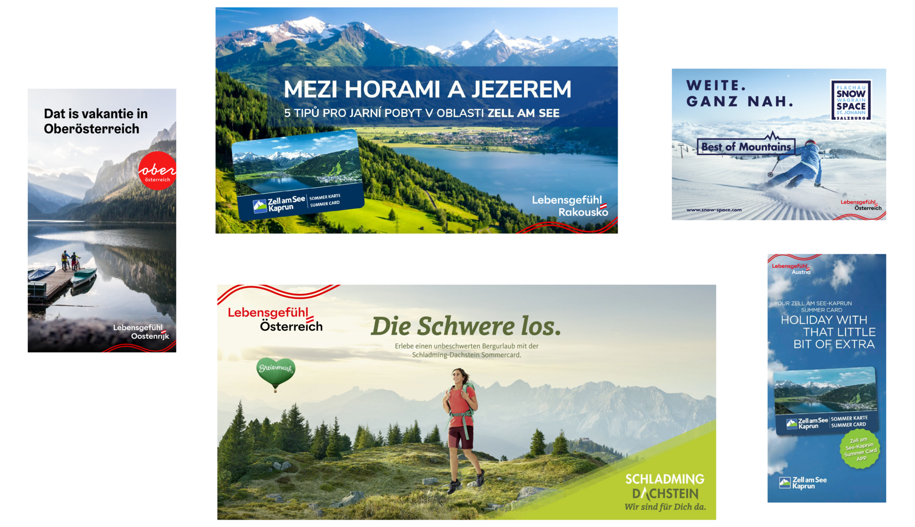
Partner adverts
Copy link to this element
Link Copied
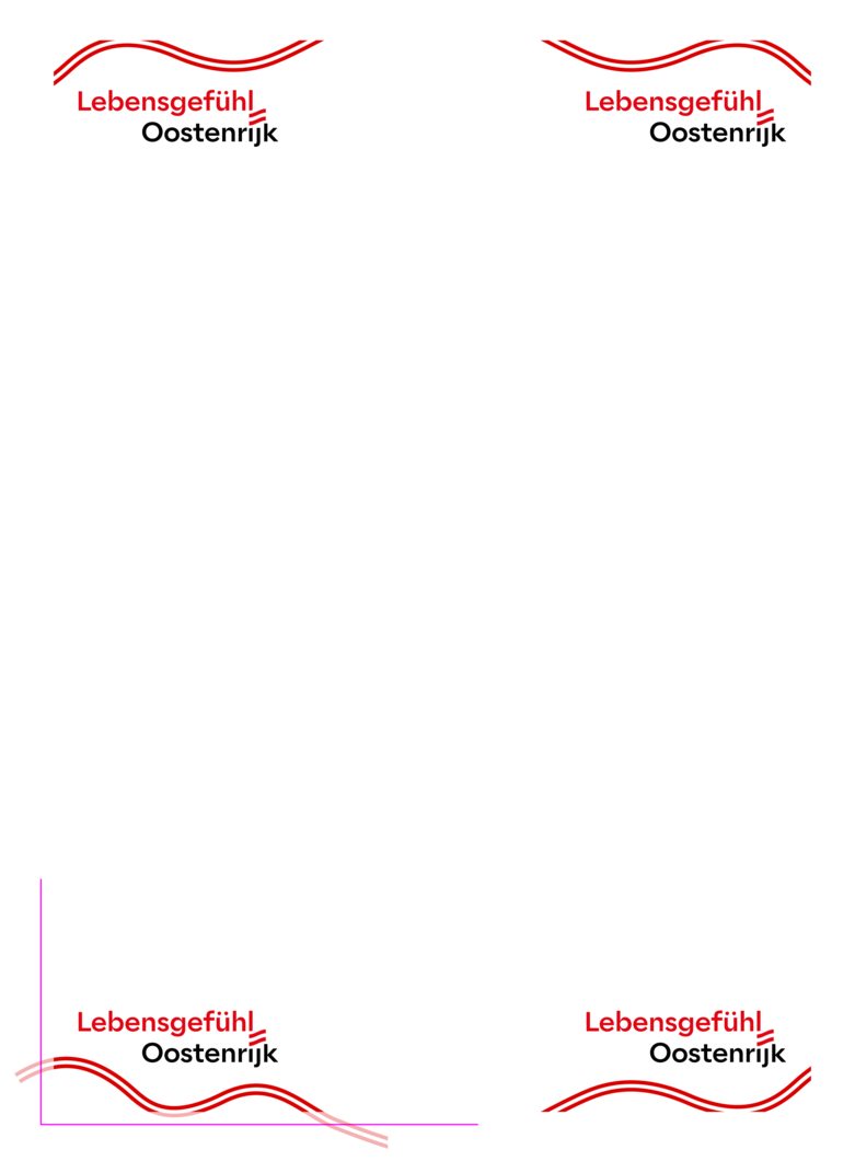
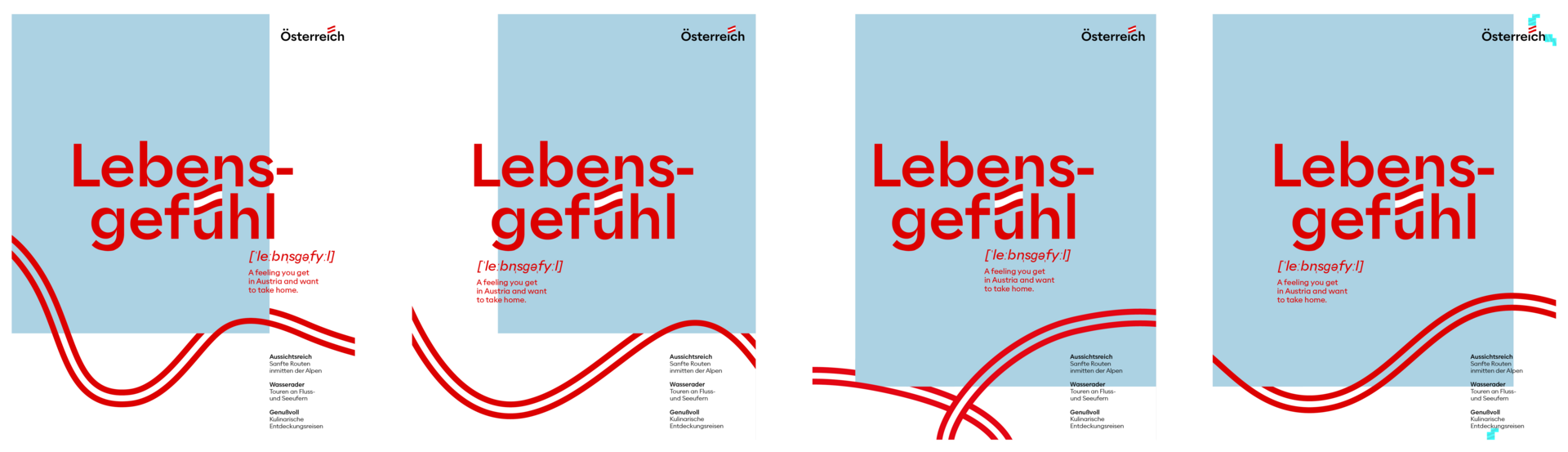
The required size ratio between logo and vibe and their placement in the corners is specified in an A4 master template.
The desired corners can simply be copied from the document and pasted into the layout. The elements can be grouped, but not scaled independently of each other
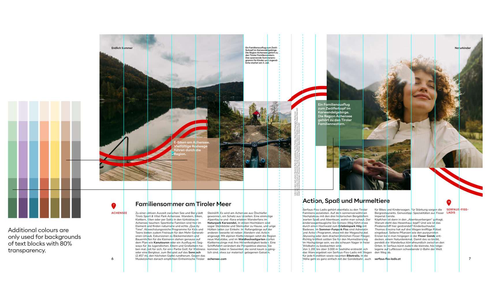
Three pages in the preferred colour variants are available for each language.
In order to be able to set bleeds for print materials, the logo and vibe are placed in the desired corner and the field is then applied so that the vibe protrudes over the edge of the format.
One document is provided in RGB for digital applications such as web banners and one in CMYK for print materials.
The size of the logo in video formats is as follows. This corresponds to a logo size of 2.5 columns.
9:16 = 187,5%
16:9 = 200%
1:1 = 140,7%
The % figures refer to Full HD.
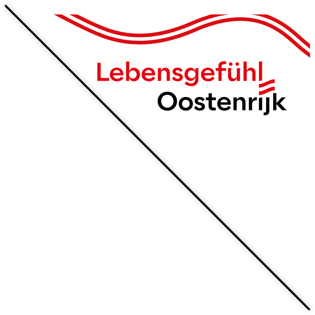

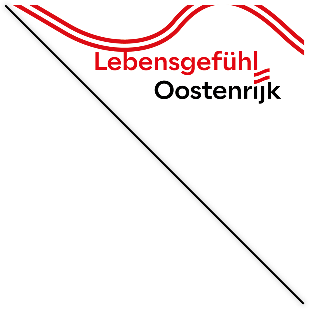
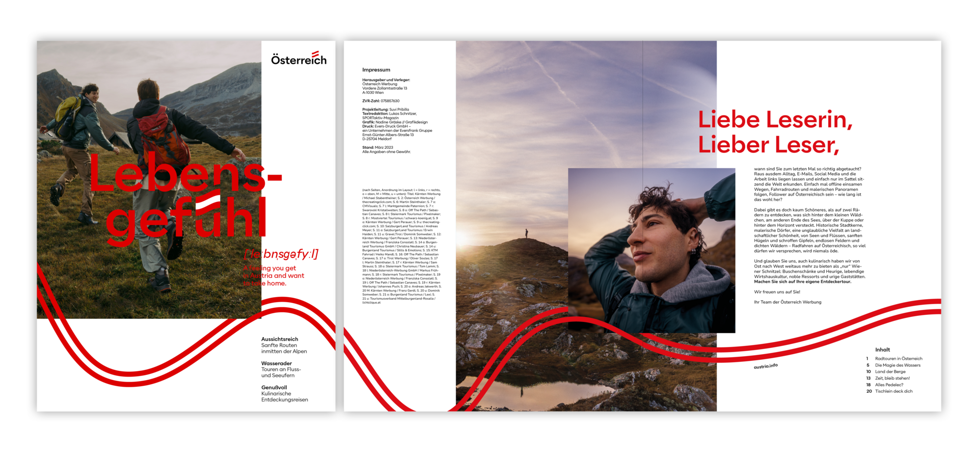
The cover features just one picture. The vibe starts on the cover page and continues across the inside pages. The intensity of the vibe is determined by the intensity of the headline on the cover: this means that the vibe intensity is 80% of the vertical stem thickness of the lowercase letters of Lebensgefühl.
-
Headline
Alaska Contrast Medium
Size variable
Left aligned
Adapt line spacing optically to headline
May cut the vibe -
Subline
Alaska Regular
10 pt
Left aligned
1.2-line spacing (automatic) -
Picture credits
Nunito Sans
5pt
Left aligned
1.2-line spacing (automatic) -
Intermediate headlines large
Alaska Medium Contrast
18 pt
Left aligned
1.2-line spacing (automatic) -
URL
Alaska Medium
8 pt
Left aligned
1.2-line spacing (automatic) -
Body text
Nunito Sans Regular
8.5 pt
Left aligned
1.2-line spacing (automatic) -
Body text highlighting
Nunito Sans Light Italic (for proper names)
or Nunito Sans Bold (for highlighting)
8.5 pt
Left aligned
1.2-line spacing (automatic) -
Localisation
Alaska Medium
8 pt
Left-aligned
1.2 line spacing (automatic) -
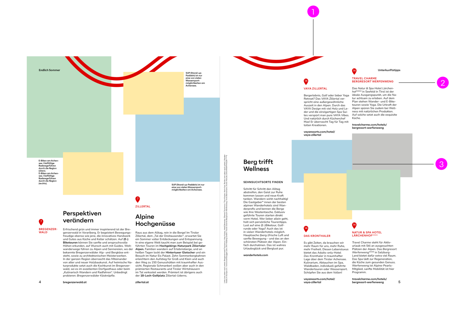
The picture captions are placed directly next to, above, below or on the pictures.
-
Bildbeschreibungstext
Alaska Medium
6.5 pt
Left-aligned
1.2 line spacing (automatic)

The number of columns depends on the size of the print product and can be derived from the master templates. This magazine is just as wide as A4, only a little less high, so the columns and logo size can be taken from the A4 master layout.
The distance from the picture edge to the caption is always half a column, regardless of whether the text is inside or outside the picture.
Distance from caption to edge of image = 0.5 flags
-
Distance inside and outside to the format edge
half column -
Vibe
The intensity is defined by the vibe on the cover.
The vibe always has this same thickness throughout the magazine.
It can disappear and then reappear. -
Distance to the edge of the format
The text is always at least half a column away from the edge of the format. -
Picture credits
in the centre of the innermost half column.
If there are several pictures on a page, they are listed from top to bottom in the credits. -
Distance at the bottom and top of the format edge
half column -
Body text
can as needed be 2 or 3 columns. -
Images
are overlapping, their height is variable, the width is always aligned with the columns and half-columns.

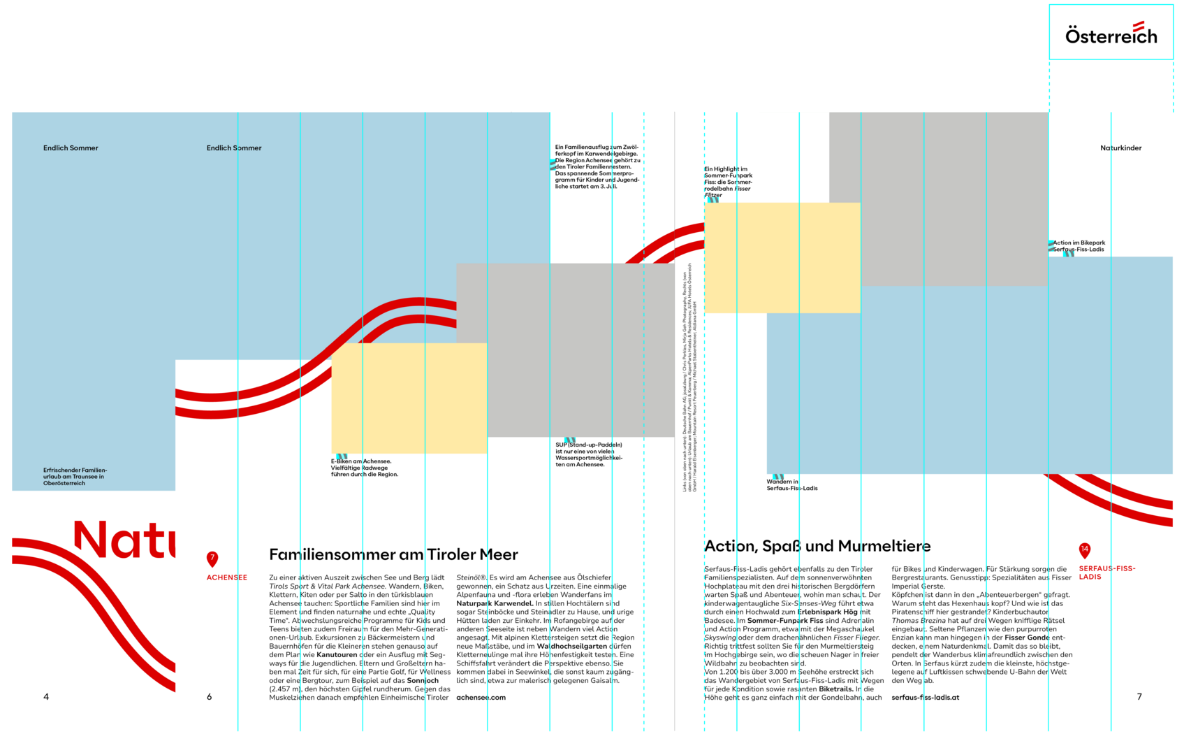
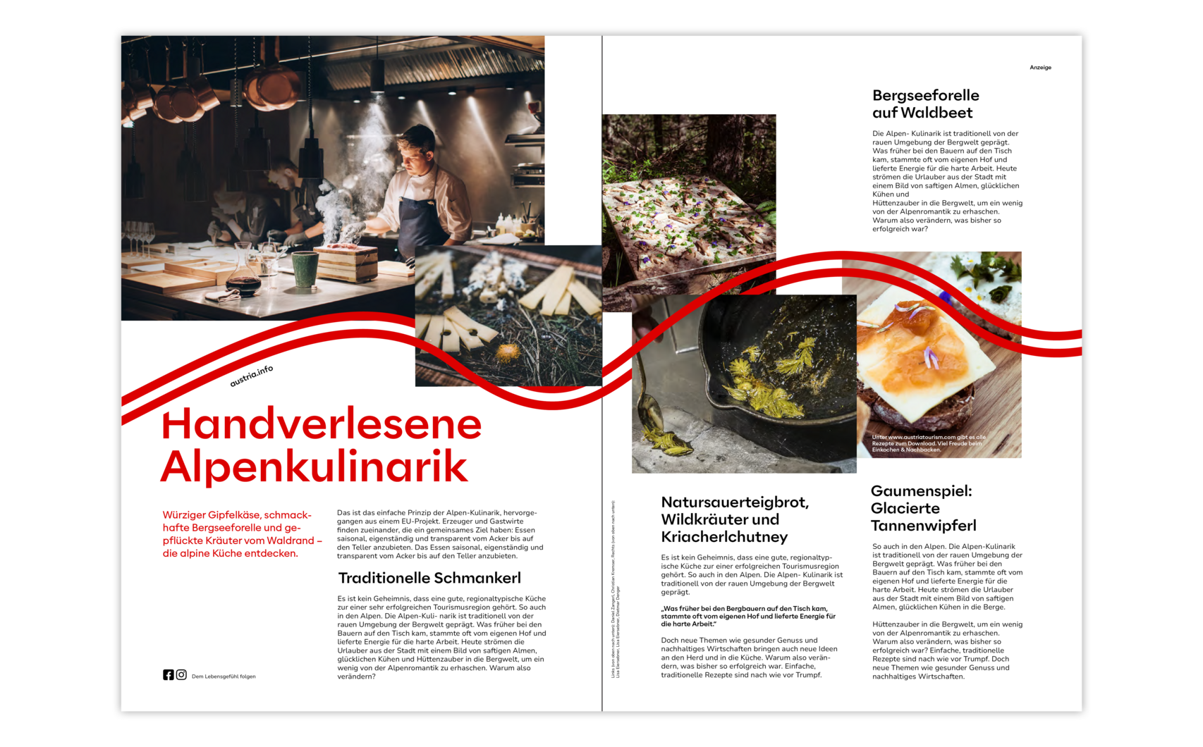
1: The vibe runs like a red thread through the magazine, sometimes more promi- nent, sometimes more discreet. The vibe does not necessarily have to appear on every individual page, but should ideally be integrated at least once on a double page.This example shows quite clearly how it can also be used in a more restrained way.
2: Locations are intermediate headlines in a smaller font size. They are allowed to be in read only when they are located in the map. In exceptional cases, they can be set in capital letters.
3: If required, images can be placed without overlapping, i.e. edge to edge.