Splendid in words and writing.
Alaska Contrast Medium
Contrasts add excitement to life – this also holds true for writing.
-
Headline
-
Interim headlines, editorial
Alaska Contrast Italic
-
Phonetic transcription
Alaska Medium
A brand's unique character is also reflected by the right typeface.
- URL
- Image captions
Alaska Regular
-
Subline
-
Explanation
-
CTA text for banner
-
Headline in text box (social media)
-
Headline without text box (social media)
-
Body texts (social media)
Nunito Sans Regular
A well-chosen font in the continuous text helps to maintain the flow of reading.
-
Body texts
-
Picture credits
Nunito Sans Regular Italic
-
Highlights in body texts/editiorial (proper names)
Nunito Sans Bold
-
Hervorhebungen im Fließtext Editorial
In a direct comparison between Alaska Contrast Medium and Alaska Medium, the former offers significantly more exciting details and lends the font additional recognition value. However, care should be taken to ensure that it is used in larger applications – it looks particularly interesting in headlines.
In smaller applications the integrated fine contrasts are not beneficial to readability. Alaska Medium is therefore recommended for URLs, sublines and the like.
Font family Hierarchies

Here you find all weights of the new font family, together with their areas of application.
The Alaska font can be used for all text types. The only exceptions are body texts in print and photo credits. Here Nunito Sans is used.
The website‘s typographic hierarchies can be found in a separate manual.
As the hashtag #feelaustria is only used where it can be clicked on directly - for example in caption texts of social media postings - it is not discussed further in this context.
Font Nunito Sans
Please download the 10 pt version:
https://fonts.google.com/specimen/Nunito+Sans
Font Alaska
https://newglyph.com/classic-collection/#font-alaska
Basic Font Rules
Copy link to this element
Link Copied
There are hierarchies to ensure that not every piece of writing catches the eye at the same time and to help decide where to look first. The hierarchies use predefined spacing, font sizes and font styles to guide the eye along the desired reading flow.
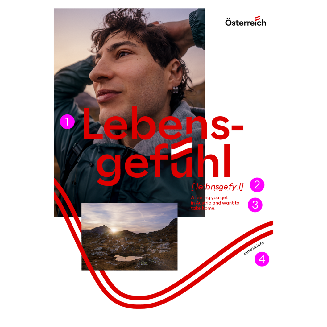
Sujets
-
Headline
Alaska Contrast Medium
Central axial No font, but own vector file, which is placed -
Phonetic transcription
Alaska Contrast Italic
No font, but own vector file, which is placed -
Subline
Alaska Regular
Left-aligned
1.2x line spacing (automatic) -
URL
Alaska Medium
Path text on the vibe with baseline offset downwards
Adjust spacing, depending on the bend of the vibe!
Flow text
-
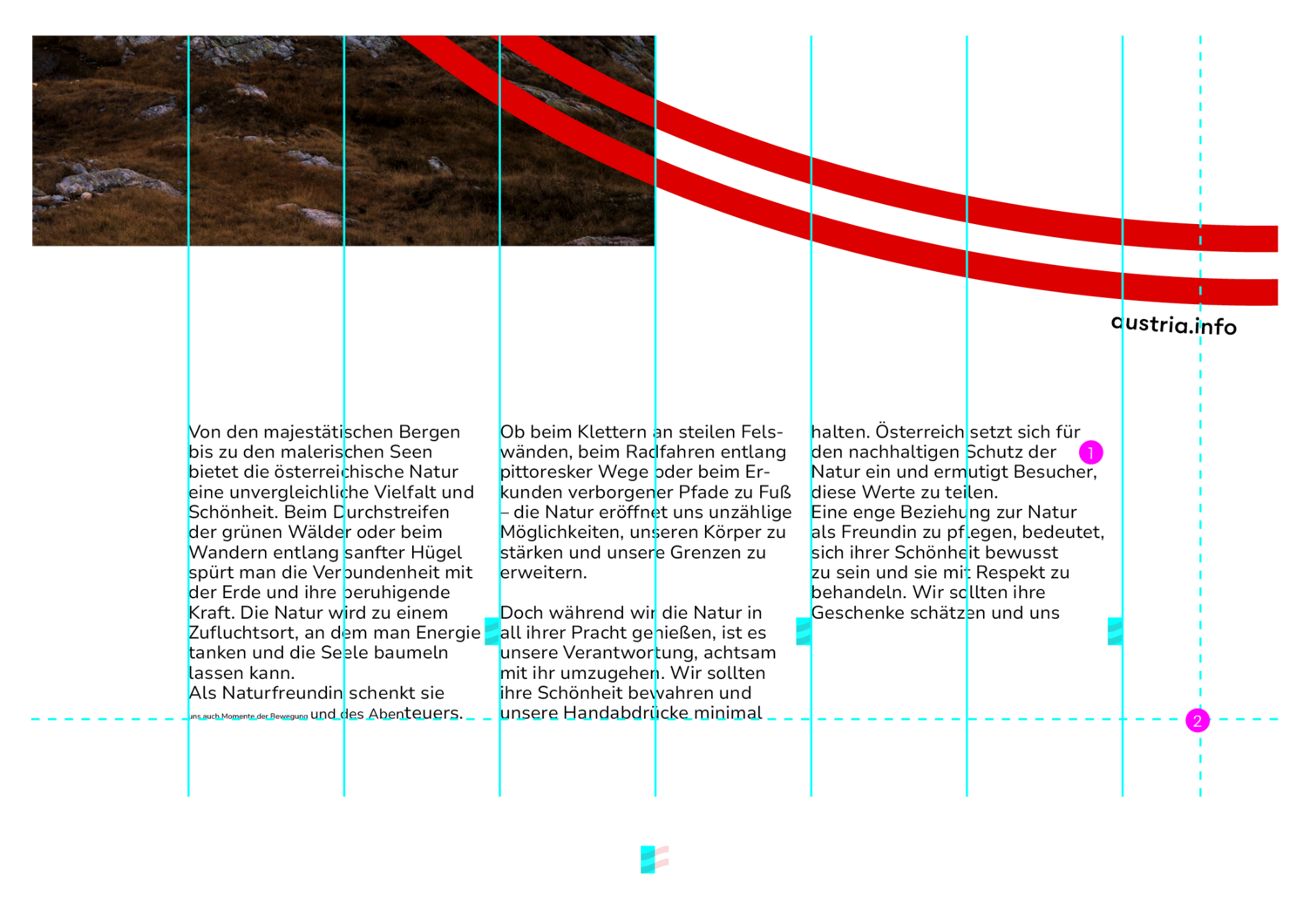
Body text
Nunito Regular
8.5pt
Left aligned
1.2x line spacing (automatically)
Automatic spacing -
Distance on all sides
at least half a column
The body text is always aligned with the columns of the grid. The intermediate bar is half a flag wide. The outermost half co- lumns must be kept free of text.The distance to the format margin at the top and bottom is half a column.
Editorial
More detailed explanations, e.g. regarding the grid can be found in the „Editorial“ chapter.
More detailed explanations, e.g. regarding the grid can be found in the „Editorial“ chapter.
- Headline
Alaska Medium ContrastVariable size
Left-aligned
Match line spacing optically to headline. -
Intermediate headlines big
Alaska Medium Contrast
18 pt
Left aligned
1.2x line spacing (automatic) -
Body text
Nunito Sans Regular
8.5 pt
Left-aligned (automatic) -
Intermediate headlines small
Alaska Medium
8 pt
Left-aligned
Apply line spacing of the text -
Picture credits
Nunito Sans
5 pt
Left-aligned
1.2 line spacing (automatic)
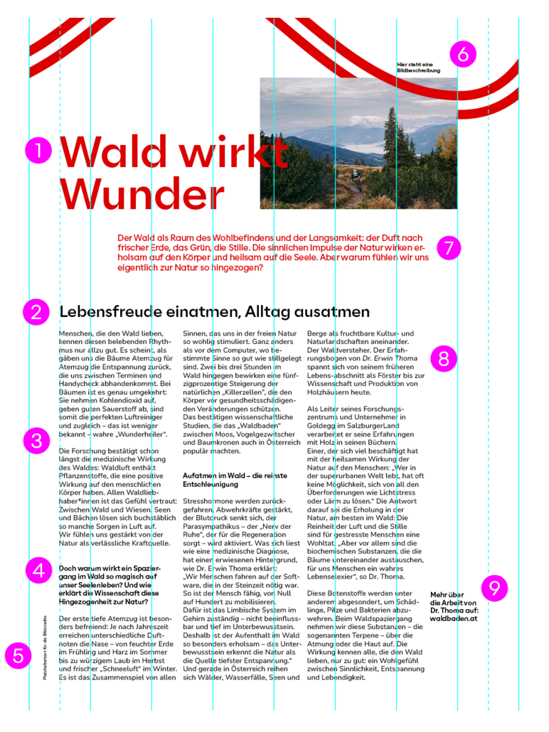
6. Picture description
Alaska Medium
6.5 pt
Left-aligned
1.2 line spacing (automatic)
7. Subline
Alaska Regular
10 pt
Left-aligned
1.2 line spacing (automatic)
8. Body-text highlighting
Nunito Sans Light Italic (for proper names)
or Nunito Sans Bold (for highlighting)
8.5 pt
Left-aligned
1.2 line spacing (automatic)
9. Additional information, Localisations, URLs
Alaska Medium
8 pt
Left-aligned
1.2 line spacing (automatic)
Text on cardboard
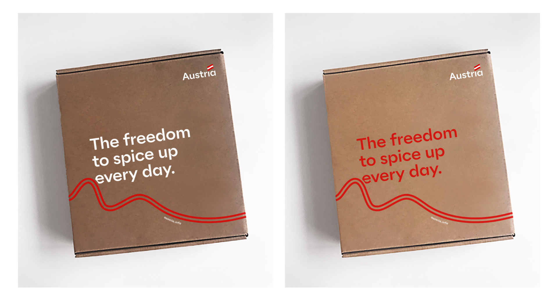
Normally, headlines are always red. The background is normally always white. Exceptions apply if the print base is made of natural cardboard. In this case the headline can still be red as long as it is easy to read. If the cardboard is too dark, the headline will be white to guarantee legibility.
The logo and URL on cardboard are also white.
هذا نموذج نص. هذا نموذج نص. هذا نموذج نص. هذا نموذج نص. هذا نموذج نص. هذا نموذج نص.
目 耳 口 手 足 见 闻 声 贝 车 雨 赤 青 言 语 鱼 鸟 羽 电 不 乃
左 右 中 大 小 月 日 年 早 木 林 山 川 土 空 田 天 生 花
로 뢰 류 르 릐 리 마 매 먀 벼 보 뵈 봬 뵤 새 샤 아 애 야 어 에 여 오 외 왜 요 웨 유 으
А Б В Г Ґ Д Ђ Е Ё Є Ж З Ѕ И І Ї Й Ј К Л Љ М Н Њ О П Р С Т Ћ У Ў Ф Х Ц Ч Џ Ш Щ Ъ Ы Ь Э Ю Я
אתם פשוט חייבים לחוות חופשה באוסטריה בעצמכם.
คุณเพียงแค่ต้องสัมผัสกับวันหยุดในออสเตรียด้วยตัวคุณเอง
Alaska should be used for all Latin languages. Since Nunito Sans is available for both Latin and Cyrillic characters, Nunito Sans replaces all Alaska hierarchies in Cyrillic.
Noto Sans is used for all other languages (for which neither Alaska nor Nunito are available). The only exception is Arabic. Since there is no Noto available in this language, we switch to Cairo.