Reduction is the key to fascination.
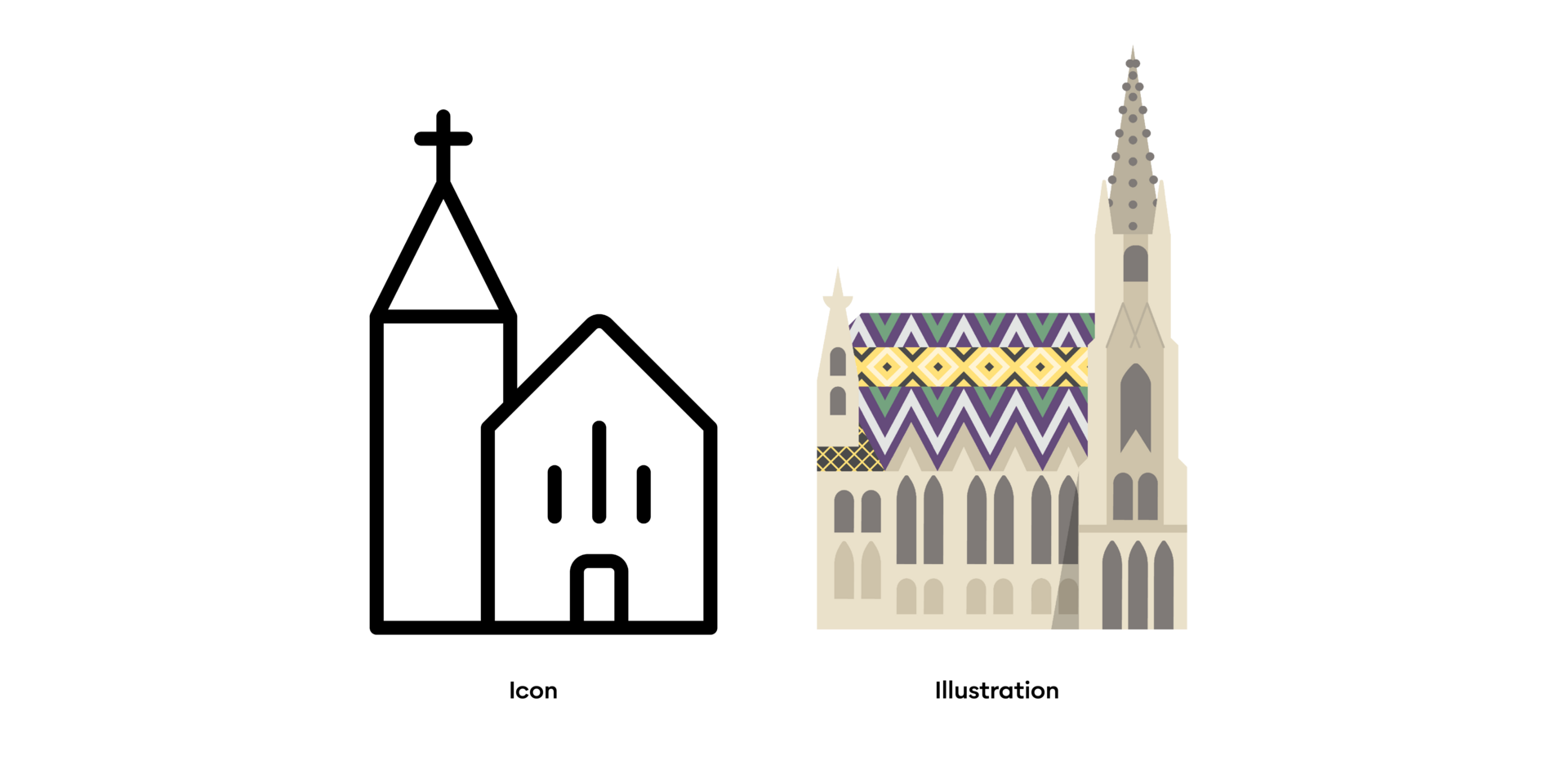

A comprehensive icon collection, customized to the brand is available. Icons are always linear. They can be used without background, as well as negative in a rectangle.
- The graphic design only uses primary colours.
- Icons are only composed of outlines and may not be coloured.
- The outlines are always continuous and must not be interrupted.
- Icons are always linear and may be positioned with or without a background – if required, they may also be placed in a rectangle.
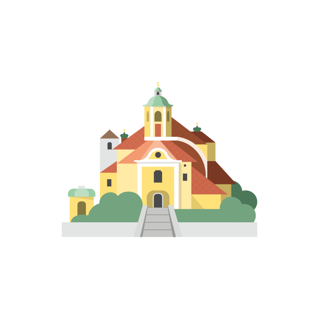
Illustrations are characterized by a geometric style and large fields in harmonious colours. They support the imagery and help to convey the Lebensgefühl. Attracting attention with delicate details, they have a charming and lively effect without forcing themselves into the foreground.
People are depicted naturally and proportionally. If they are displayed in a larger format, facial features can be recognisable - if they are shown small or as a group, they may be reduced to silhouettes. Skin colours may be rendered in shades of brown or grey.


Use of colours
Copy link to this element
Link Copied
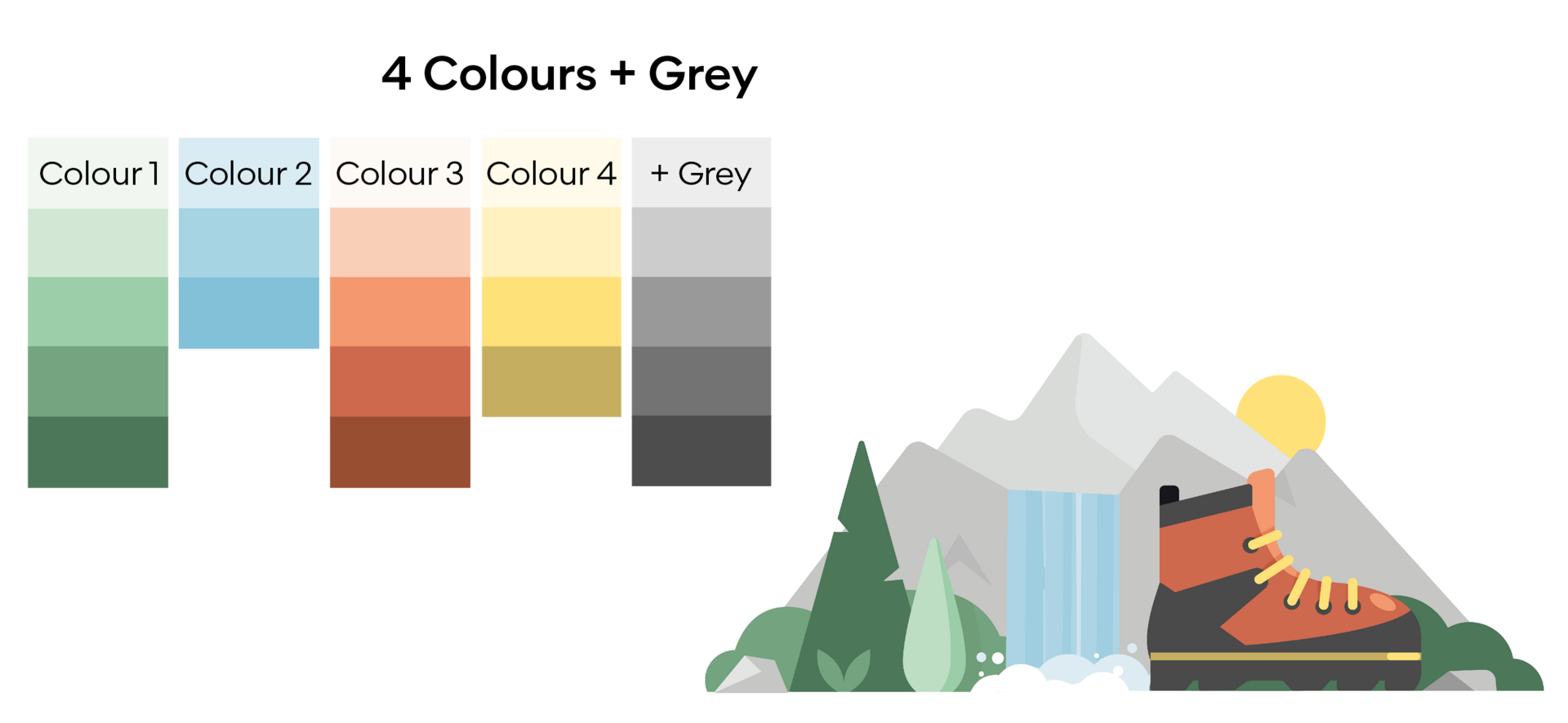
Each illustration has a maximum of 4 colours and grey.
Landscape elements such as water, grass or sky should be depicted in their natural colours, whereas all other illustration elements may be interpreted artistically more freely.
- Every illustration should contain at least one shade of grey.
- Shadows should feature in the darker of the same colour.
- Pure black may not be used.
- The darkest permissible colours can be found in the overview.
- For highlights, the lighter shades of the same colour are used.
- Pure white is permitted, but should be used mi- nimally for highlights or as background for cut-out illustrations.
- Illustrations generally use as few colours as possible.
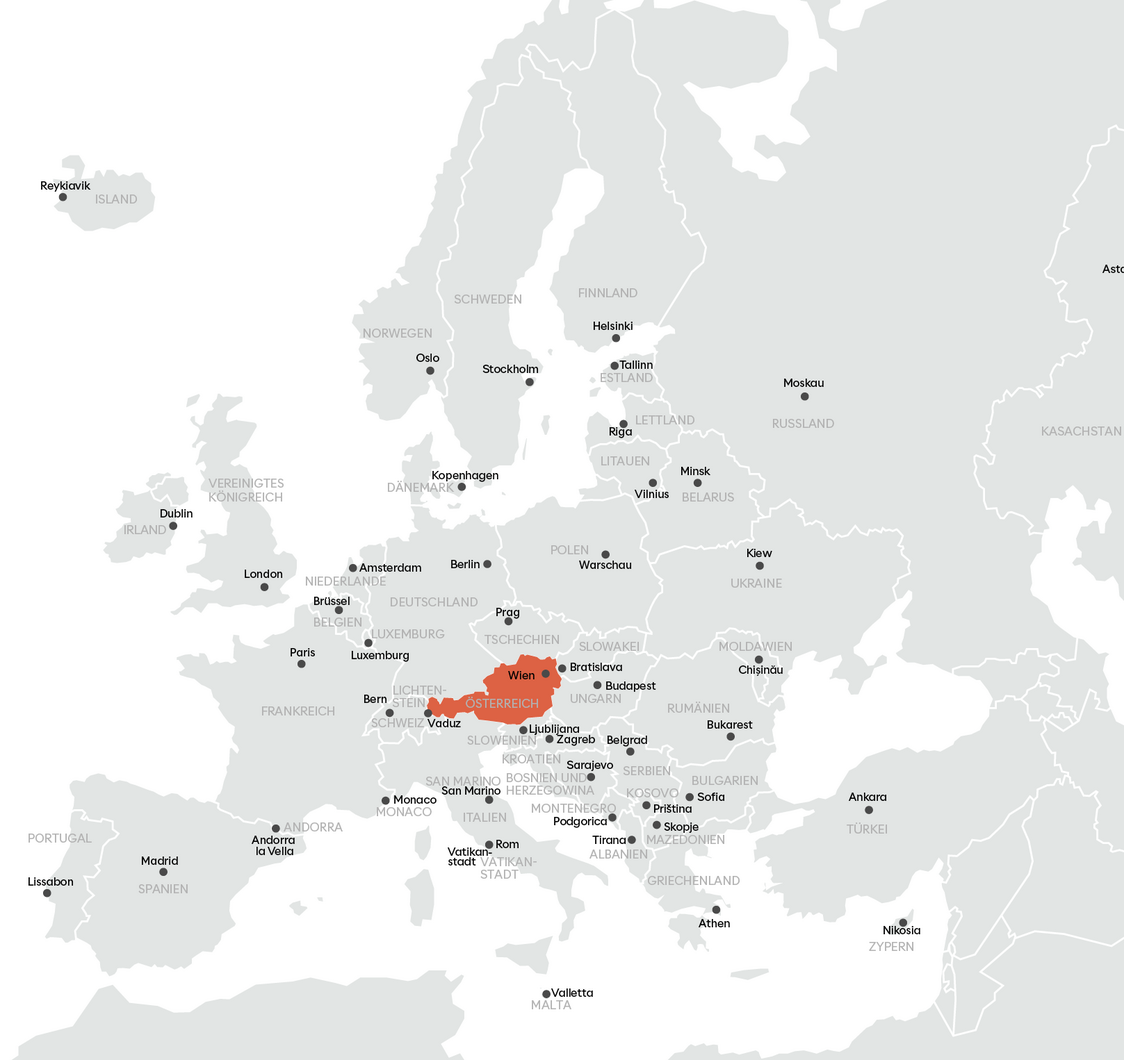
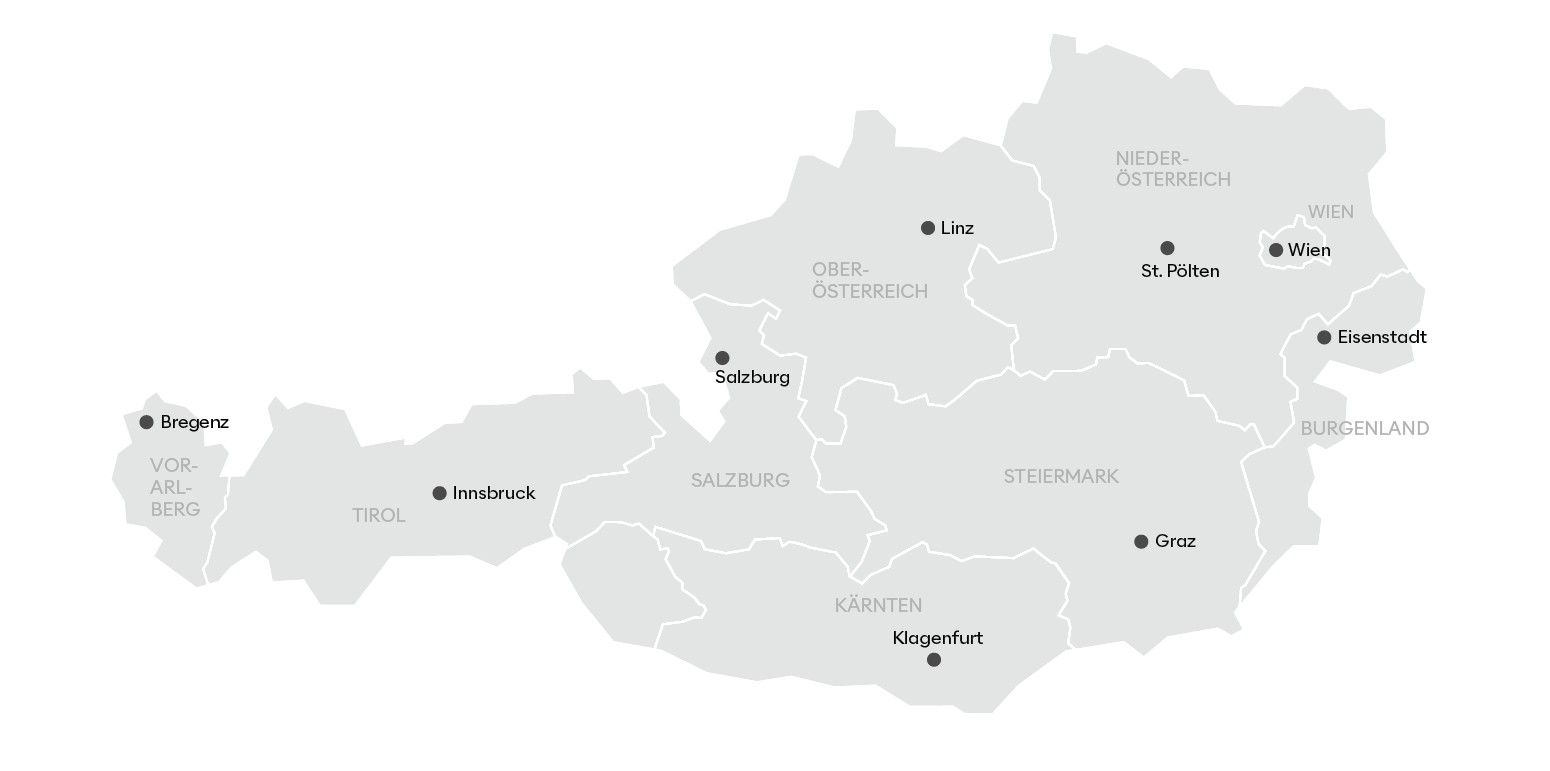
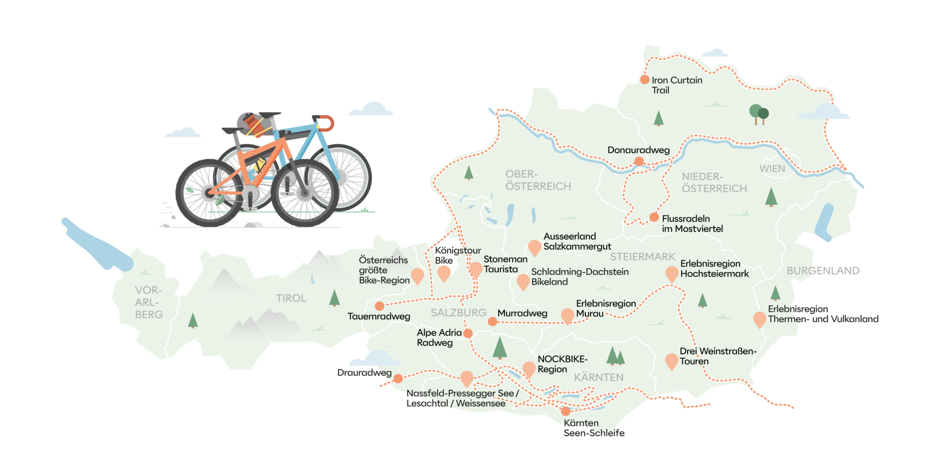
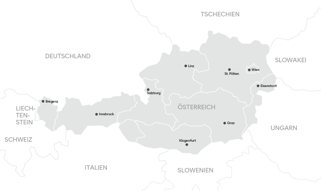
Infographics and maps
Copy link to this element
Link Copied
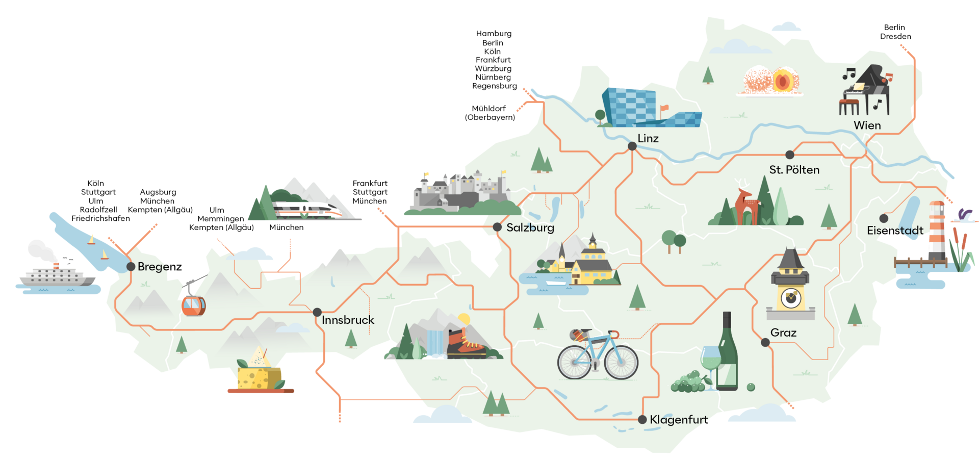
Many different types of information and illustrations can be faded in and out:
state borders, state capitals, neighbouring states, rivers, lakes, mountains, national parks, cycle routes, culinary delights, places of interest and much more.
Illustrations are kept in secondary colours. The red colour of Austria Tourism does not come into use.

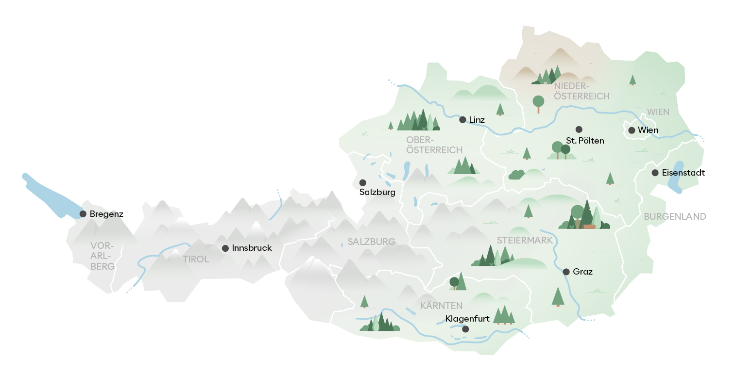
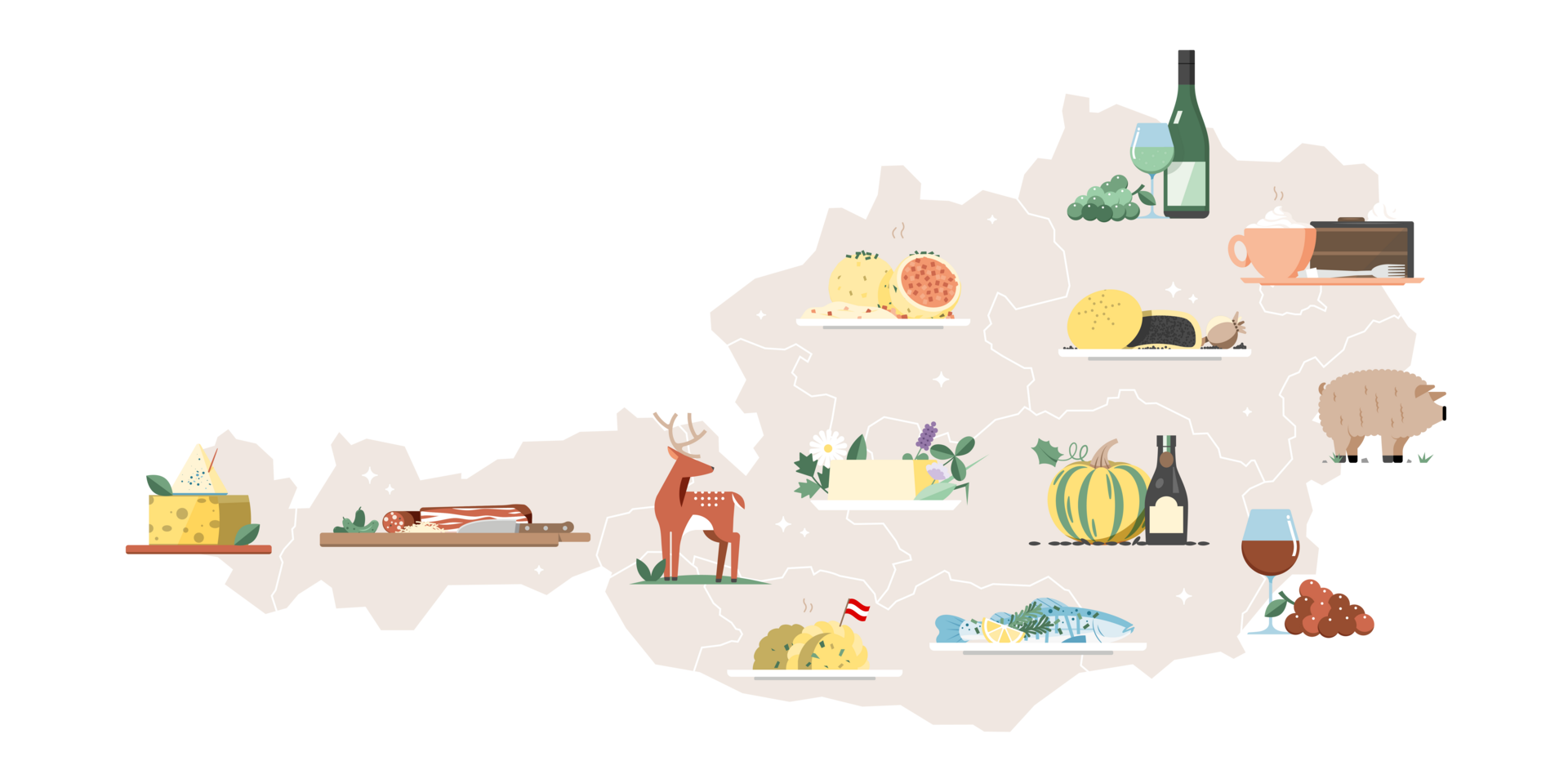
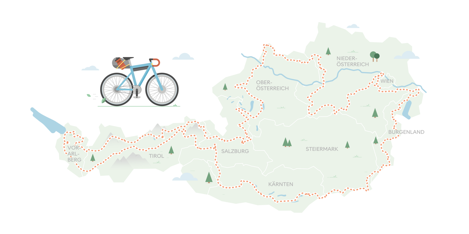
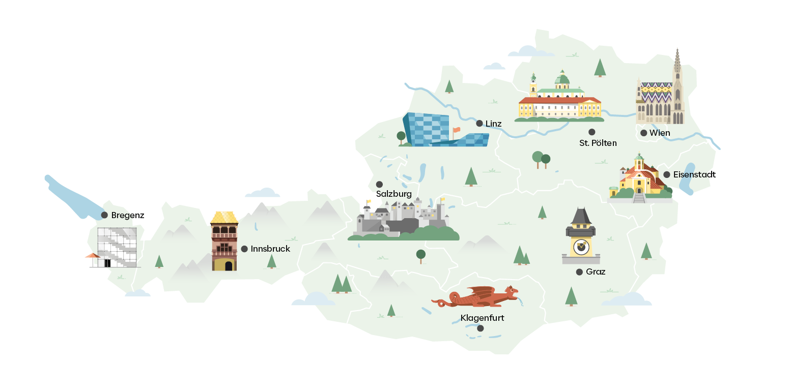

Illustrations should not look hand- drawn.

No brush strokes or aquarelle effects should be visible.

Illustrations should not have a linear, childish or kitschy style. Illustrations should not be too colourful - only defined colours and shades may be used.

The colours should be chosen naturally, i.e. no yellow lake, purple meadow, pink sun, green sky, etc.

People must be illustrated in their natural proportions.

The closer to the depicted object, the more details are visible.

The further away, the simpler the illustration becomes.