The vibe is right.
Vibe
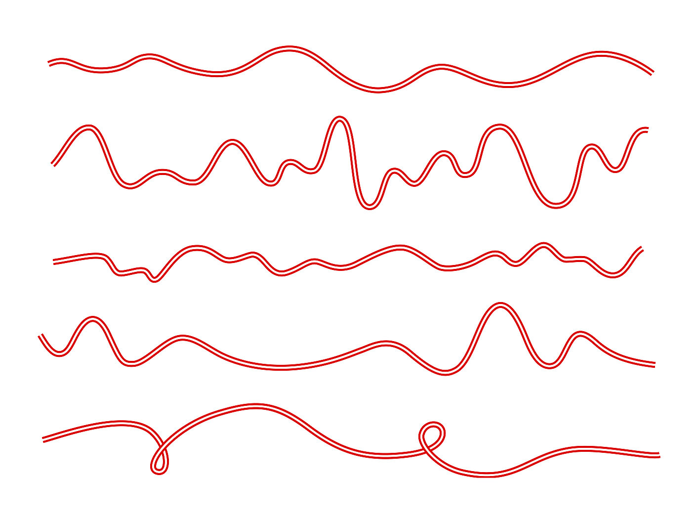
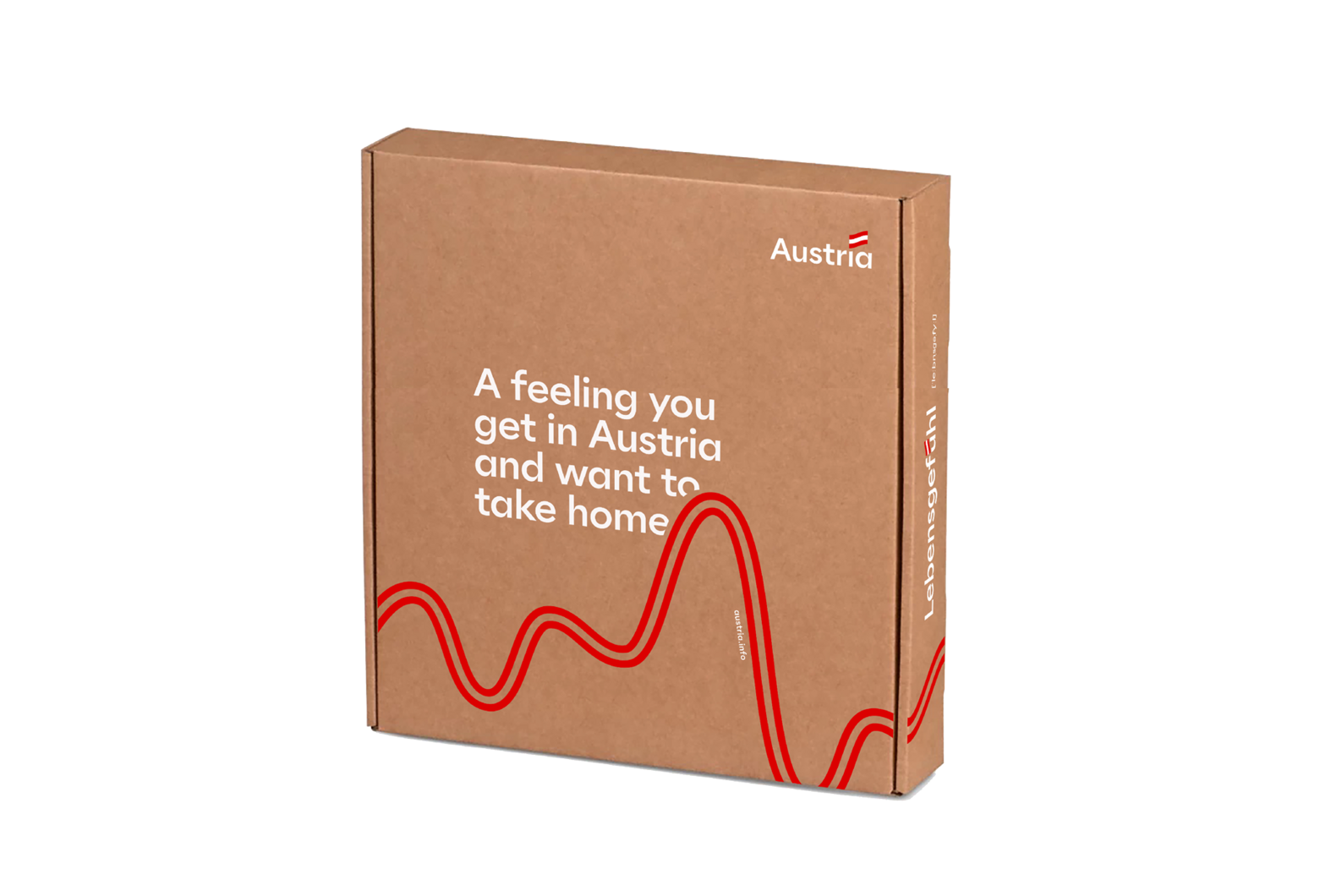
As a design element, the vibe runs through all advertising media, which ensures a consistent wavelength. Inspired by the Austrian flag, it is constantly carried on. As a graphic element, it can - depending on the theme - be configured more calmly or with a greater amplitude, so that it transforms a feeling into a real vibe.
As a design element, the vibe runs through all advertising media, which ensures a consistent wavelength. Inspired by the Austrian flag, it is constantly carried on. As a graphic element, it can - depending on the theme - be configured more calmly or with a greater amplitude, so that it transforms a feeling into a real vibe.


Vibe on multi-page advertising materials
Copy link to this element
Link Copied
The vibe is designed to create a flowing illusion: It has no beginning and no end, and is always flowing downwards over the respective layout. If it is a multi- page or 3-dimensional print product, the vibe continues on the following page as seamlessly as possible.
If there are more than two sides, the vibe practically loops round the corner and runs around the entire box like a ribbon. If the inside is also printed, the vibe continues exactly at the respective bend points on the inside.
If there is a front and back, the vibe merges seamlessly at 360° into itself. If the vibe leaves the format at the bottom of the front side, it re- enters the format from the bottom of the back side.
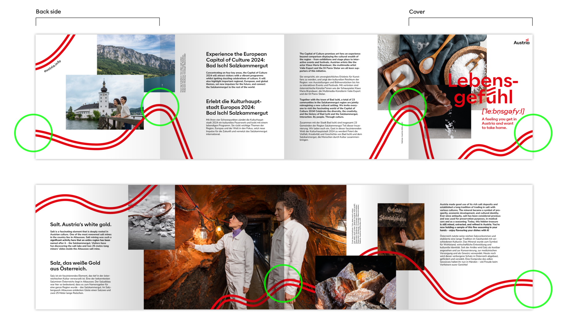
On an 8-page leporello, the vibe continues not only on the pages next to each other, but also on the back. It is advisable during the layout process to check exactly with a test print where there can or should be overlaps.

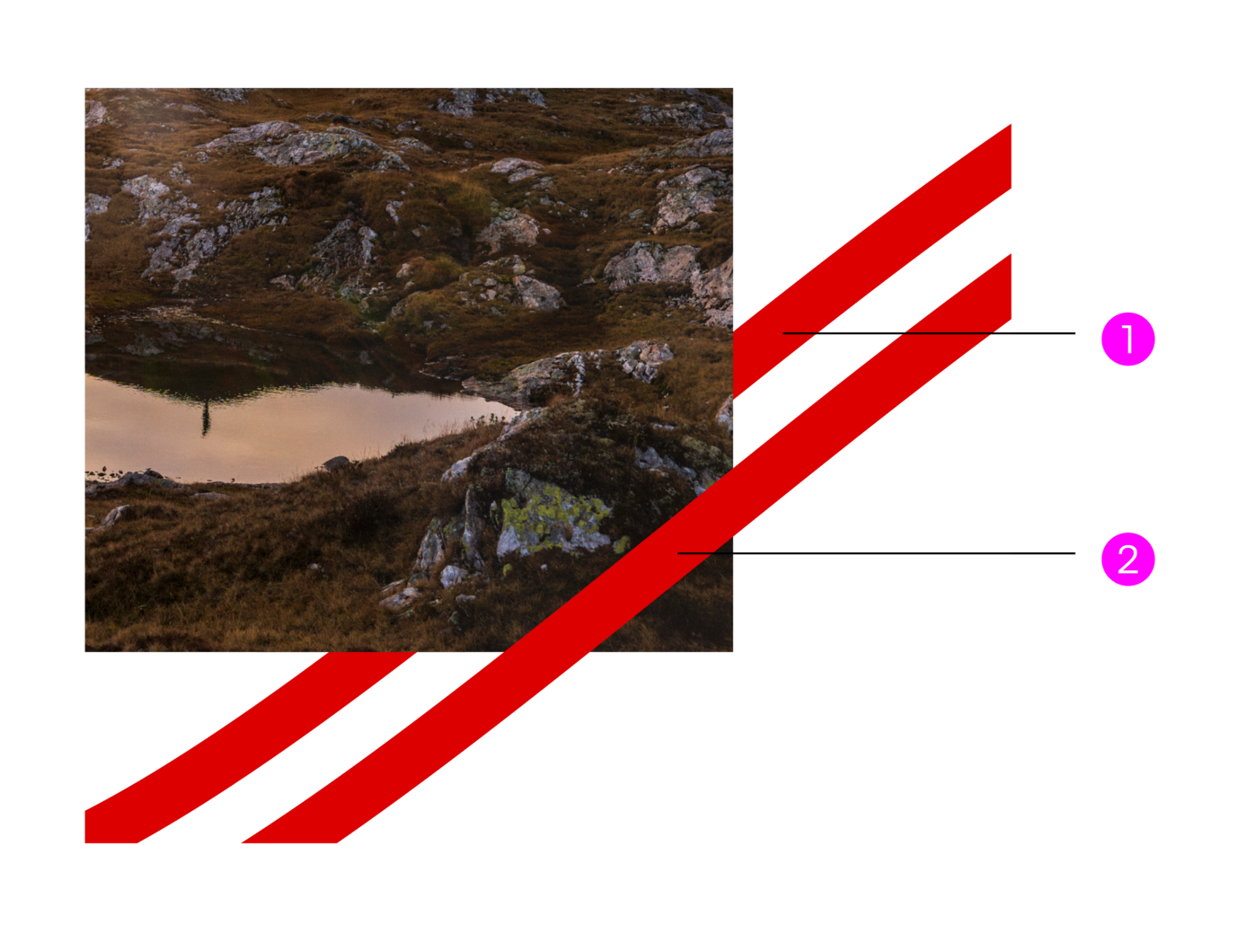
The vibe must under no circumstances In pictures, the vibe must not have The vibe must always be bleeding have different colours, shades or perspective distortions.

In pictures, must not have a white filling, the centre always remains transparent.

The vibe must always be bleeding and must neither begin nor end in the middle of the layout.

However, the vibe can emerge or disappear behind a picture.
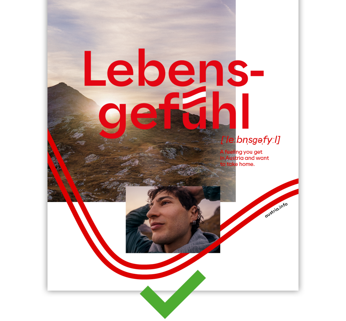

If the vibe forms a loop, the overlapped part must be hidden.

If the vibe forms a loop, the overlapped part must be hidden.

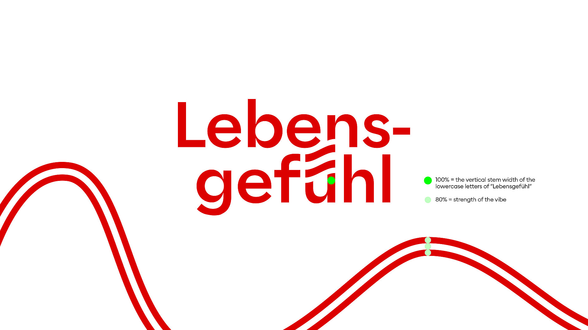
If the vibe crosses a headline, it must remain legible.

If the vibe crosses a headline, it must remain legible.
.")
The bleed must not leave any doubt as to which letter is involved (hold or bold?).