Show your true colours.
Primary Colours
Copy link to this element
Link Copied
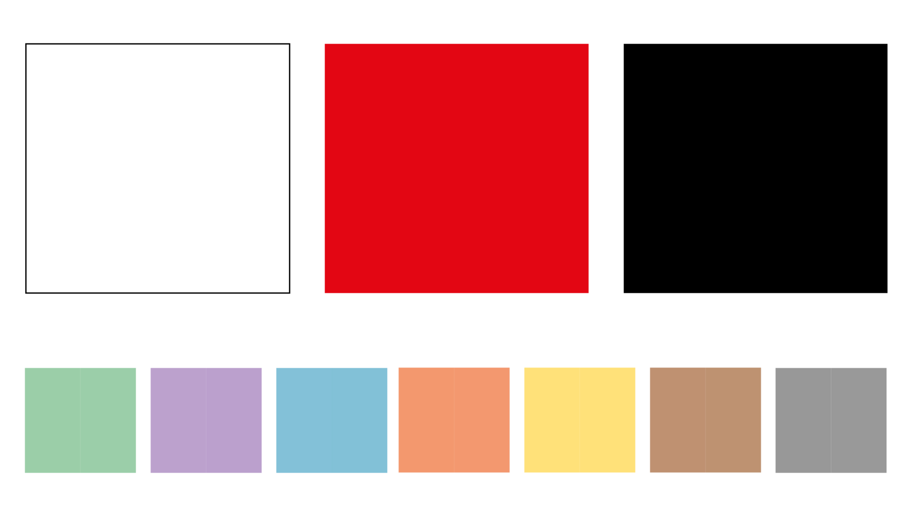
In line with their name, primary colours should be the first to be used - they are often combined with photos and should not distract in these combinations, but rather convey a calm and self-confident strength. Secondary colours should be used exclusively as supporters that need to follow special rules.
Secondary Colours
Copy link to this element
Link Copied
In order to clearly contrast with the saturated primary colours, the secondary colours are kept in a pastel palette. When used in combination, the primary colours automatically become hierarchically more prominent and stand out visibly. The colours provided are labelled with keywords that underline their content. These are associations meant to serve as inspiration, however, you are also welcome to invent your own denominations.
The secondary colours unfold their effect in infographics, editorial illustrations, maps or GIFs, for example. They are not used in standard advertising materials.
The colour gradations listed here are permissible. The exact way they should be used in illustrations is explained in more detail in the “Illustrations“ chapter.
| CMYK | ||||
| 13/0/13/0 | 31/0/30/0 | 45/0/43/0 | 55/10/53/15 | 65/20/63/35 |
| RGB | ||||
| 235/243/233 | 189/222/195 | 155/206/168 | 116/163/127 | 76/119/89 |
| HEX | ||||
| ebf3e9 | bddec3 | 9bcea8 | 74a37f | 4c7759 |
| CMYK | ||||
| 9/12/0/0 | 21/29/0/0 | 30/41/0/0 | 40/52/0/15 | 55/65/0/38 |
| RGB | ||||
| 235/230/243 | 207/190/222 | 188/161/205 | 150/121/169 | 101/75/123 |
| HEX | ||||
| ebe6f3 | cfbede | bca1cd | 9679a9 | 654b7b |
| CMYK | ||||
| 15/2/3/2 | 35/4/7/4 | 50/5/10/5 | 60/10/10/15 | 80/35/30/15 |
| RGB | ||||
| 221/236/243 | 173/212/228 | 130/193/215 | 93/164/194 | 40/120/143 |
| HEX | ||||
| ddecf3 | add4e4 | 82c1d7 | 5da4c2 | 28788f |
| CMYK | ||||
| 0/13/15/0 | 0/35/40/0 | 0/50/57/0 | 10/66/67/10 | 20/70/77/35 |
| RGB | ||||
| 247/234/222 | 248/186/153 | 243/152/111 | 206/105/77 | 151/77/48 |
| HEX | ||||
| f7eade | f8ba99 | f3986f | ce694d | 974d30 |
| CMYK | ||||
| 0/4/22/0 | 1/7/44/0 | 0/11/62/0 | 0/11/62/30 | 0/11/62/60 |
| RGB | ||||
| 255/244/212 | 255/234/166 | 255/255/121 | 197/174/96 | 133/119/65 |
| HEX | ||||
| fff4d4 | ffeaa6 | ffe179 | c5ae60 | 857741 |
| CMYK | ||||
| 8/12/14/0 | 20/30/38/0 | 30/46/58/0 | 30/46/58/30 | 30/46/58/55 |
| RGB | ||||
| 237/226/218 | 213/183/160 | 190/146/113 | 149/115/89 | 110/86/66 |
| HEX | ||||
| ede2da | d5b7a0 | be9271 | 957359 | 6e5642 |
| CMYK | ||||
| 5/3/4/10 | 6/4/6/25 | 11/9/9/45 | 25/20/20/60 | 25/20/20/77 |
| RGB | ||||
| 227/229/228 | 198/198/196 | 153/153/153 | 107/107/107 | 74/74/74 |
| HEX | ||||
| e3e5e4 | c6c6c4 | 999999 | 6b6b6b | 4a4a4a |
Areas of application
The Austria Tourism red therefore always stands out clearly and retains its dominance in every constellation. The hierarchy thus always remains clear. For example, in applications such as editorials the vibe, logo and headlines are kept in Austria Tourism red, while illustrations are always used in pastel colours
The Austria Tourism red therefore always stands out clearly and retains its dominance in every constellation. The hierarchy thus always remains clear. For example, in applications such as editorials the vibe, logo and headlines are kept in Austria Tourism red, while illustrations are always used in pastel colours


